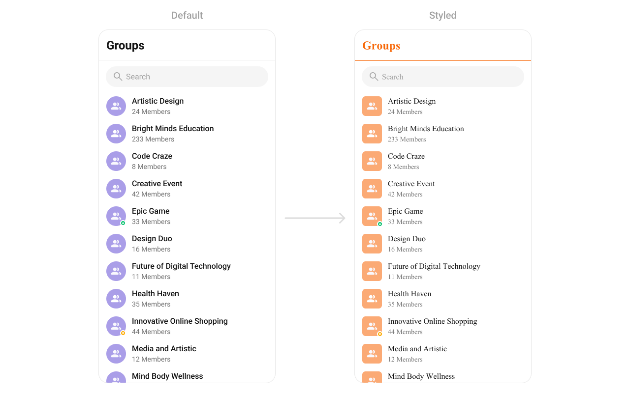
{
  "component": "CometChatGroups",
  "package": "@cometchat/chat-uikit-react-native",
  "import": "import { CometChatGroups } from \"@cometchat/chat-uikit-react-native\";",
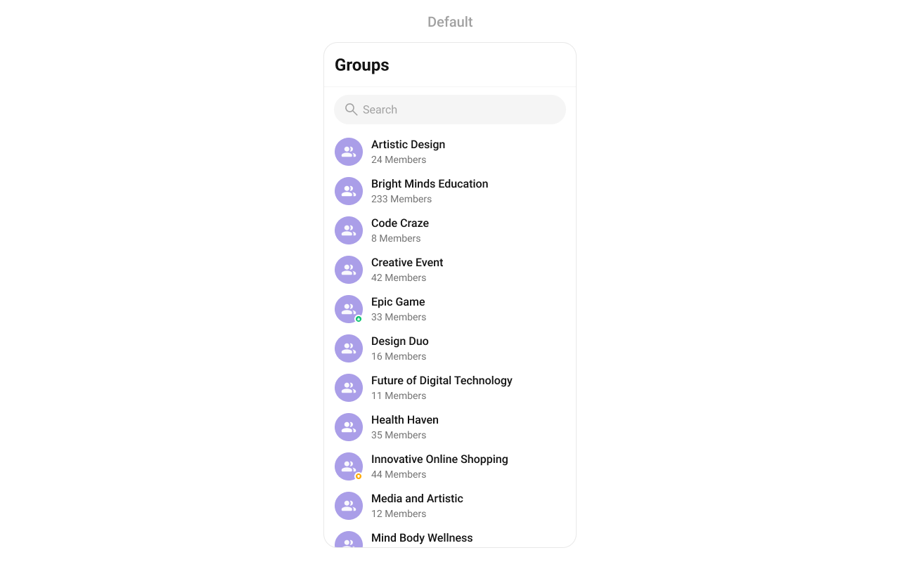
  "description": "Searchable, scrollable list of all available groups with icon, name, member count, and group type indicator.",
  "primaryOutput": {
    "prop": "onItemPress",
    "type": "(group: CometChat.Group) => void"
  },
  "props": {
    "data": {
      "groupsRequestBuilder": {
        "type": "CometChat.GroupsRequestBuilder",
        "default": "SDK default (30 per page)",
        "note": "Pass the builder, not the result of .build()"
      },
      "searchRequestBuilder": {
        "type": "CometChat.GroupsRequestBuilder",
        "default": "undefined"
      },
      "searchKeyword": {
        "type": "string",
        "default": "\"\""
      }
    },
    "callbacks": {
      "onItemPress": "(group: CometChat.Group) => void",
      "onItemLongPress": "(group: CometChat.Group) => void",
      "onBack": "() => void",
      "onSelection": "(list: Array<CometChat.Group>) => void",
      "onSubmit": "(list: Array<CometChat.Group>) => void",
      "onError": "(error: CometChat.CometChatException) => void",
      "onEmpty": "() => void",
      "onLoad": "(list: CometChat.GroupMember[]) => void"
    },
    "visibility": {
      "hideHeader": { "type": "boolean", "default": false },
      "showBackButton": { "type": "boolean", "default": false },
      "hideSearch": { "type": "boolean", "default": false },
      "hideError": { "type": "boolean", "default": false },
      "hideSubmitButton": { "type": "boolean", "default": true },
      "hideLoadingState": { "type": "boolean", "default": false },
      "groupTypeVisibility": { "type": "boolean", "default": true }
    },
    "icons": {
      "privateGroupIcon": { "type": "ImageSourcePropType", "default": "built-in" },
      "passwordGroupIcon": { "type": "ImageSourcePropType", "default": "built-in" }
    },
    "menu": {
      "options": "(group: CometChat.Group) => MenuItemInterface[]",
      "addOptions": "(group: CometChat.Group) => MenuItemInterface[]"
    },
    "search": {
      "searchPlaceholderText": { "type": "string", "default": "\"Search\"" }
    },
    "selection": {
      "selectionMode": {
        "type": "SelectionMode",
        "values": ["single", "multiple", "none"],
        "default": "none"
      }
    },
    "viewSlots": {
      "ItemView": "(group: CometChat.Group) => JSX.Element",
      "LeadingView": "(group: CometChat.Group) => JSX.Element",
      "TitleView": "(group: CometChat.Group) => JSX.Element",
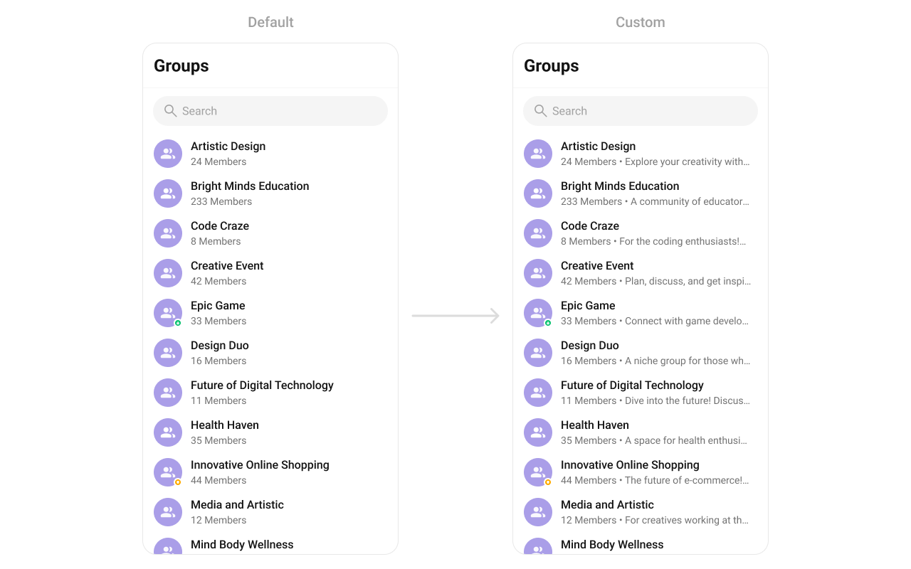
      "SubtitleView": "(group: CometChat.Group) => JSX.Element",
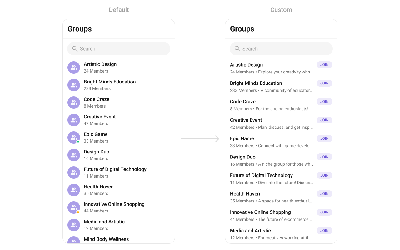
      "TrailingView": "(group: CometChat.Group) => JSX.Element",
      "LoadingView": "() => JSX.Element",
      "EmptyView": "() => JSX.Element",
      "ErrorView": "() => JSX.Element",
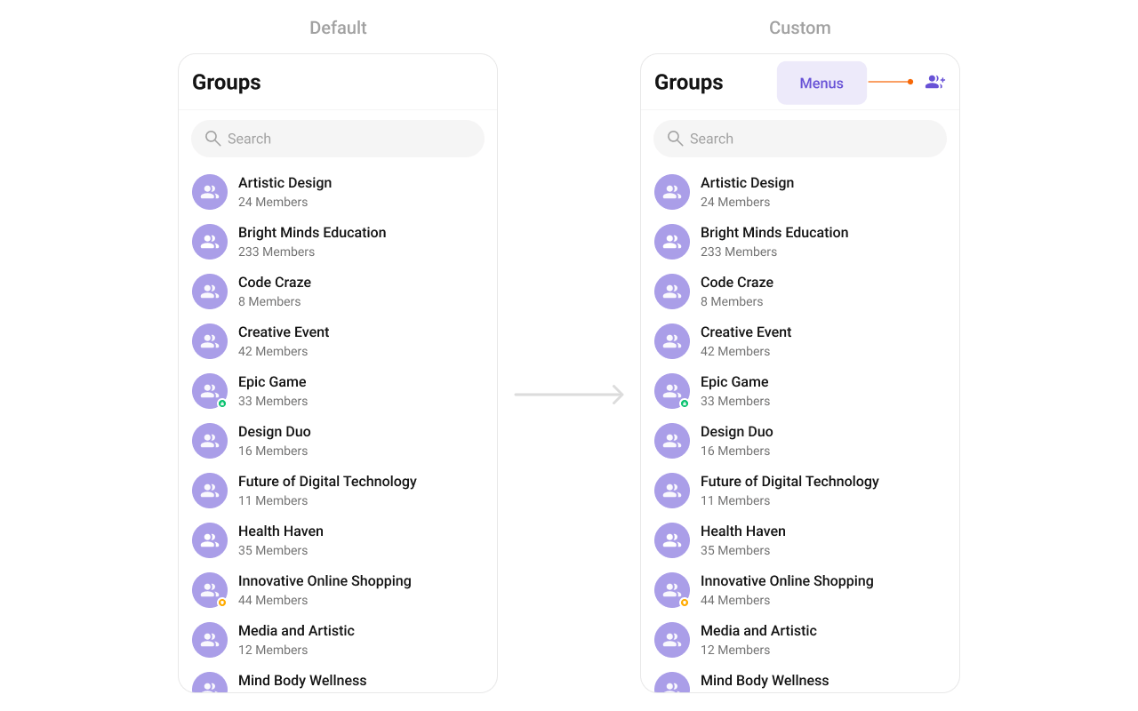
      "AppBarOptions": "() => JSX.Element"
    }
  },
  "events": [
    { "name": "ccGroupCreated", "payload": "CometChat.Group", "description": "Triggered when logged-in user creates a group" },
    { "name": "ccGroupDeleted", "payload": "CometChat.Group", "description": "Triggered when logged-in user deletes a group" },
    { "name": "ccGroupLeft", "payload": "{ leftGroup: CometChat.Group }", "description": "Triggered when logged-in user leaves a group" },
    { "name": "ccGroupMemberScopeChanged", "payload": "IGroupMemberScopeChanged", "description": "Triggered when logged-in user changes scope of another member" },
    { "name": "ccGroupMemberBanned", "payload": "IGroupMemberKickedBanned", "description": "Triggered when logged-in user bans a group member" },
    { "name": "ccGroupMemberKicked", "payload": "IGroupMemberKickedBanned", "description": "Triggered when logged-in user kicks a group member" },
    { "name": "ccGroupMemberUnbanned", "payload": "IGroupMemberUnBanned", "description": "Triggered when logged-in user unbans a group member" },
    { "name": "ccGroupMemberJoined", "payload": "IGroupMemberJoined", "description": "Triggered when logged-in user joins a group" },
    { "name": "ccGroupMemberAdded", "payload": "IGroupMemberAdded", "description": "Triggered when logged-in user adds members to a group" },
    { "name": "ccOwnershipChanged", "payload": "IOwnershipChanged", "description": "Triggered when logged-in user transfers group ownership" }
  ],
  "sdkListeners": [
    "onGroupMemberJoined",
    "onGroupMemberLeft",
    "onMemberAddedToGroup",
    "onGroupMemberKicked",
    "onGroupMemberBanned",
    "onGroupMemberScopeChanged"
  ],
  "compositionExample": {
    "description": "Group directory wired to message view",
    "components": [
      "CometChatGroups",
      "CometChatMessageHeader",
      "CometChatMessageList",
      "CometChatMessageComposer"
    ],
    "flow": "onItemPress emits CometChat.Group -> pass to MessageHeader, MessageList, MessageComposer"
  },
  "types": {
    "SelectionMode": {
      "single": "Select one group at a time",
      "multiple": "Select multiple groups",
      "none": "No selection mode"
    }
  }
}