

AI Integration Quick Reference
AI Integration Quick Reference
Selector Pattern
Use this table to construct the correct CSS selector for any message bubble target. AI agents should use this pattern to generalize — do not guess selectors.<TYPE><TYPE> is one of text, image, video, audio, file, delete, meeting (direct call), whiteboard, document, poll, stickerLink Preview BubblesIt reuse the
text-message type selector since link previews are rendered inside text messages.CSS Variable Reference
These are the CSS variables (tokens) used across message bubble styling. This table tells you exactly what each token controls — do not assume a token affects something not listed here.CSS Specificity & Precedence Rules:
- Message-type selectors (e.g.,
__text-message) override “All Message Bubbles” selectors - Always keep the
.cometchatprefix to avoid leaking styles into the host app - Component-level variable overrides (
.cometchat-message-list { --var: val }) override global overrides (.cometchat { --var: val }) - CSS variable overrides only affect properties the UI Kit theme binds to that variable — they do NOT change layout or spacing
!importantshould never be needed — if it is, your selector specificity is wrong
Incoming & Outgoing Messages
Incoming and outgoing messages have different styling by default, allowing users to visually separate their own messages from others’. Here, we show both the default view and examples of customizations for these message bubbles. Shown below is the default chat interface.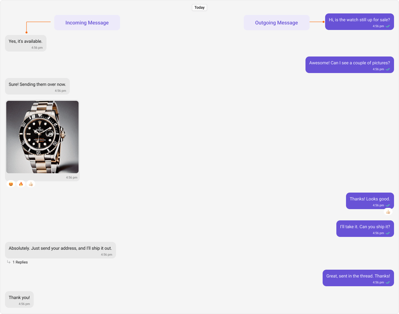
Styling
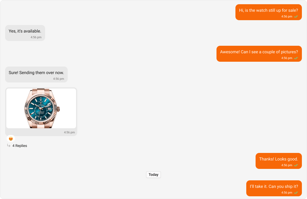
Outgoing Message Bubbles
Selectors:
The customized chat interface is displayed below.
App.css
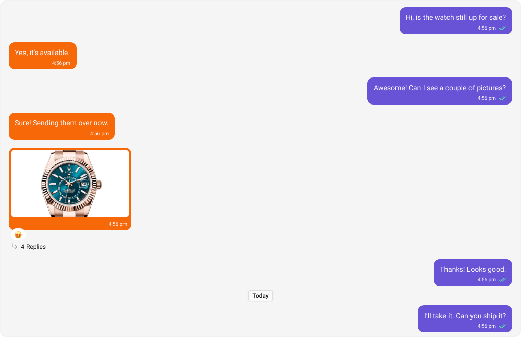
Incoming Message Bubbles
Selectors:
The customized chat interface is displayed below.
App.css
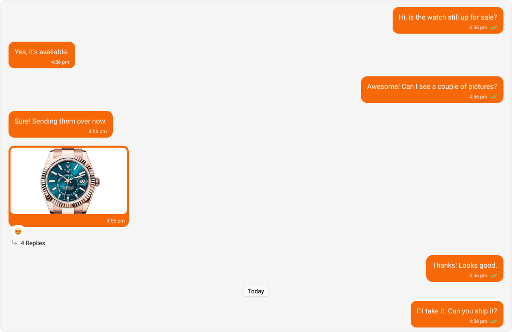
All Message Bubbles
Selectors:
The customized chat interface is displayed below.
App.css
Complete End-to-End Example
To apply custom bubble colors in your app: Step 1: Add toApp.css:
App.tsx imports the CSS:
Message Types
CometChat UI Kit includes classes for various message types. Below are examples of default & customised views for each message type, along with the relevant CSS code snippets so that you can quickly get up to speed with CSS customization.Text Message Bubble
Selectors:- Outgoing
- Incoming
Shown below is the default chat interface.


- App.css
Image Message Bubble
Selectors:- Outgoing
- Incoming
Shown below is the default chat interface.
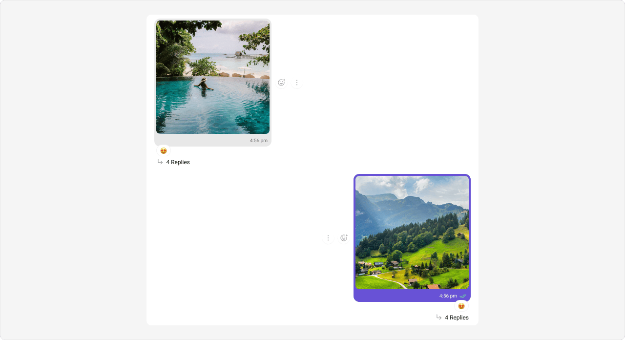
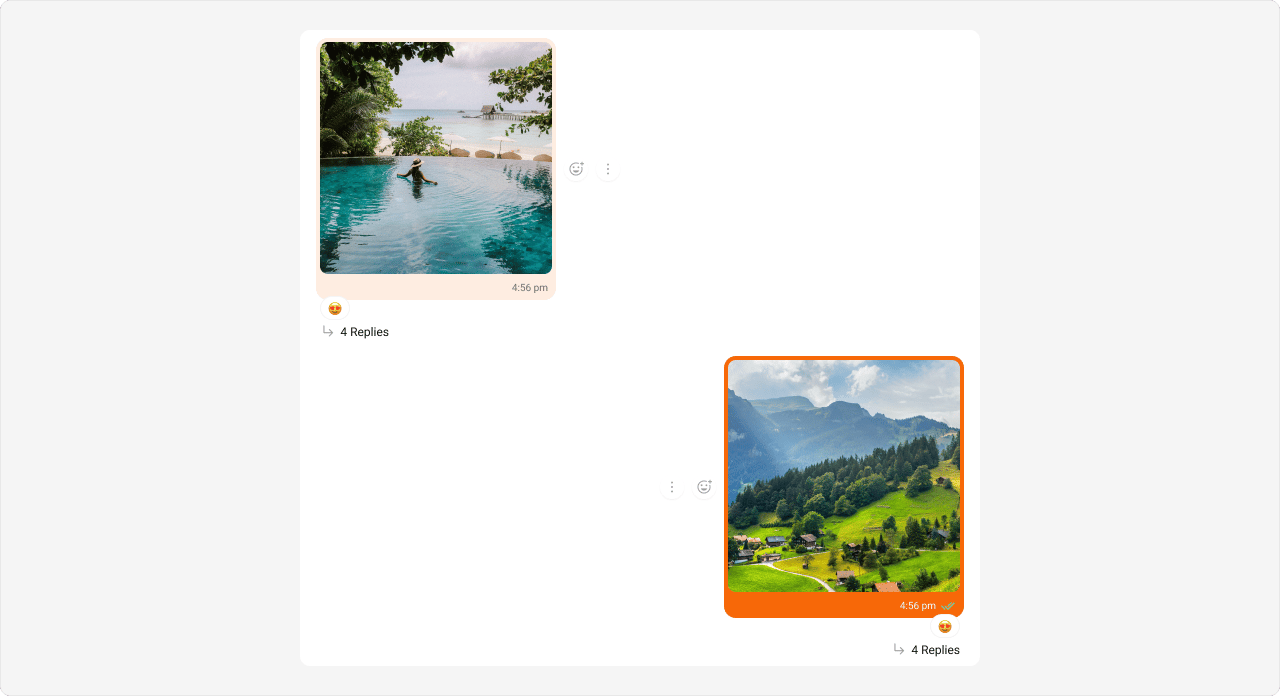
- App.css
Video Message Bubble
Selectors:- Outgoing
- Incoming
Shown below is the default chat interface.
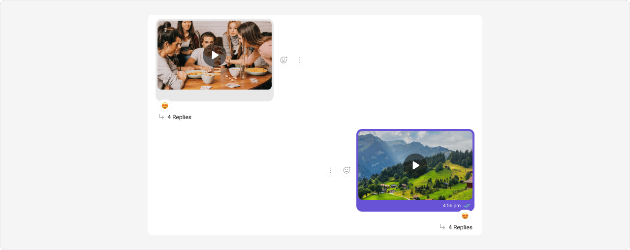
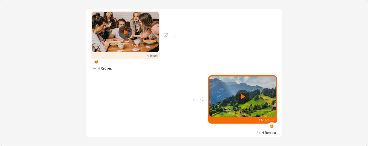
- App.css
Audio Message Bubble
Selectors:- Outgoing
- Incoming
Shown below is the default chat interface.

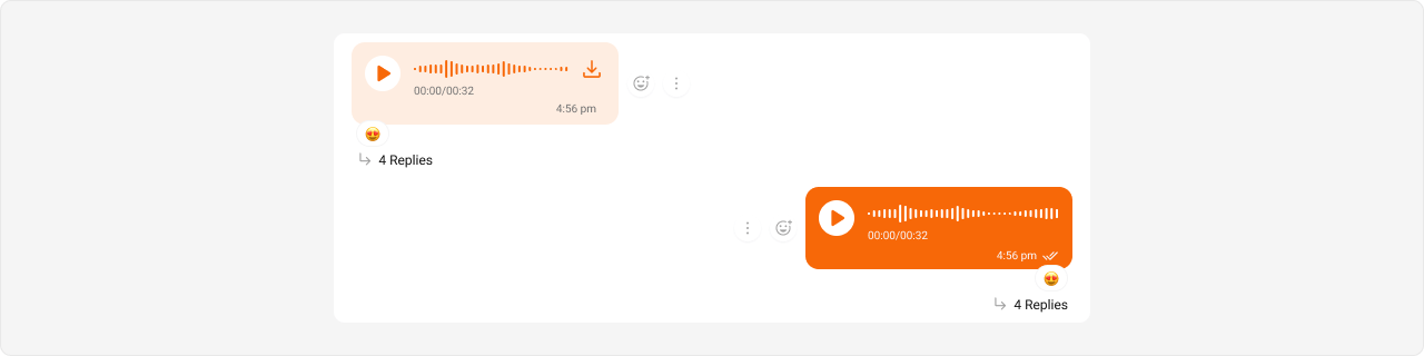
- App.css
File Message Bubble
Selectors:- Outgoing
- Incoming
Shown below is the default chat interface.


- App.css
Delete Message Bubble
Selectors:- Outgoing
- Incoming
Shown below is the default chat interface.


- App.css
Action Message Bubble
Action messages (e.g., “User joined the group”) use a different selector pattern — they are not directional (no incoming/outgoing). Selector:.cometchat .cometchat-message-bubble__body .cometchat-action-bubble
Shown below is the default chat interface.


- App.css
Direct Call Message Bubble
Direct call messages use themeeting-message type selector (not call-message).
Selectors:
- Outgoing
- Incoming
Shown below is the default chat interface.


- App.css
Default Call Message Bubble
Default call messages (ringing calls) use the same action bubble selector as Action Messages. Selector:.cometchat .cometchat-message-bubble__body .cometchat-action-bubble
Styling default call message bubbles also affects Action Message bubbles since they share the same
.cometchat-action-bubble selector. To style them independently, use more specific parent selectors if available.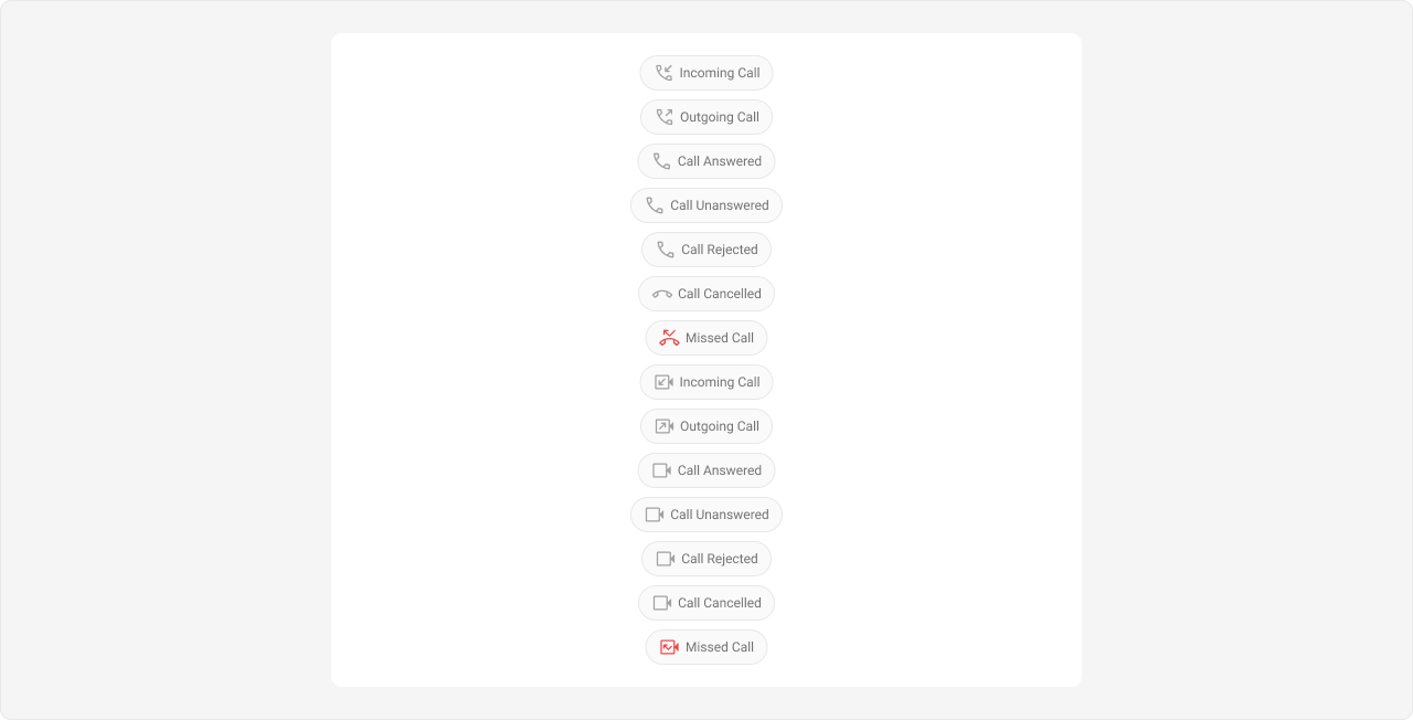
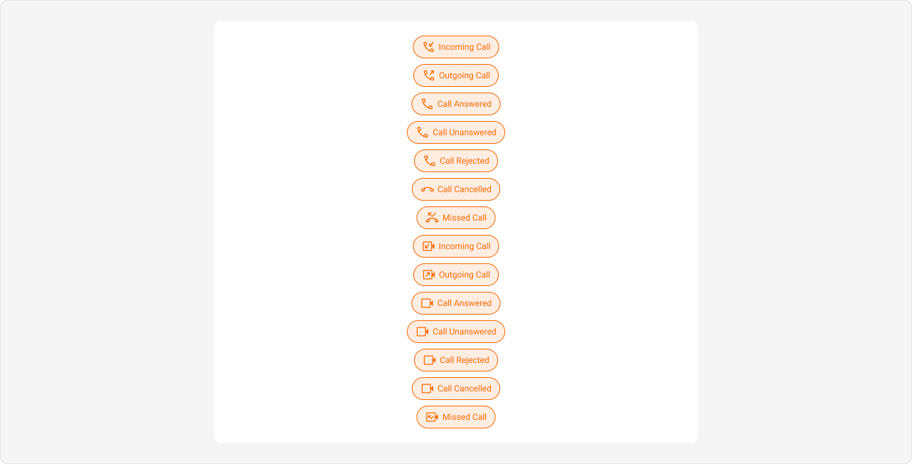
- App.css
Extensions
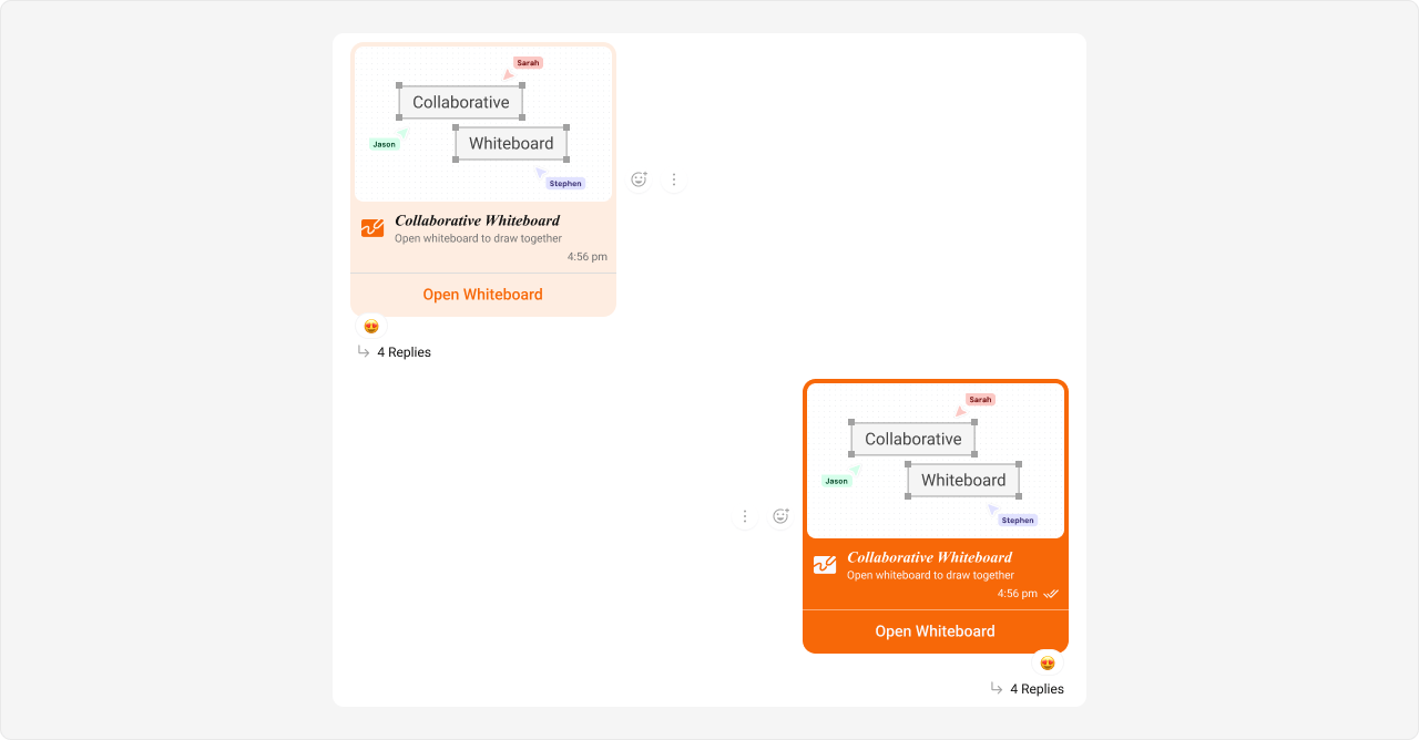
Collaborative Whiteboard Bubble
Selectors:- Outgoing
- Incoming
Shown below is the default chat interface.
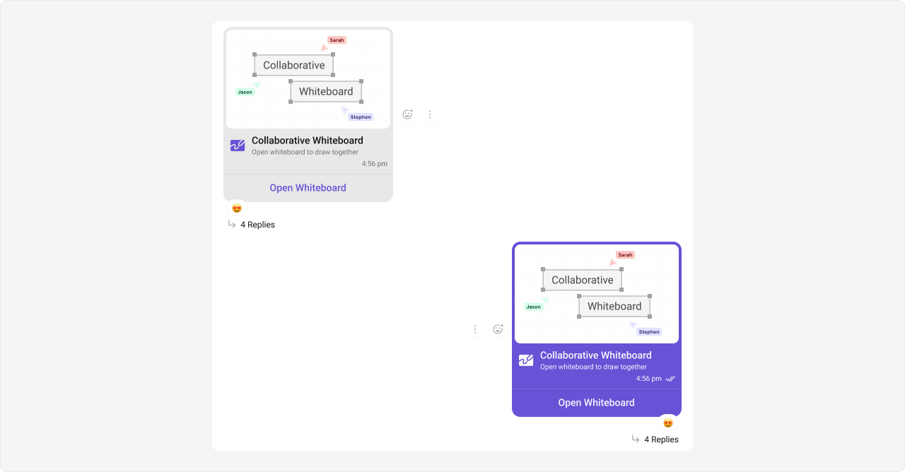
- App.css
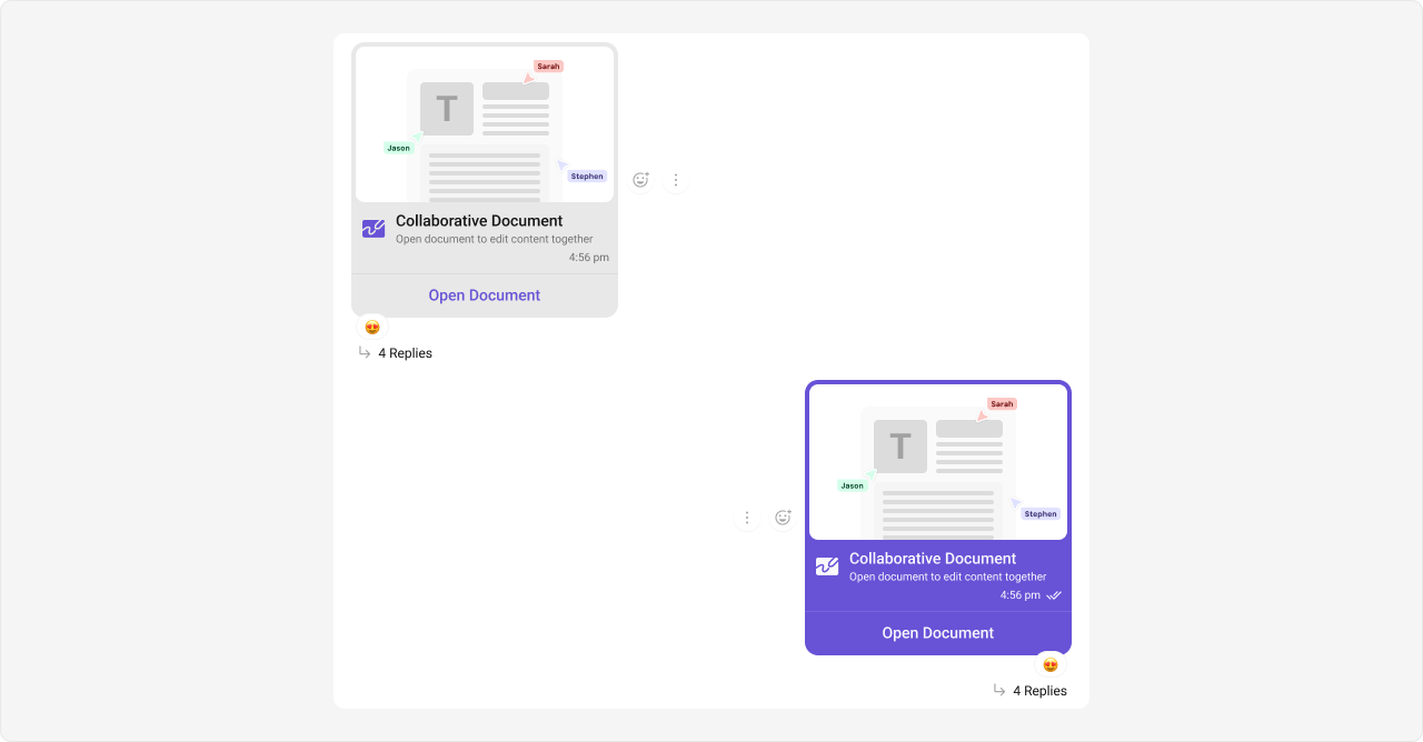
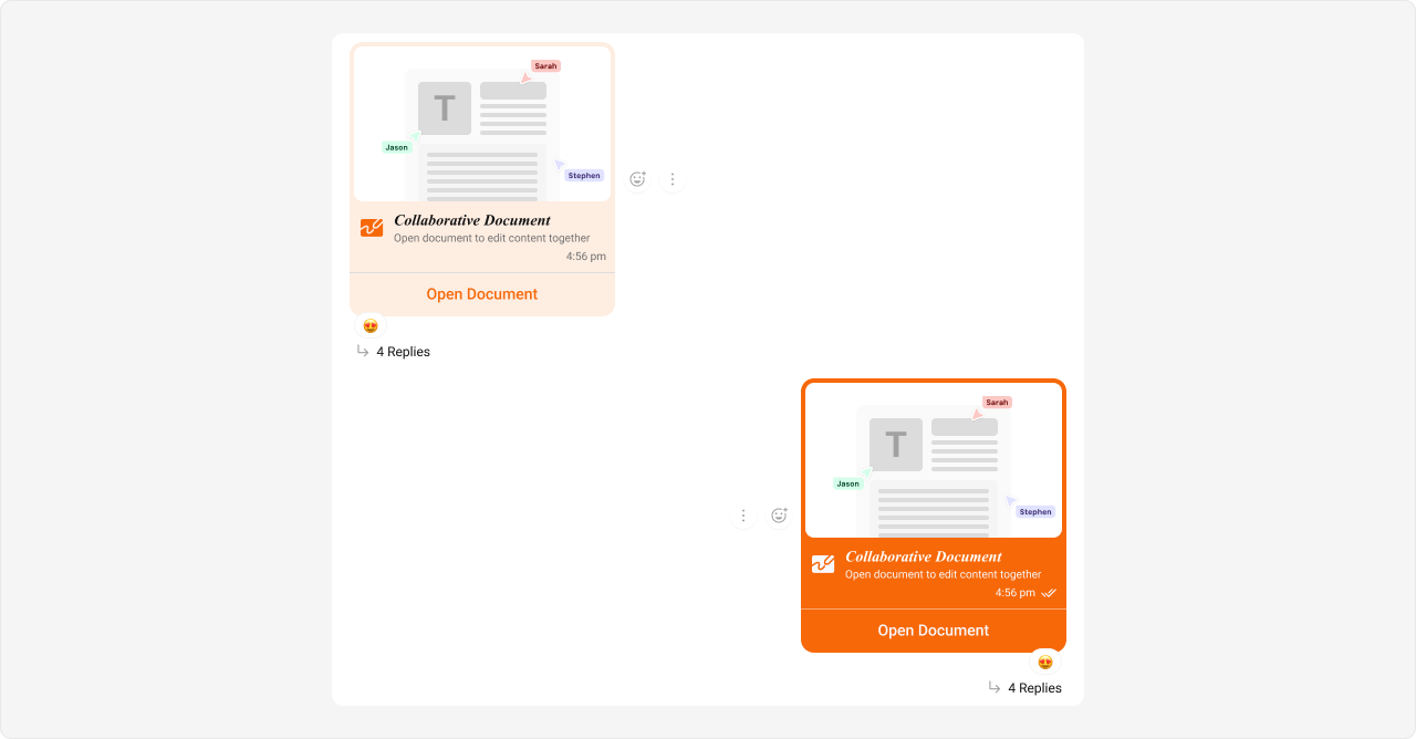
Collaborative Document Bubble
Selectors:- Outgoing
- Incoming
Shown below is the default chat interface.
- App.css
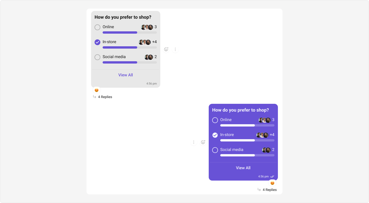
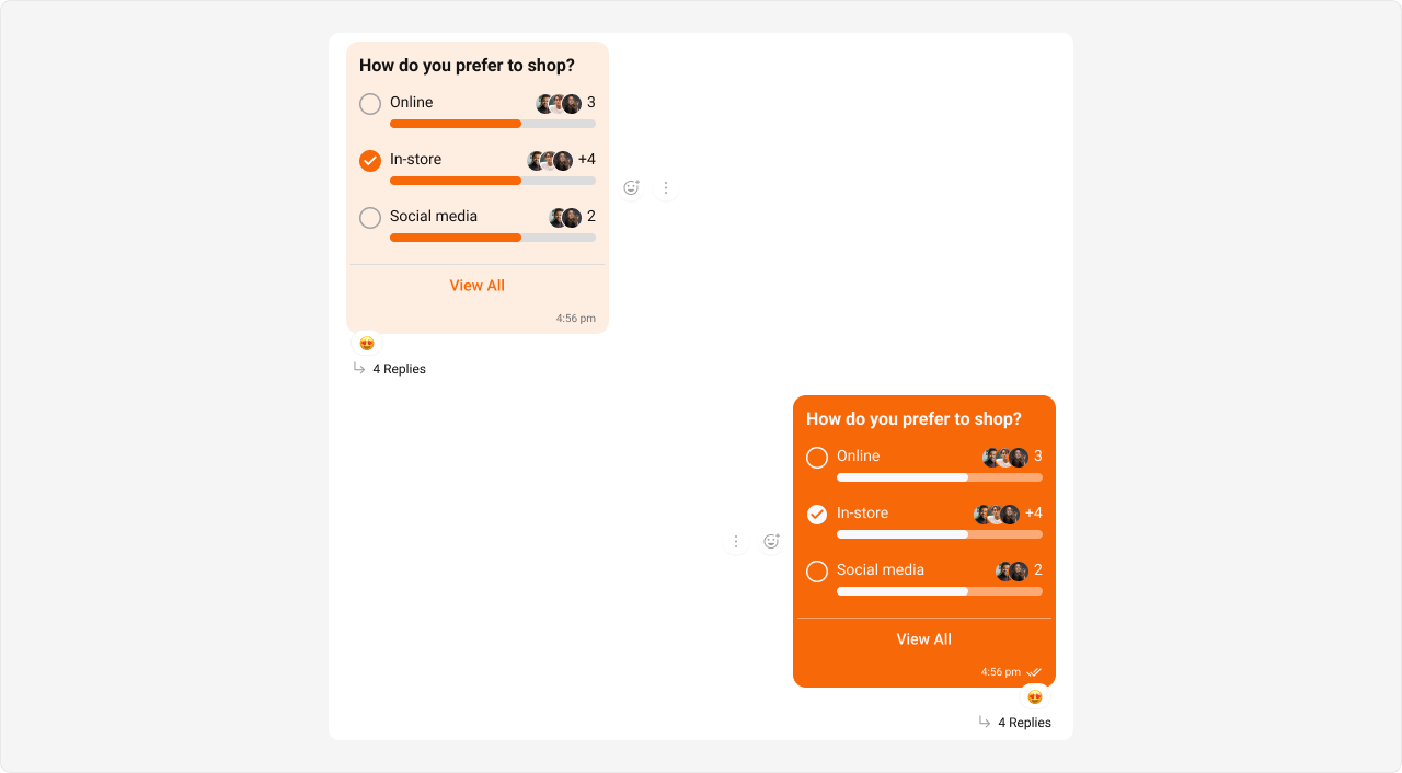
Polls Bubble
Selectors:- Outgoing
- Incoming
Shown below is the default chat interface.
- App.css
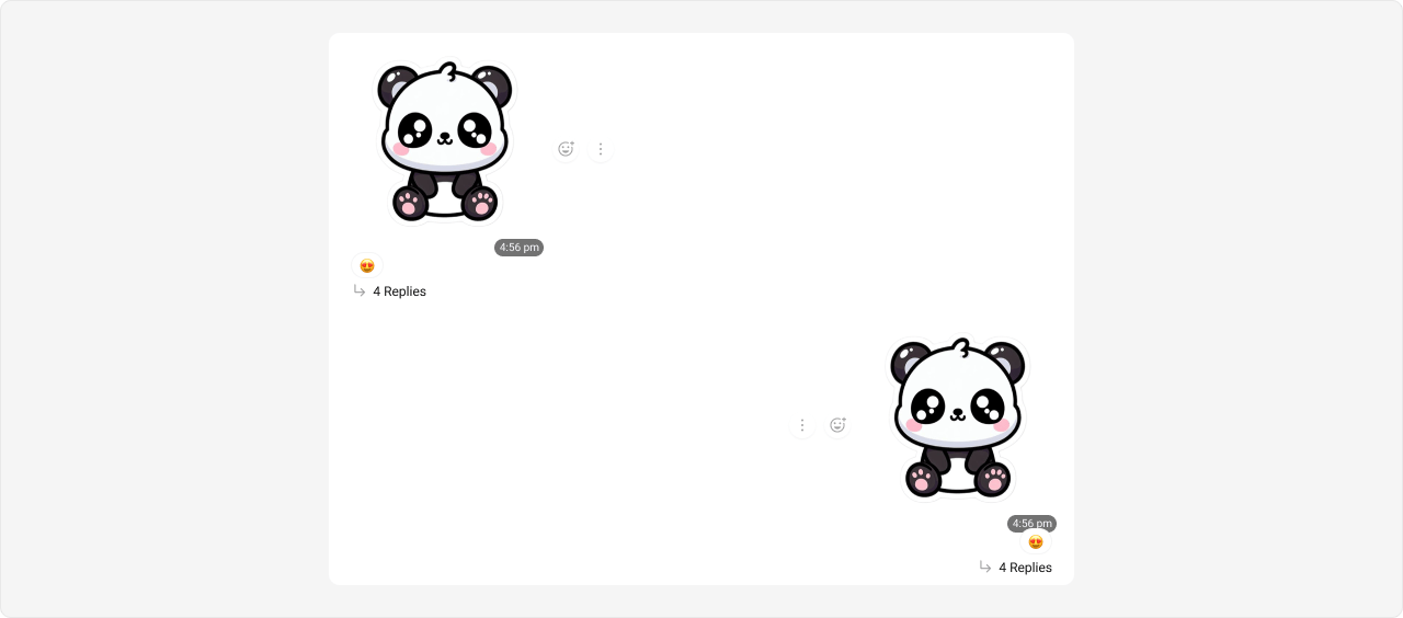
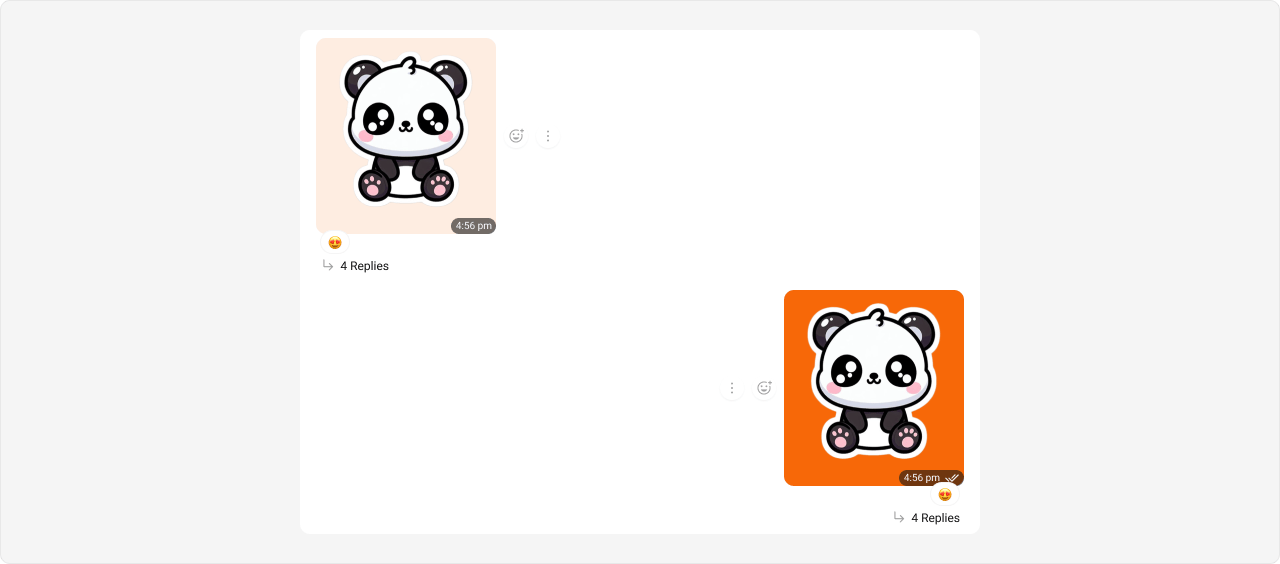
Stickers Bubble
Selectors:- Outgoing
- Incoming
Shown below is the default chat interface.
- App.css
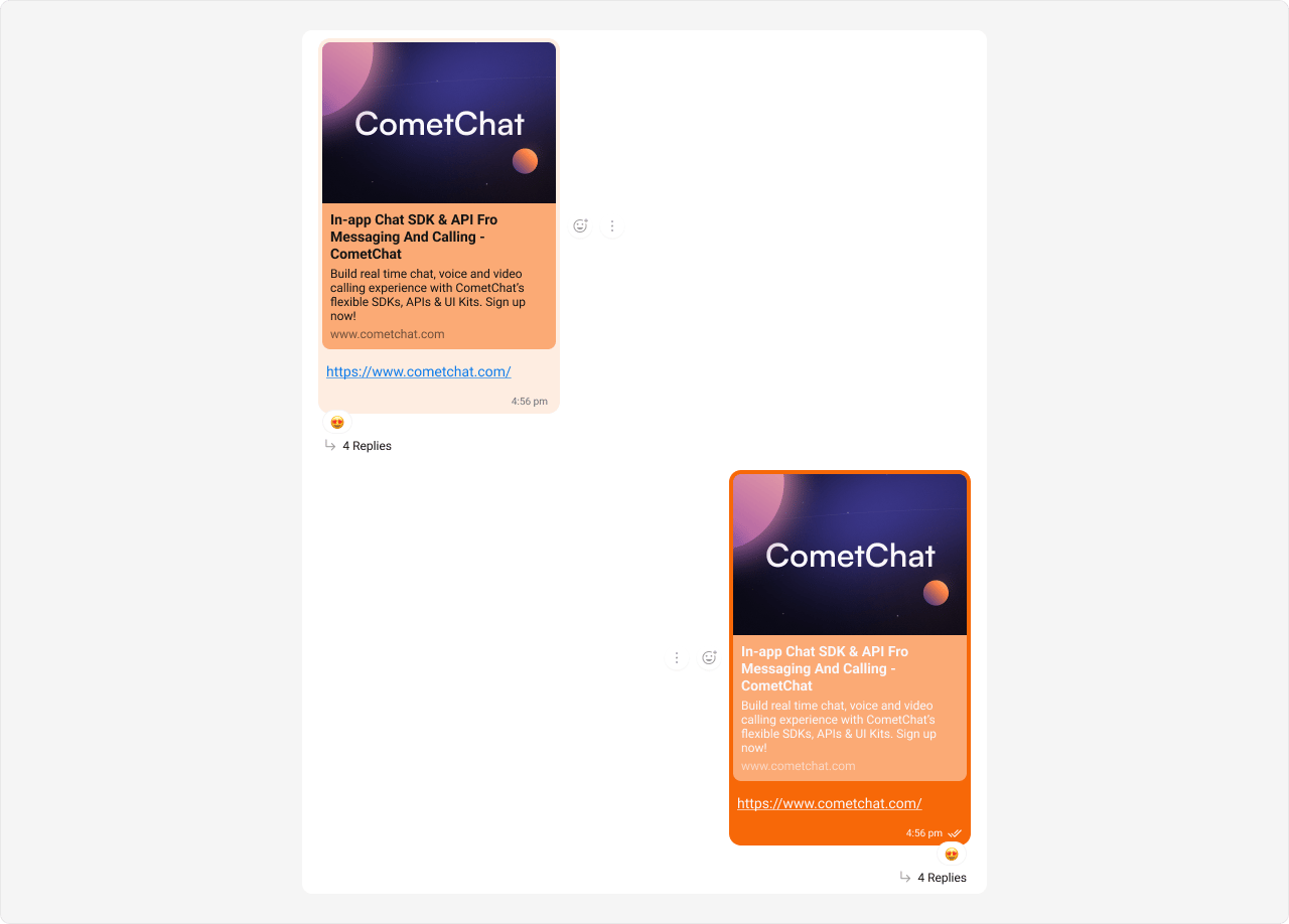
Link Preview Bubble
Link previews render inside text message bubbles, so they use thetext-message type selector.
Selectors:
- Outgoing
- Incoming
Styling link preview bubbles also affects regular text message bubbles since they share the same
__text-message selector. This is by design — link previews are a sub-feature of text messages.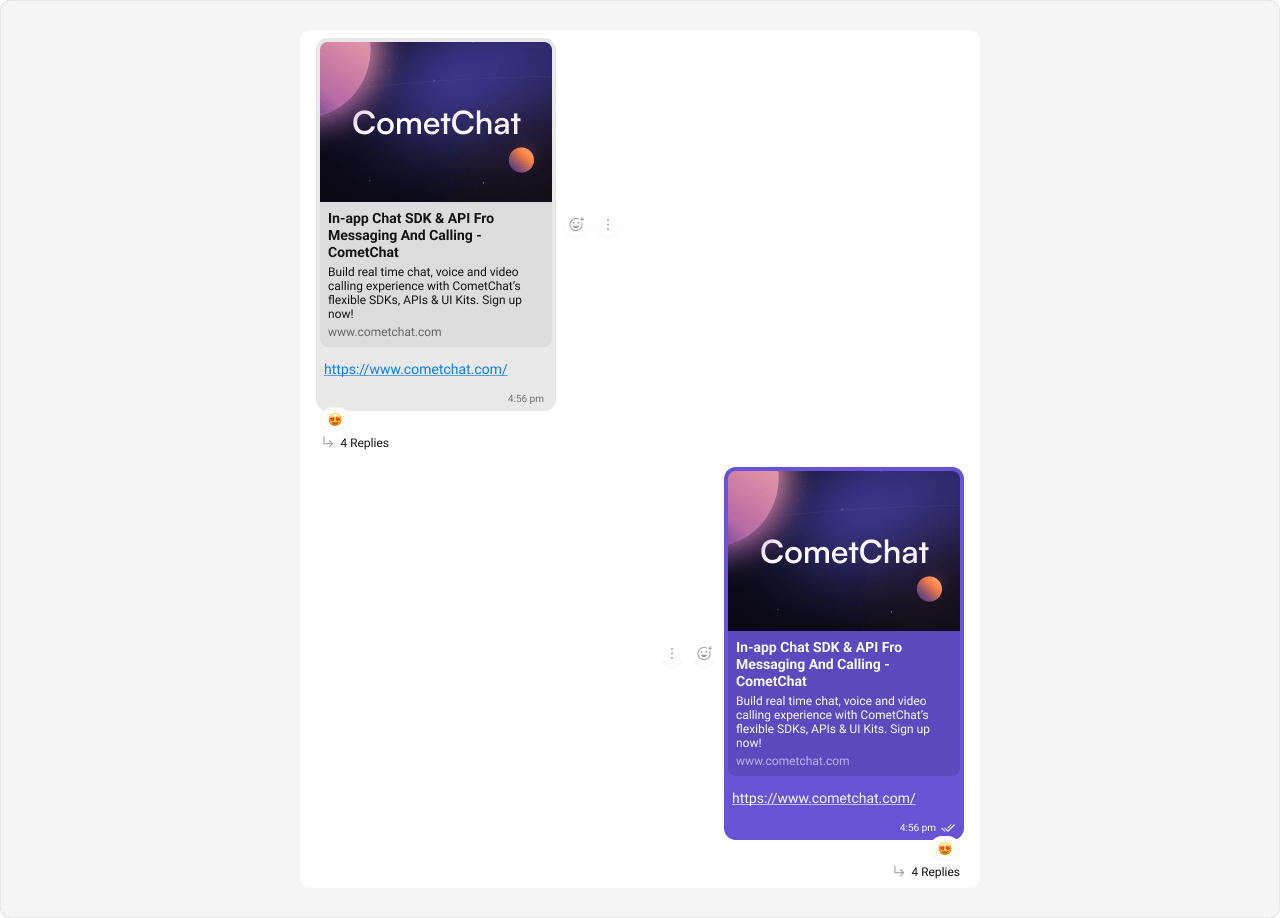
- App.css