

Overview
The Users is a Component, showcasing an accessible list of all available users. It provides an integral search functionality, allowing you to locate any specific user swiftly and easily. For each user listed, the widget displays the user’s name by default, in conjunction with their avatar when available. Furthermore, it includes a status indicator, visually informing you whether a user is currently online or offline.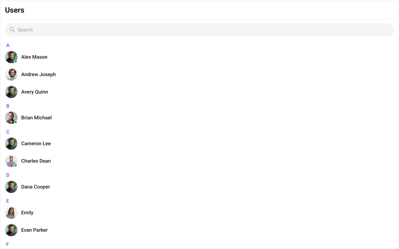
| Components | Description |
|---|---|
| CometChatList | A reusable container component having title, search box, customisable background and a list view. |
| CometChatListItem | A component that renders data obtained from a User object on a Tile having a title, subtitle, leading and trailing view. |
Usage
Integration
The following code snippet illustrates how you can directly incorporate the Users component into your Application.- UsersDemo.tsx
- App.tsx
Actions
Actions dictate how a component functions. They are divided into two types: Predefined and User-defined. You can override either type, allowing you to tailor the behavior of the component to fit your specific needs.1. onSelect
TheonSelect action is activated when you select the done icon while in selection mode. This returns a list of all the users that you have selected.
This action does not come with any predefined behavior. However, you have the flexibility to override this event and tailor it to suit your needs using the following code snippet.
- TypeScript
- JavaScript
2. onItemClick
TheOnItemClick event is activated when you click on the UserList item. This action does not come with any predefined behavior. However, you have the flexibility to override this event and tailor it to suit your needs using the following code snippet.
- TypeScript
- JavaScript
3. onEmpty
This action allows you to specify a callback function to be executed when a certain condition, typically the absence of data or content, is met within the component or element.- TypeScript
- JavaScript
4. onError
This action doesn’t change the behavior of the component but rather listens for any errors that occur in the User component.- TypeScript
- JavaScript
Filters
Filters allow you to customize the data displayed in a list within a Component. You can filter the list based on your specific criteria, allowing for a more customized. Filters can be applied using RequestBuilders of Chat SDK.1. UserRequestBuilder
The UserRequestBuilder enables you to filter and customize the user list based on available parameters in UserRequestBuilder. This feature allows you to create more specific and targeted queries when fetching users. The following are the parameters available in UserRequestBuilder| Methods | Type | Description |
|---|---|---|
| setLimit | number | sets the number users that can be fetched in a single request, suitable for pagination |
| setSearchKeyword | String | used for fetching users matching the passed string |
| hideBlockedUsers | boolean | used for fetching all those users who are not blocked by the logged in user |
| friendsOnly | boolean | used for fetching only those users in which logged in user is a member |
| setRoles | List<String> | used for fetching users containing the passed tags |
| setTags | List<String> | used for fetching users containing the passed tags |
| withTags | boolean | used for fetching users containing tags |
| setStatus | String | used for fetching users by their status online or offline |
| setUIDs | List<String> | used for fetching users containing the passed users |
- TypeScript
- JavaScript
2. SearchRequestBuilder
The SearchRequestBuilder uses UserRequestBuilder enables you to filter and customize the search list based on available parameters in UserRequestBuilder. This feature allows you to keep uniformity between the displayed UserList and searched UserList. Example- TypeScript
- JavaScript
Events
Events are emitted by aComponent. By using event you can extend existing functionality. Being global events, they can be applied in Multiple Locations and are capable of being Added or Removed.
To handle events supported by Users you have to add corresponding listeners by using CometChatUserEvents
The Users component does not produce any events directly.
Customization
To fit your app’s design requirements, you can customize the appearance of the Users component. We provide exposed methods that allow you to modify the experience and behavior according to your specific needs.Style
Using CSS you can customize the look and feel of the component in your app like the color, size, shape, and fonts. Example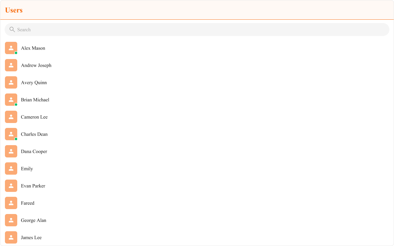
- TypeScript
- JavaScript
- CSS
Functionality
These are a set of small functional customizations that allow you to fine-tune the overall experience of the component. With these, you can change text, set custom icons, and toggle the visibility of UI elements.- TypeScript
- JavaScript
| Property | Description | Code |
|---|---|---|
| Hide Search | Hides the default search bar. | hideSearch={true} |
| Show Section Header | Displays an alphabetical section header for the user list. | showSectionHeader={true} |
| Hide Error | Hides both the default and custom error view passed in errorView prop. | hideError={true} |
| Hide User Status | Hides the user’s online/offline status indicator. | hideUserStatus={true} |
| Show Scrollbar | Controls the visibility of the scrollbar in the list. | showScrollbar={true} |
| Active User | The user to be highlighted in the users list. | activeUser={chatUser} |
| Search Keyword | The search keyword used to filter the user list. | searchKeyword="Alice" |
| Section Header Key | The property on the user object used to extract the section header character. | sectionHeaderKey={getName} |
| Selection Mode | Selection mode to use for the default trailing view. | selectionMode={SelectionMode.multiple} |
| Loading View | A custom view to display during the loading state. | loadingView={<>Custom Loading View</>} |
| Empty View | A custom view to display when no users are available in the list. | emptyView={<>Custom Empty View</>} |
| Error View | A custom view to display when an error occurs. | errorView={<>Custom Error View</>} |
Advanced
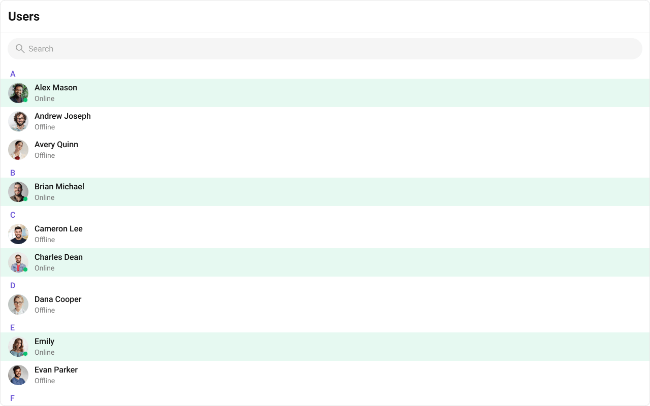
For advanced-level customization, you can set custom views to the component. This lets you tailor each aspect of the component to fit your exact needs and application aesthetics. You can create and define your views, layouts, and UI elements and then incorporate those into the component.ItemView
A custom view to render for each user in the fetched list. Shown below is the default chat interface.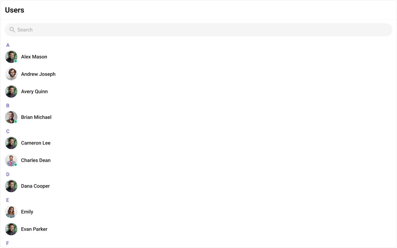
- TypeScript
- JavaScript
- CSS
TitleView
The customized chat interface is displayed below.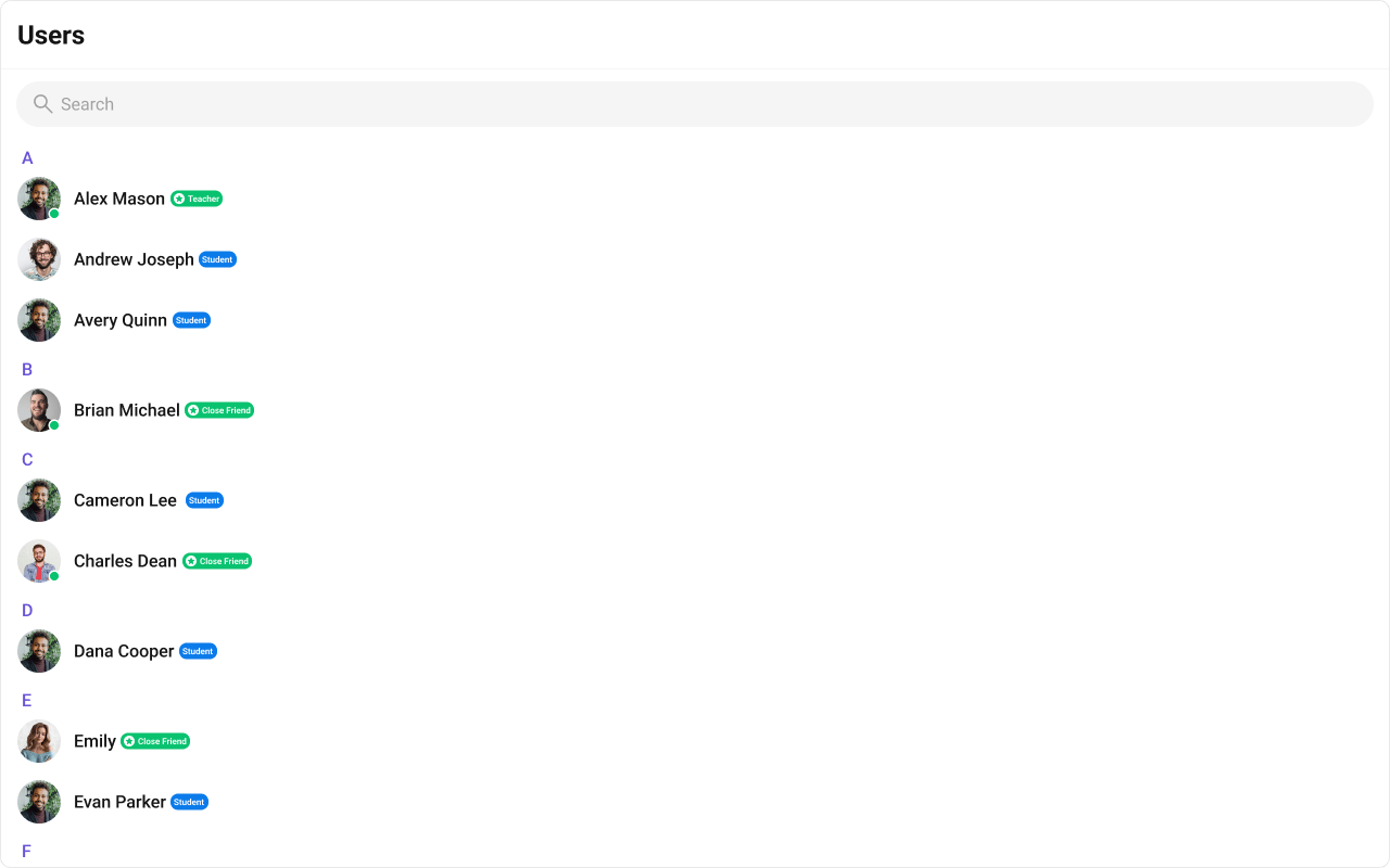
- TypeScript
- CSS
SubtitleView
A custom view to render the subtitle for each user. Shown below is the default chat interface.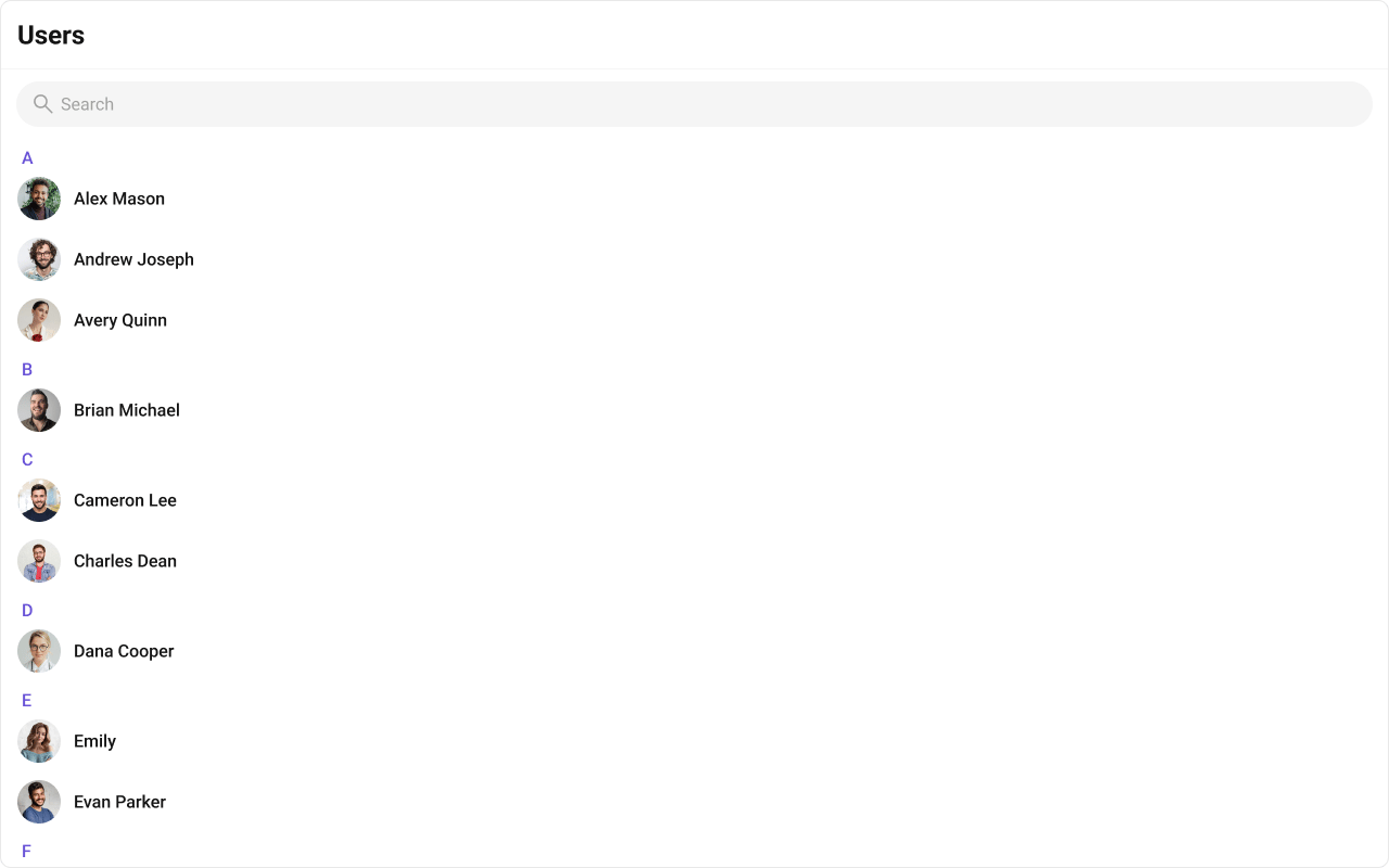
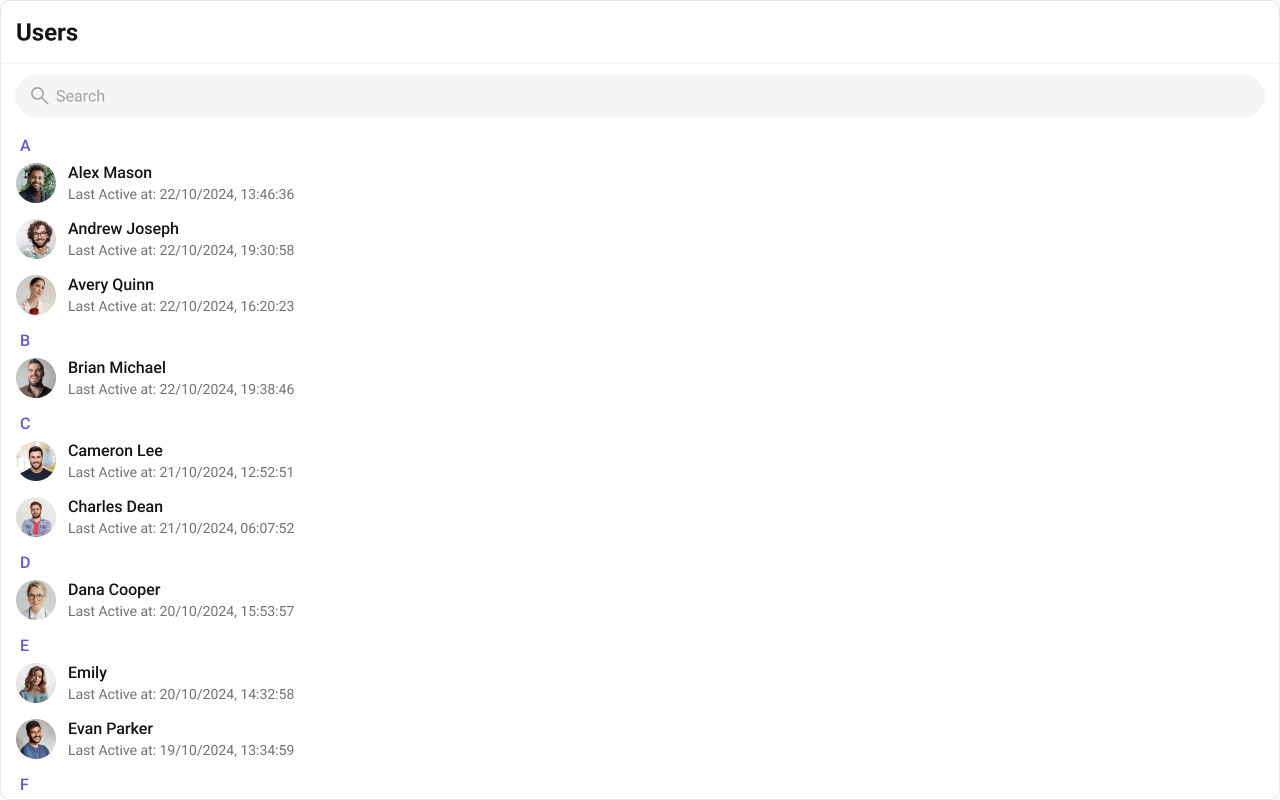
- TypeScript
- JavaScript
- CSS
HeaderView
You can set the Custom headerView to add more options to the Users component. The customized chat interface is displayed below.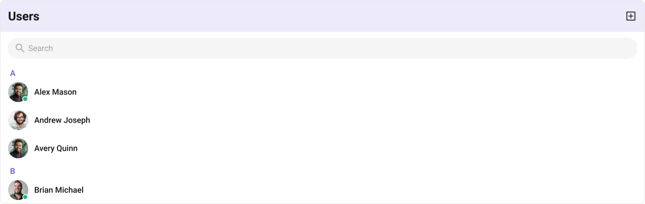
- TypeScript
- CSS
LeadingView
The customized chat interface is displayed below.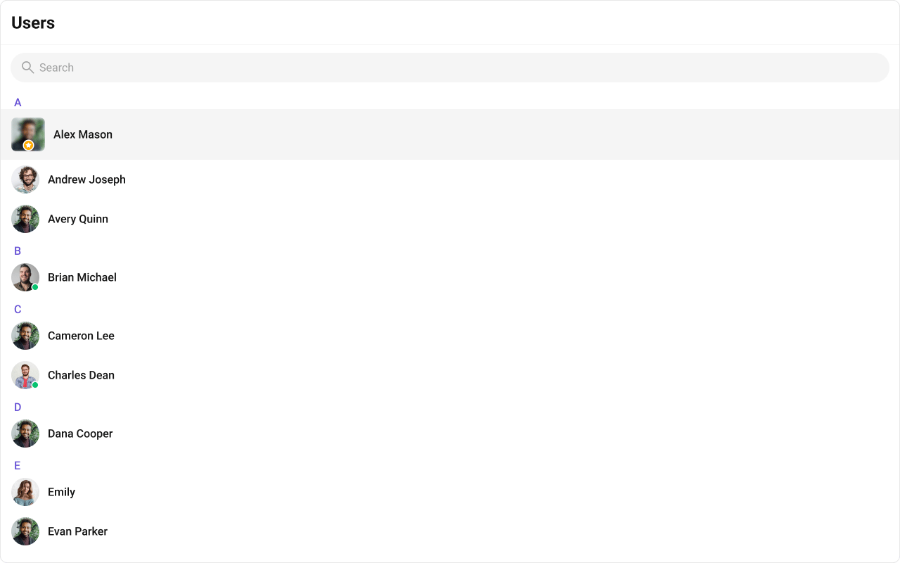
- TypeScript
- CSS
TrailingView
The customized chat interface is displayed below.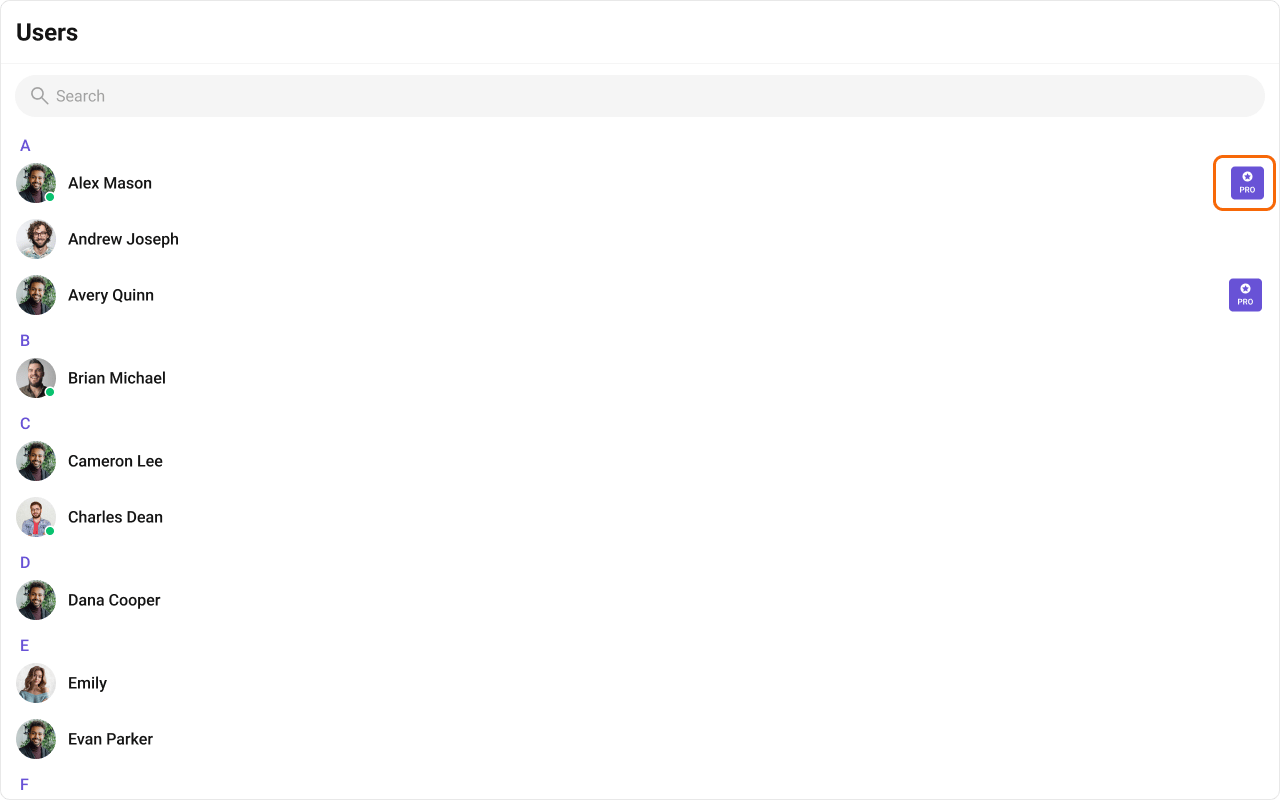
- TypeScript
- CSS
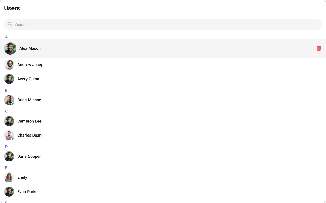
Options
A function that returns a list of actions available when hovering over a user item. Shown below is the default chat interface.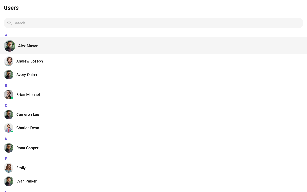
- TypeScript
- JavaScript
- CSS