

AI Integration Quick Reference
AI Integration Quick Reference
CometChatNotificationFeed displays a scrollable notification feed where each item is rendered as a card using @cometchat/cards-react. It handles fetching, pagination, category filtering, timestamp grouping, real-time updates, and read/delivered/engagement reporting automatically.
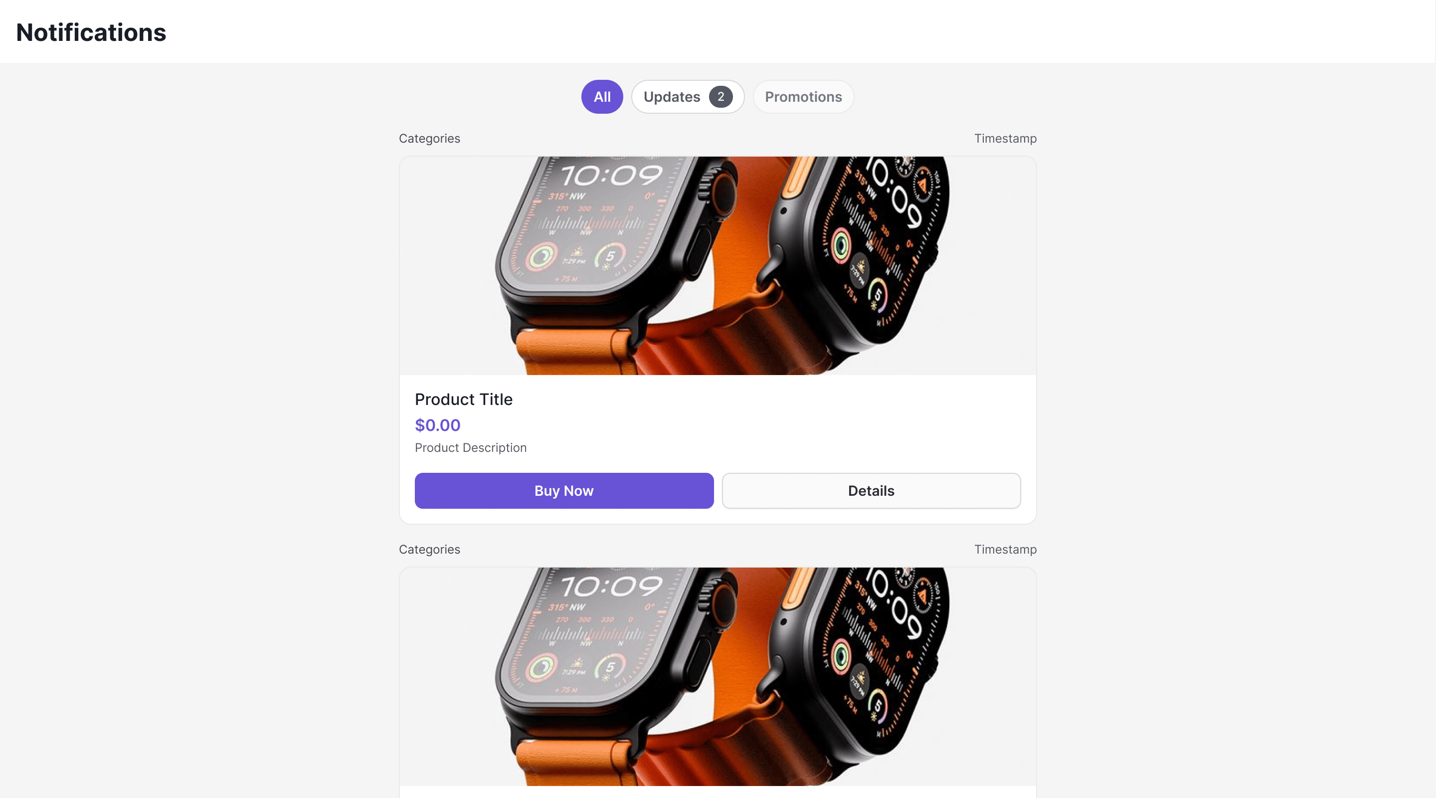
Live Preview — interact with the notification feed component.Open in Storybook ↗
Where It Fits
CometChatNotificationFeed is a full-screen component. Drop it into a page or route. It manages its own data fetching, state, and real-time listeners — you just handle navigation callbacks.
Minimal Render
CometChatUIKit.init() and a user logged in.
Root CSS class: .cometchat-notification-feed
Filtering Feed Items
Control what loads using custom request builders:Filter Options
| Builder Method | Description |
|---|---|
.setLimit(number) | Items per page (default 20, max 100) |
.setReadState(state) | "read", "unread", or "all" |
.setCategory(string) | Filter by category label |
.setChannelId(string) | Filter by channel |
.setTags(string[]) | Filter by tags |
.setDateFrom(string) | ISO 8601 date lower bound |
.setDateTo(string) | ISO 8601 date upper bound |
Actions and Events
Callback Props
onItemClick
Fires when a feed item card is clicked.onActionClick
Fires when an interactive element (button, link) inside a card is clicked. Theaction object contains the action type, parameters, and the element ID that triggered it.
onError
Fires when an internal error occurs (network failure, SDK exception).onBackPress
Fires when the back button in the header is clicked.Automatic Behaviors
The component handles these automatically — no manual setup needed:| Behavior | Description |
|---|---|
| Real-time updates | New items appear at the top via WebSocket NotificationFeedListener |
| Delivery reporting | Items are reported as delivered when fetched |
| Read reporting | Items are reported as read when visible in viewport (IntersectionObserver) |
| Unread count polling | Polls unread count every 30 seconds to update badges |
| Infinite scroll | Fetches next page when scrolling near the bottom |
| Timestamp grouping | Groups items as “Today”, “Yesterday”, day name, or date |
| Category filtering | Filter chips row with per-category unread badges |
| Mark all read | Header button to mark all notifications as read |
Customization
View Props
| Slot | Signature | Replaces |
|---|---|---|
headerView | ReactNode | Entire header bar |
loadingView | ReactNode | Loading state |
emptyView | ReactNode | Empty state |
errorView | ReactNode | Error state |
itemView | (item: NotificationFeedItem) => ReactNode | Individual feed item rendering |
Compound Composition
For full layout control, use sub-components. Omit any sub-component to hide it:| Sub-component | Description | Props | Flat API equivalent |
|---|---|---|---|
Root | Context provider and container | All Root props + children | — |
Header | Header bar with title + mark-all-read | title, showBackButton, onBackPress, children | headerView |
FilterChips | Category filter chips | children | — |
List | Scrollable feed list | itemView | itemView |
Item | Individual feed item | item, cardThemeMode, cardThemeOverride | — |
EmptyState | Empty state | children | emptyView |
ErrorState | Error state | children | errorView |
LoadingState | Loading state | children | loadingView |
CSS Styling
Override design tokens on the component selector:CSS Classes
| Class | Description |
|---|---|
.cometchat-notification-feed | Root container |
.cometchat-notification-feed__header | Header bar |
.cometchat-notification-feed__header-title | Header title text |
.cometchat-notification-feed__header-back | Back button |
.cometchat-notification-feed__mark-all-read | Mark all read button |
.cometchat-notification-feed__chips | Filter chips container |
.cometchat-notification-feed__chip | Individual filter chip |
.cometchat-notification-feed__chip--active | Active filter chip |
.cometchat-notification-feed__chip--inactive | Inactive filter chip |
.cometchat-notification-feed__chip-badge | Chip unread badge |
.cometchat-notification-feed__content | Scrollable content area |
.cometchat-notification-feed__item | Feed item container |
.cometchat-notification-feed__item--unread | Unread feed item |
.cometchat-notification-feed__unread-indicator | Unread dot indicator |
.cometchat-notification-feed__item-meta | Item metadata row (category + time) |
.cometchat-notification-feed__card-container | Card wrapper |
.cometchat-notification-feed__loading | Loading state |
.cometchat-notification-feed__empty | Empty state |
.cometchat-notification-feed__error | Error state |
Props
All props are optional.title
Header title text.| Type | string |
| Default | "Notifications" |
showHeader
Shows/hides the entire header.| Type | boolean |
| Default | true |
showBackButton
Shows/hides the back button in the header.| Type | boolean |
| Default | false |
showFilterChips
Shows/hides the category filter chips row.| Type | boolean |
| Default | true |
notificationFeedRequestBuilder
Custom request builder for fetching feed items.| Type | CometChat.NotificationFeedRequestBuilder |
| Default | SDK default (20 per page) |
notificationCategoriesRequestBuilder
Custom request builder for fetching categories.| Type | CometChat.NotificationCategoriesRequestBuilder |
| Default | SDK default (50 per page) |
onItemClick
Callback fired when a feed item card is clicked.| Type | (feedItem: NotificationFeedItem) => void |
| Default | undefined |
onActionClick
Callback fired when an interactive element inside a card is clicked.| Type | (feedItem: NotificationFeedItem, action: CardAction) => void |
| Default | undefined |
CardAction object contains:
type— Action type (e.g.,"openUrl","chatWithUser")params— Action parameters (e.g.,{ url: "..." },{ uid: "..." })elementId— ID of the element that triggered the action
onError
Callback fired when the component encounters an error.| Type | (error: CometChat.CometChatException) => void |
| Default | undefined |
onBackPress
Callback fired when the back button is pressed.| Type | () => void |
| Default | undefined |
cardThemeMode
Theme mode for the card renderer (@cometchat/cards-react).
| Type | "auto" | "light" | "dark" |
| Default | "auto" |
cardThemeOverride
Custom theme override passed to the card renderer.| Type | Record<string, unknown> |
| Default | undefined |
headerView
Custom component replacing the entire header.| Type | ReactNode |
| Default | Built-in header with title and mark-all-read button |
loadingView
Custom component displayed during the initial loading state.| Type | ReactNode |
| Default | Built-in loading state |
errorView
Custom component displayed when an error occurs.| Type | ReactNode |
| Default | Built-in error state with retry button |
emptyView
Custom component displayed when there are no notifications.| Type | ReactNode |
| Default | Built-in empty state with illustration |
itemView
Custom renderer for each feed item.| Type | (item: NotificationFeedItem) => ReactNode |
| Default | Built-in card renderer |
Additional Exports
useNotificationUnreadCount
A React hook for tracking unread notification count. Uses a shared singleton — multiple components share one polling interval and WebSocket listener.Options
| Option | Type | Default | Description |
|---|---|---|---|
category | string | undefined | Filter count by category |
pollingInterval | number | 30000 | Polling interval in milliseconds |
Return Value
| Field | Type | Description |
|---|---|---|
count | number | Current unread count |
refresh | () => Promise<void> | Manually refresh the count |
isLoading | boolean | Whether the initial fetch is in progress |
Common Patterns
Show only unread items
Hide filter chips and header
Embed in a sidebar
Add notification badge to navigation
Next Steps
Campaigns Feature
Overview of how campaigns work end-to-end
SDK Campaigns API
Low-level SDK APIs for feed items, categories, and engagement
Theming
Customize colors, fonts, and appearance
Components
Browse all prebuilt UI components