

Overview
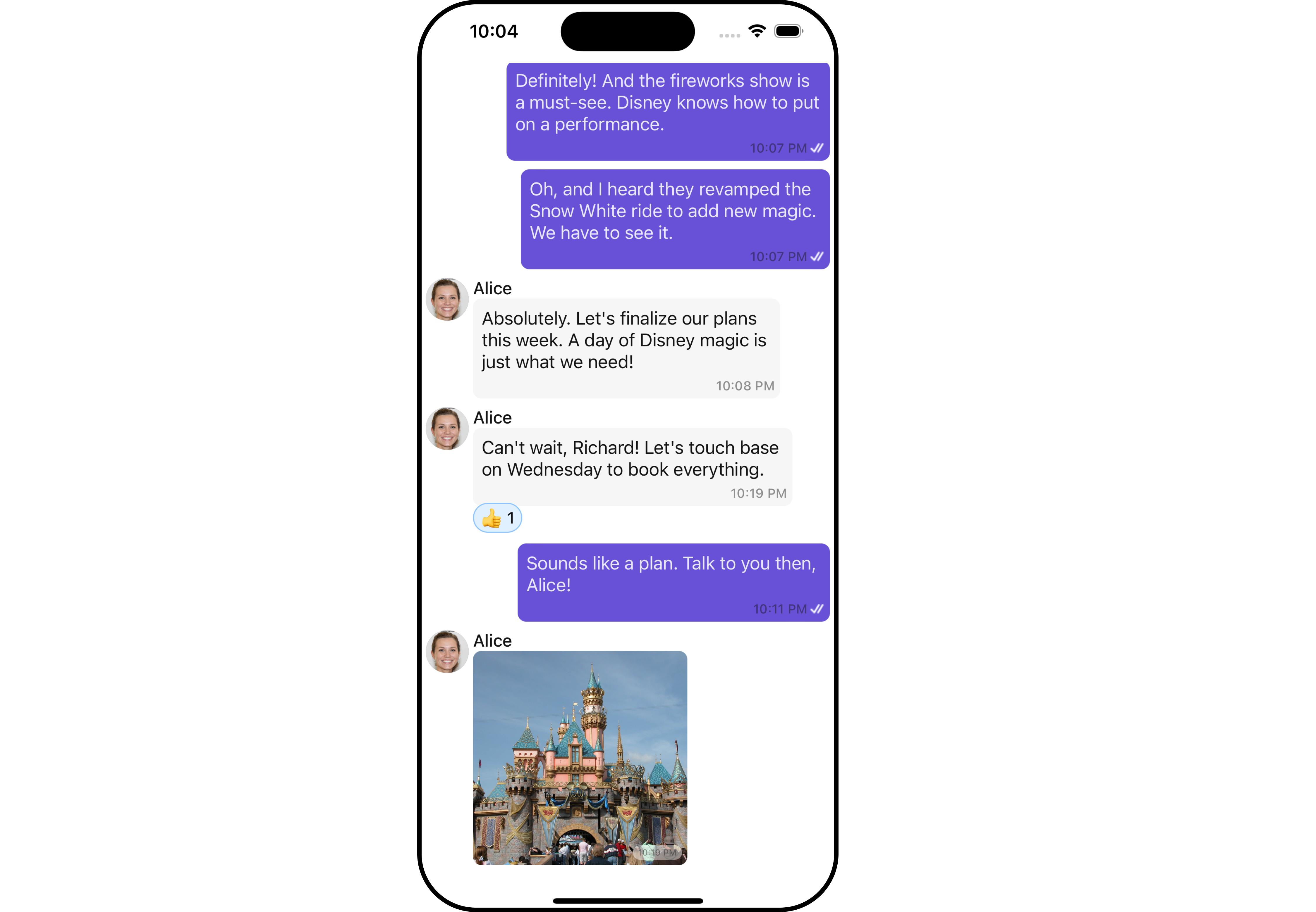
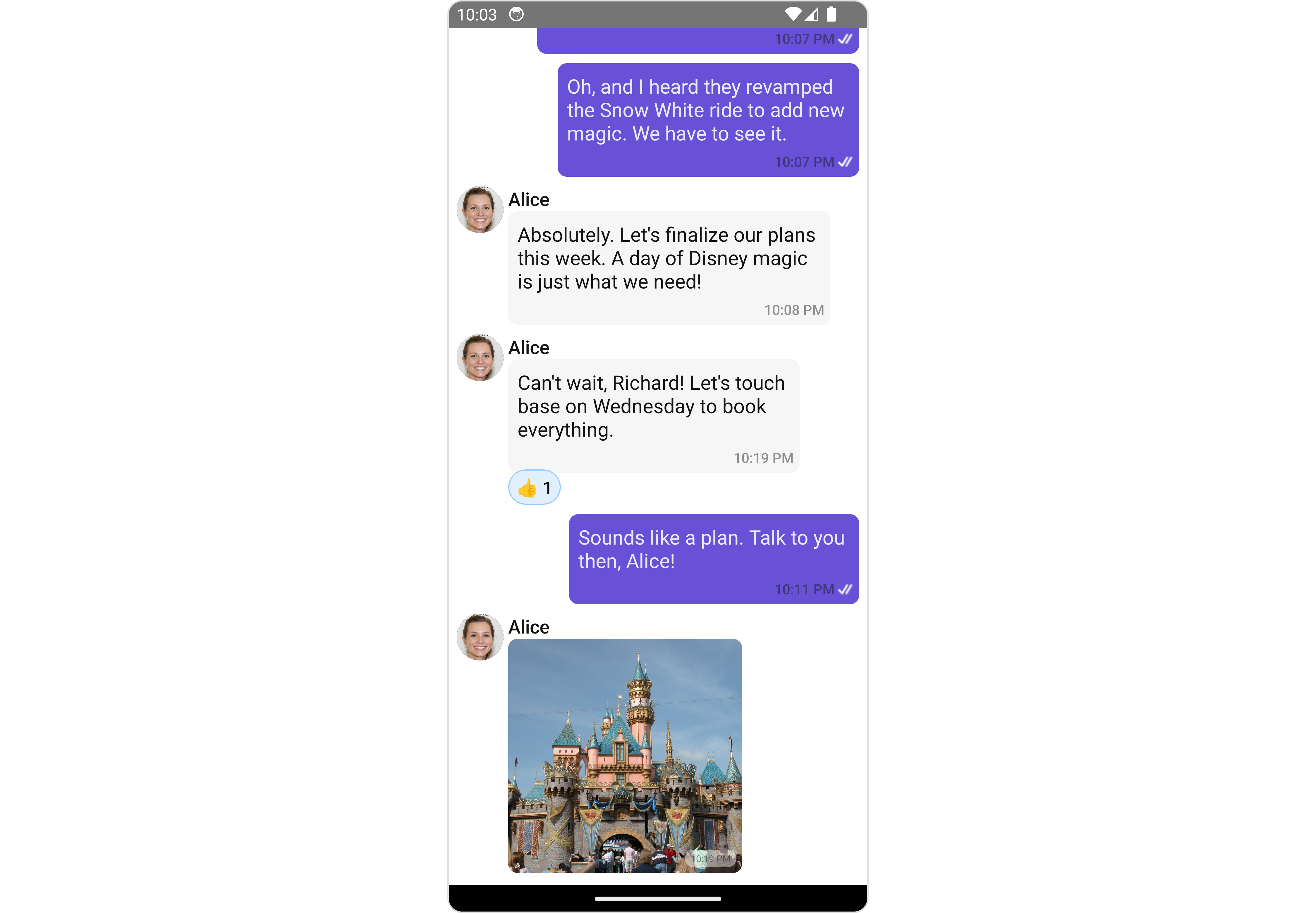
MessageList is a Composite Component that displays a list of messages and effectively manages real-time operations. It includes various types of messages such as Text Messages, Media Messages, Stickers, and more.
MessageList is primarily a list of the base component MessageBubble. The MessageBubble Component is utilized to create different types of chat bubbles depending on the message type.
- iOS
- Android
Usage
Integration
The following code snippet illustrates how you can directly incorporate the MessageList component into your Application.- App.tsx
Actions
Actions dictate how a component functions. They are divided into two types: Predefined and User-defined. You can override either type, allowing you to tailor the behavior of the component to fit your specific needs.1. onThreadRepliesPress
onThreadRepliesPress is triggered when you click on the threaded message bubble. The onThreadRepliesPress action doesn’t have a predefined behavior. You can override this action using the following code snippet.
- App.tsx
2. onError
This action doesn’t change the behavior of the component but rather listens for any errors that occur in the MessageList component.- App.tsx
Filters
You can adjust theMessagesRequestBuilder in the MessageList Component to customize your message list. Numerous options are available to alter the builder to meet your specific needs. For additional details on MessagesRequestBuilder, please visit MessagesRequestBuilder.
In the example below, we are applying a filter to the messages based on a search substring and for a specific user. This means that only messages that contain the search term and are associated with the specified user will be displayed
- App.tsx
infoThe following parameters in messageRequestBuilder will always be altered inside the message list
- UID
- GUID
Events
Events are emitted by aComponent. By using event you can extend existing functionality. Being global events, they can be applied in Multiple Locations and are capable of being Added or Removed.
The list of events emitted by the Message List component is as follows.
Adding
CometChatMessageEvents Listener’s
- JavaScript
Removing Listeners
- JavaScript
Customization
To fit your app’s design requirements, you can customize the appearance of the conversation component. We provide exposed methods that allow you to modify the experience and behavior according to your specific needs.Style
Using Style you can customize the look and feel of the component in your app, These parameters typically control elements such as the color, size, shape, and fonts used within the component.1. MessageList Style
You can set the MessageListStyle to the MessageList Component Component to customize the styling.- App.tsx
2. Avatar Style
To apply customized styles to theAvatar component in the Conversations Component, you can use the following code snippet. For further insights on Avatar Styles refer
- App.tsx
Functionality
These are a set of small functional customizations that allow you to fine-tune the overall experience of the component. With these, you can change text, set custom icons, and toggle the visibility of UI elements.- App.tsx
Below is a list of customizations along with corresponding code snippets
Advanced
For advanced-level customization, you can set custom views to the component. This lets you tailor each aspect of the component to fit your exact needs and application aesthetics. You can create and define your views, layouts, and UI elements and then incorporate those into the component.Templates
CometChatMessageTemplate is a pre-defined structure for creating message views that can be used as a starting point or blueprint for creating message views often known as message bubbles. For more information, you can refer to CometChatMessageTemplate. You can set message Templates to MessageList by using the following code snippet- App.tsx
DateSeperatorPattern
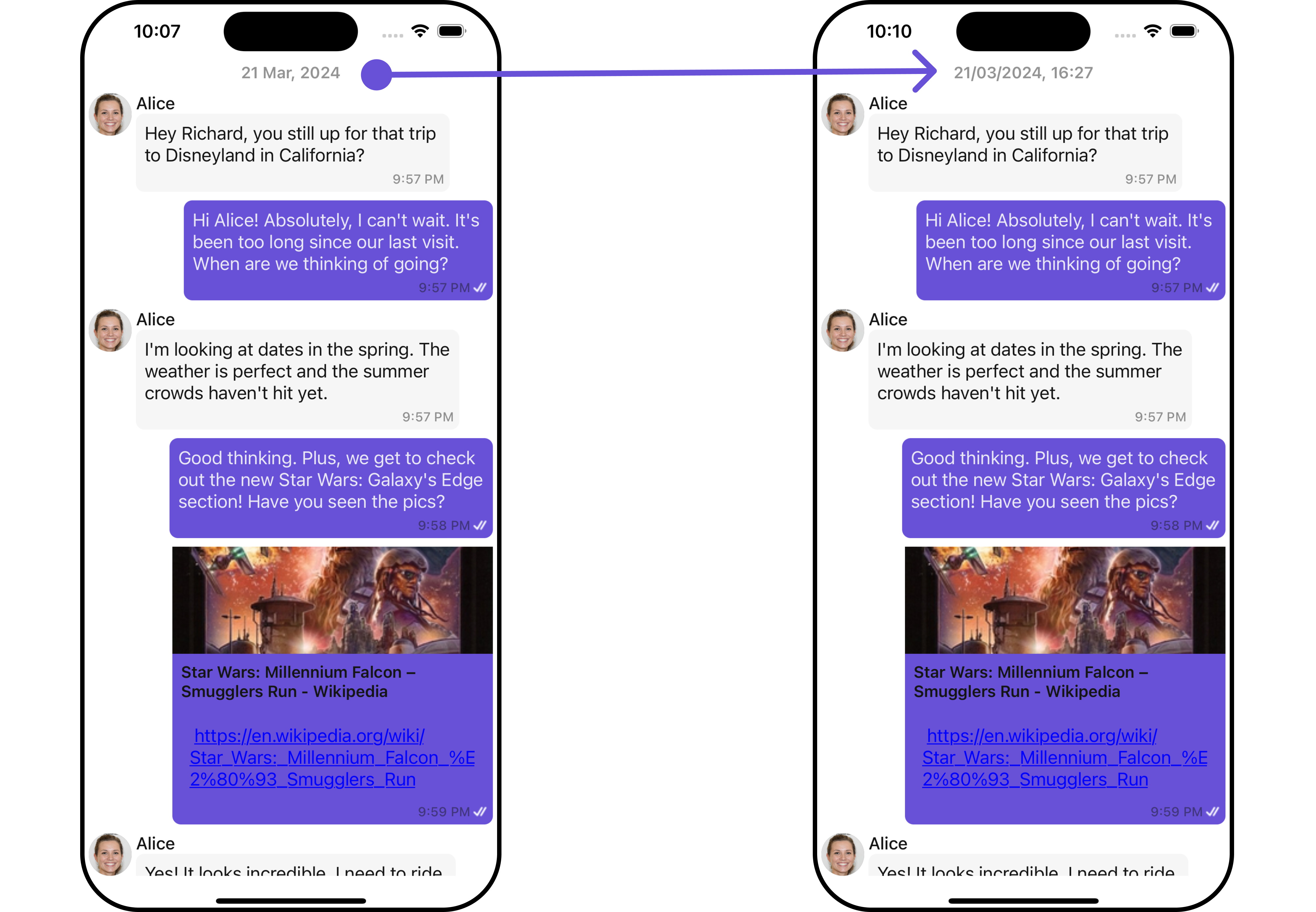
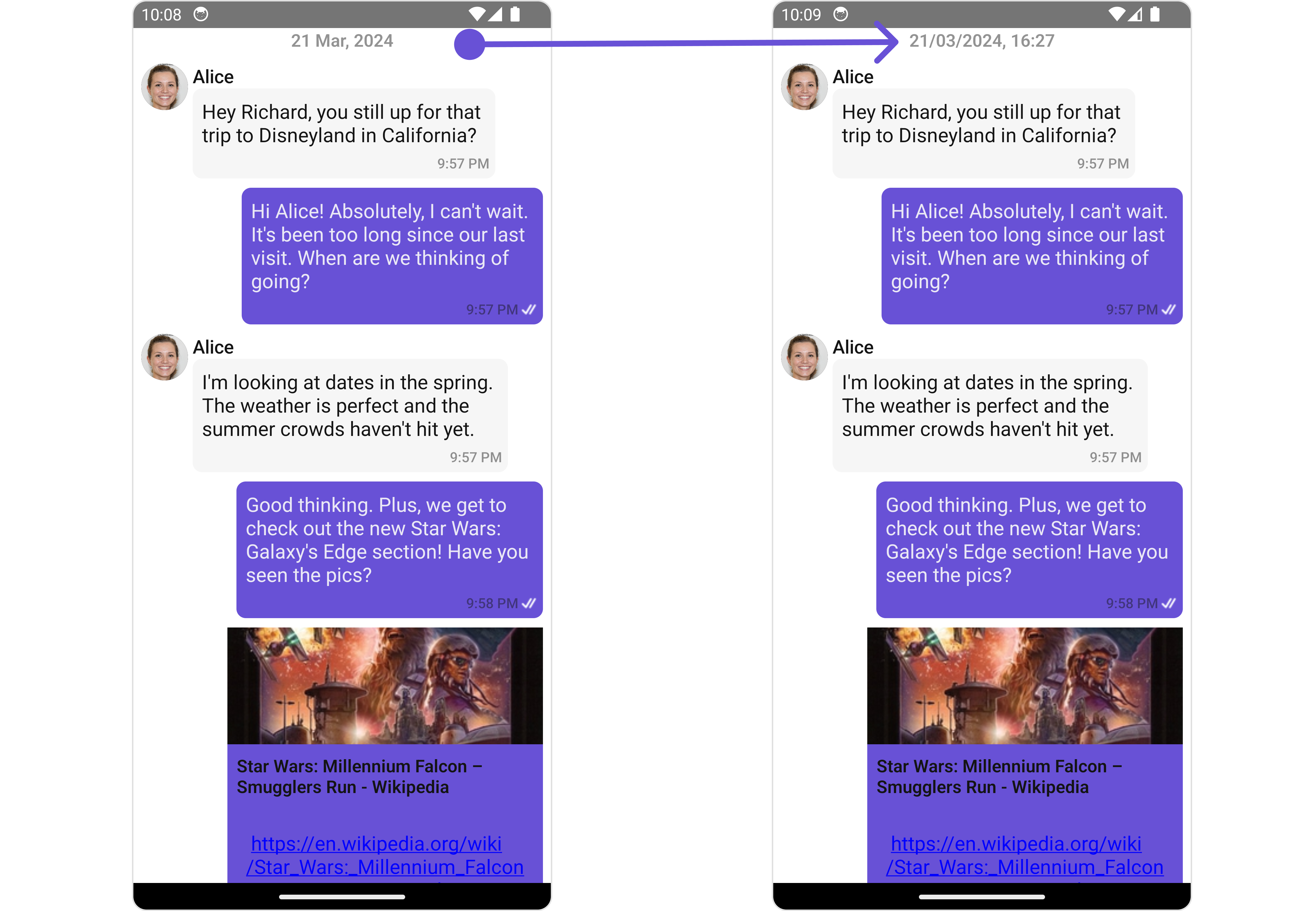
You can customize the date pattern of the message list separator using theDateSeparatorPattern prop. Pass a custom function to use your own pattern.
- App.tsx
- iOS
- Android
DatePattern
You can modify the date pattern to your requirement using thedatePattern prop. Pass a custom function to use your own pattern.
- App.tsx
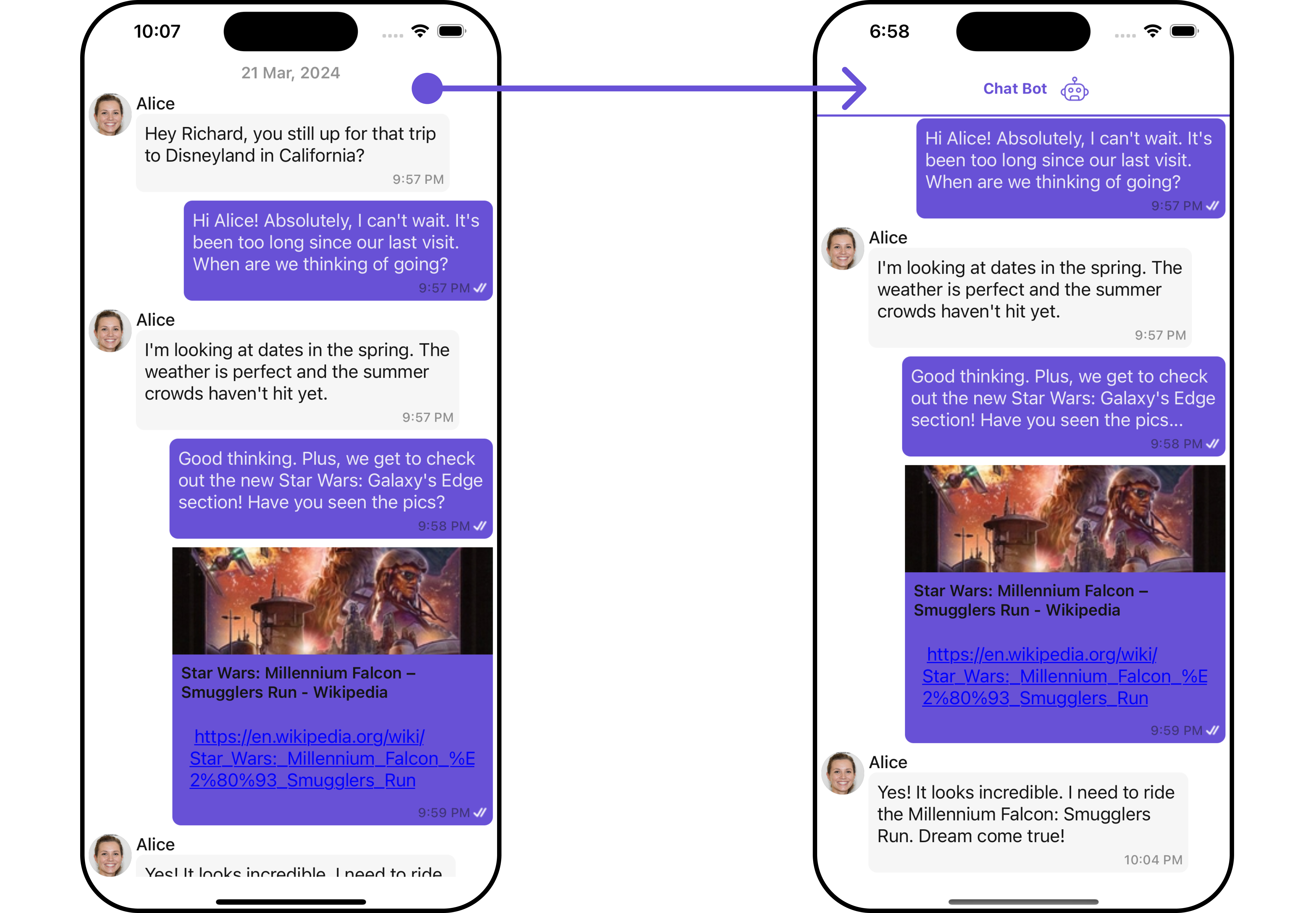
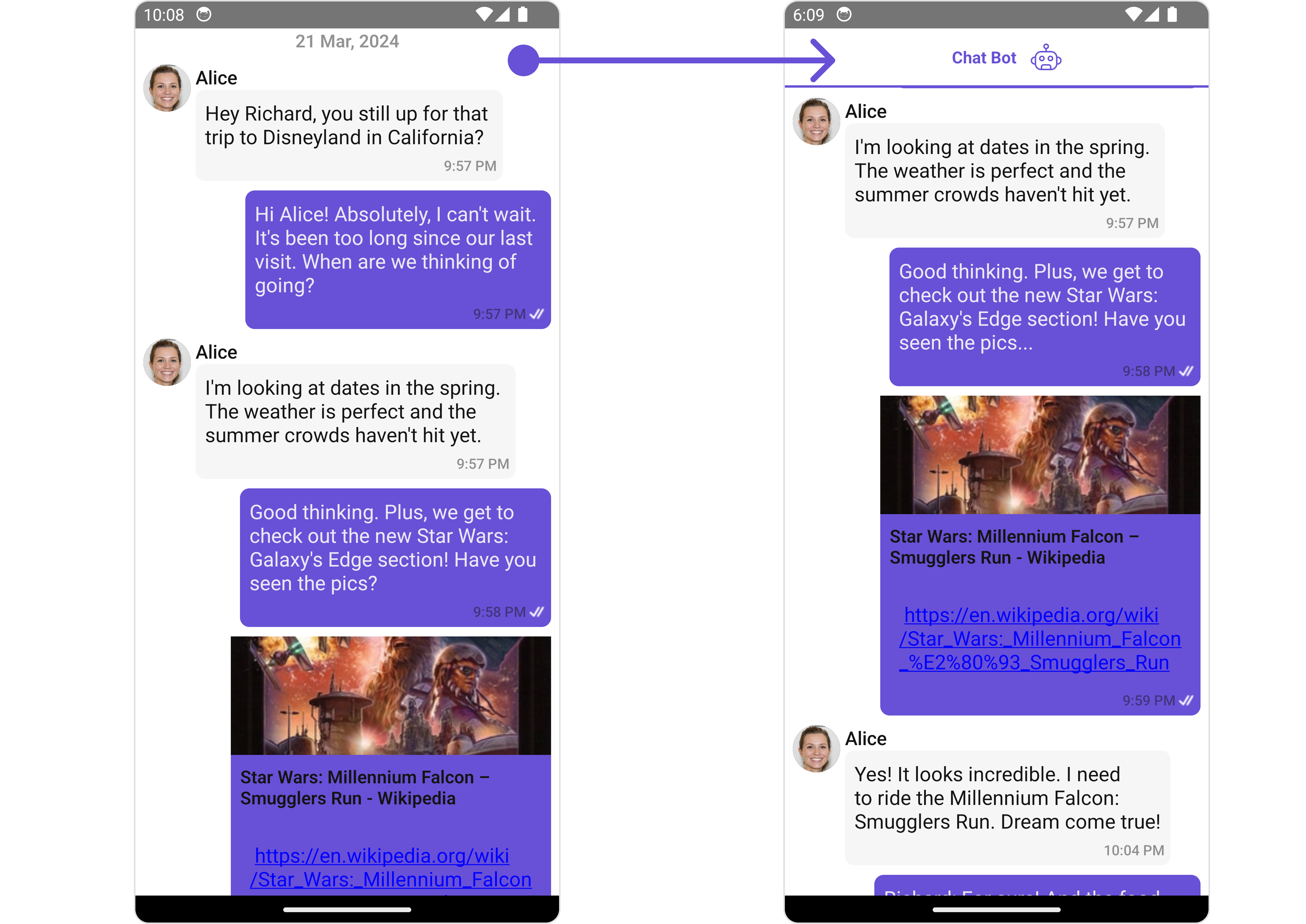
HeaderView
You can set custom headerView to the Message List component using the following method.- App.tsx
- iOS
- Android
FooterView
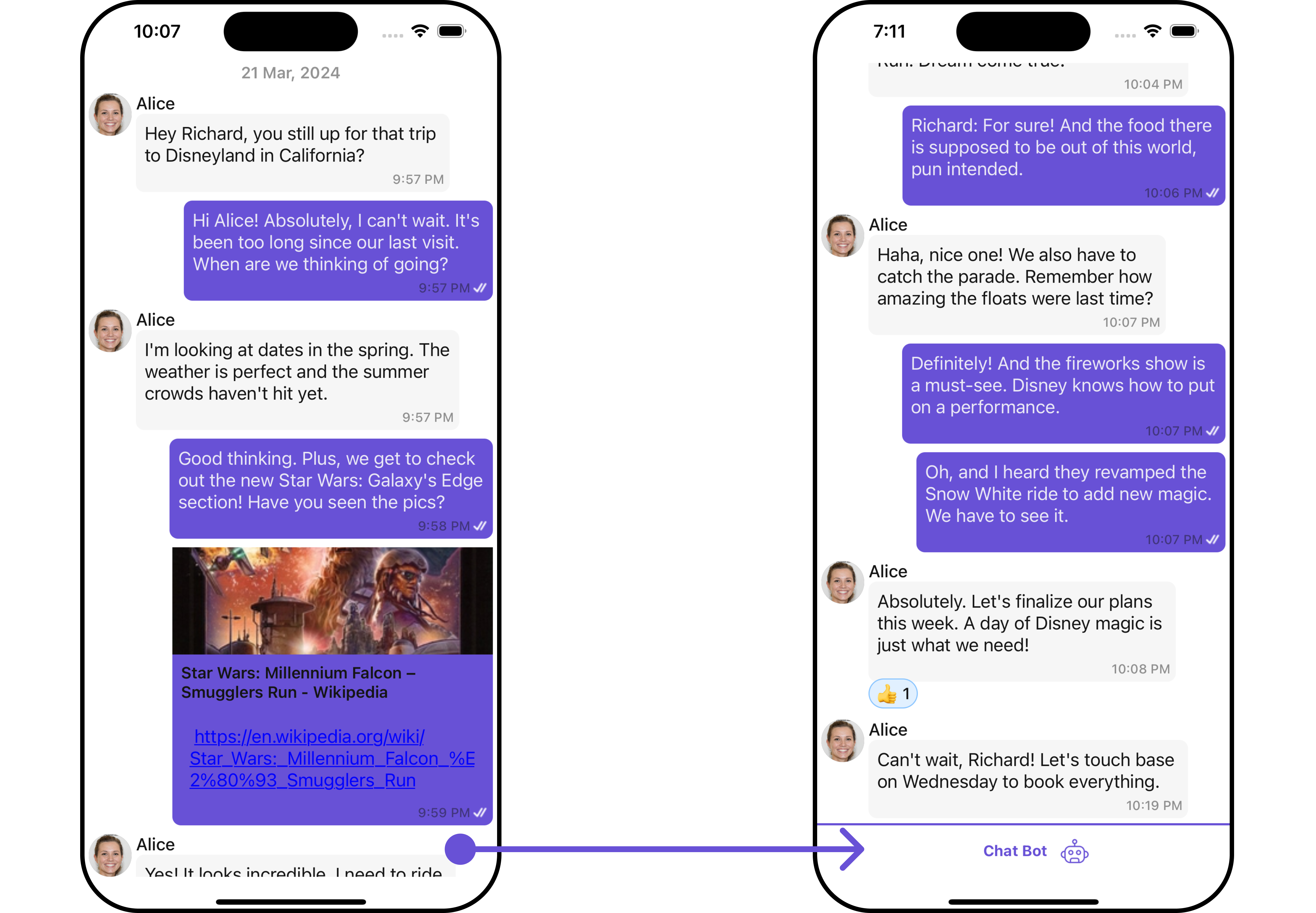
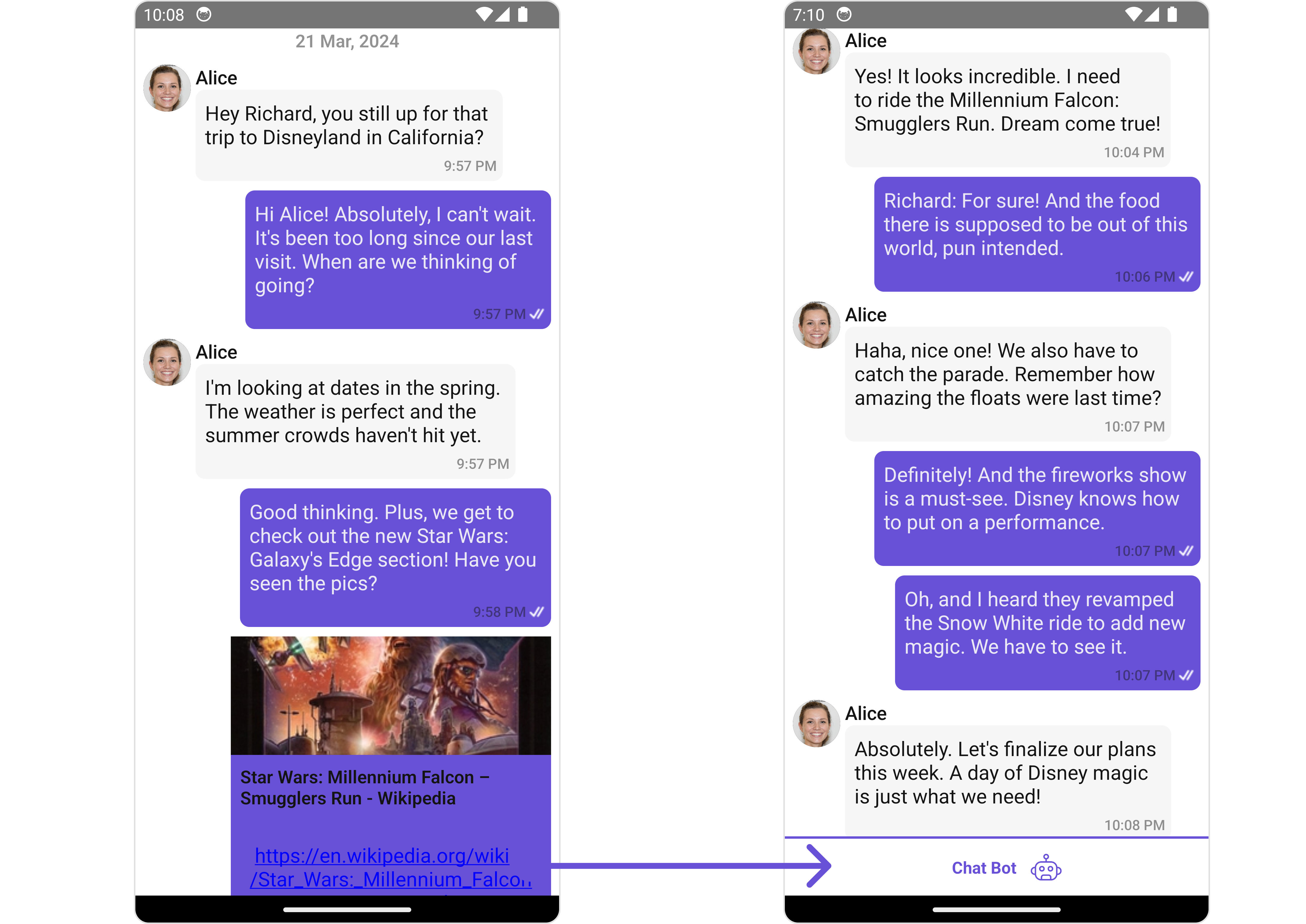
You can set custom footerView to the Message List component using the following method.- App.tsx
- iOS
- Android
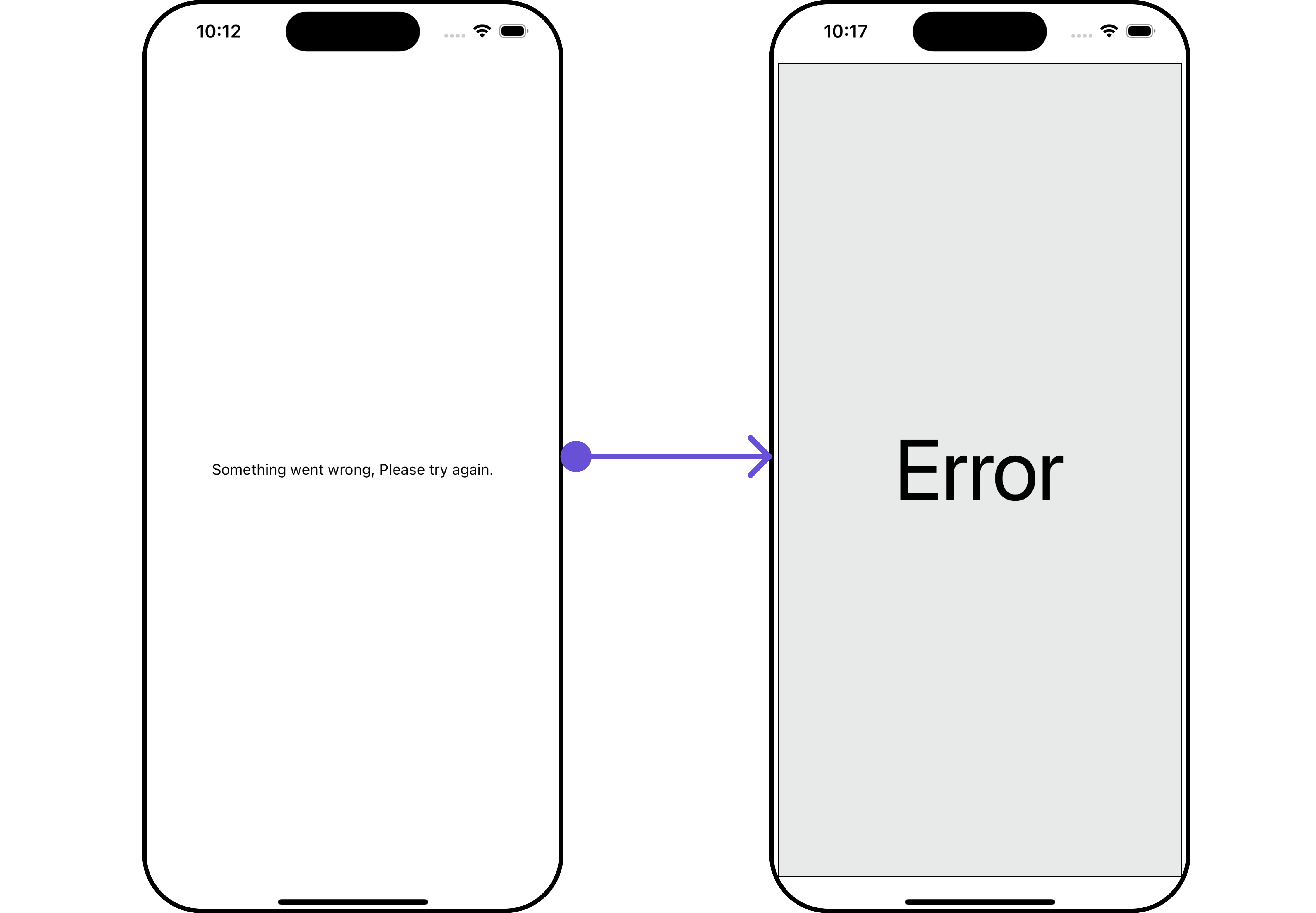
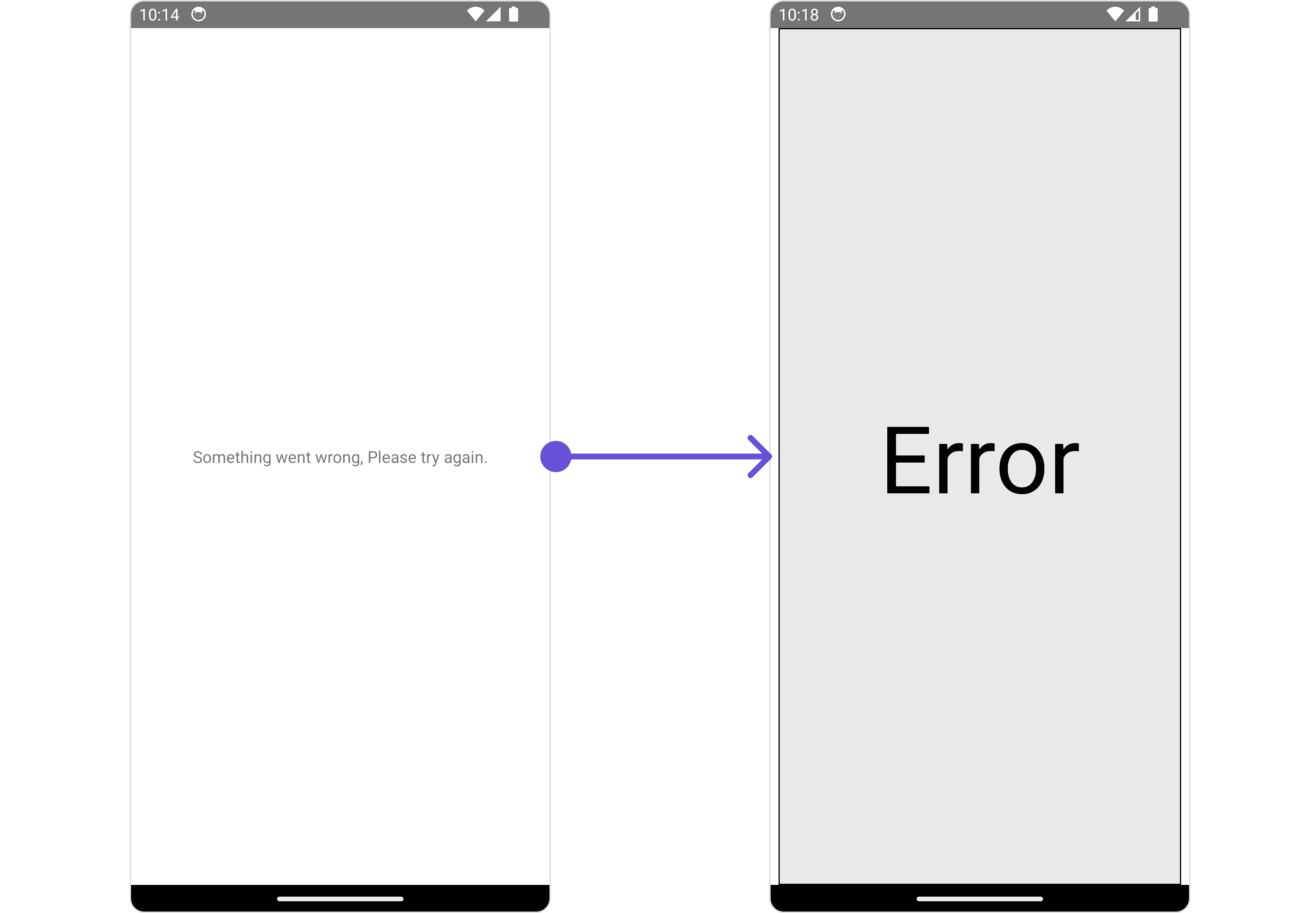
ErrorStateView
You can set a customErrorStateView to match the error view of your app.
- App.tsx
- iOS
- Android
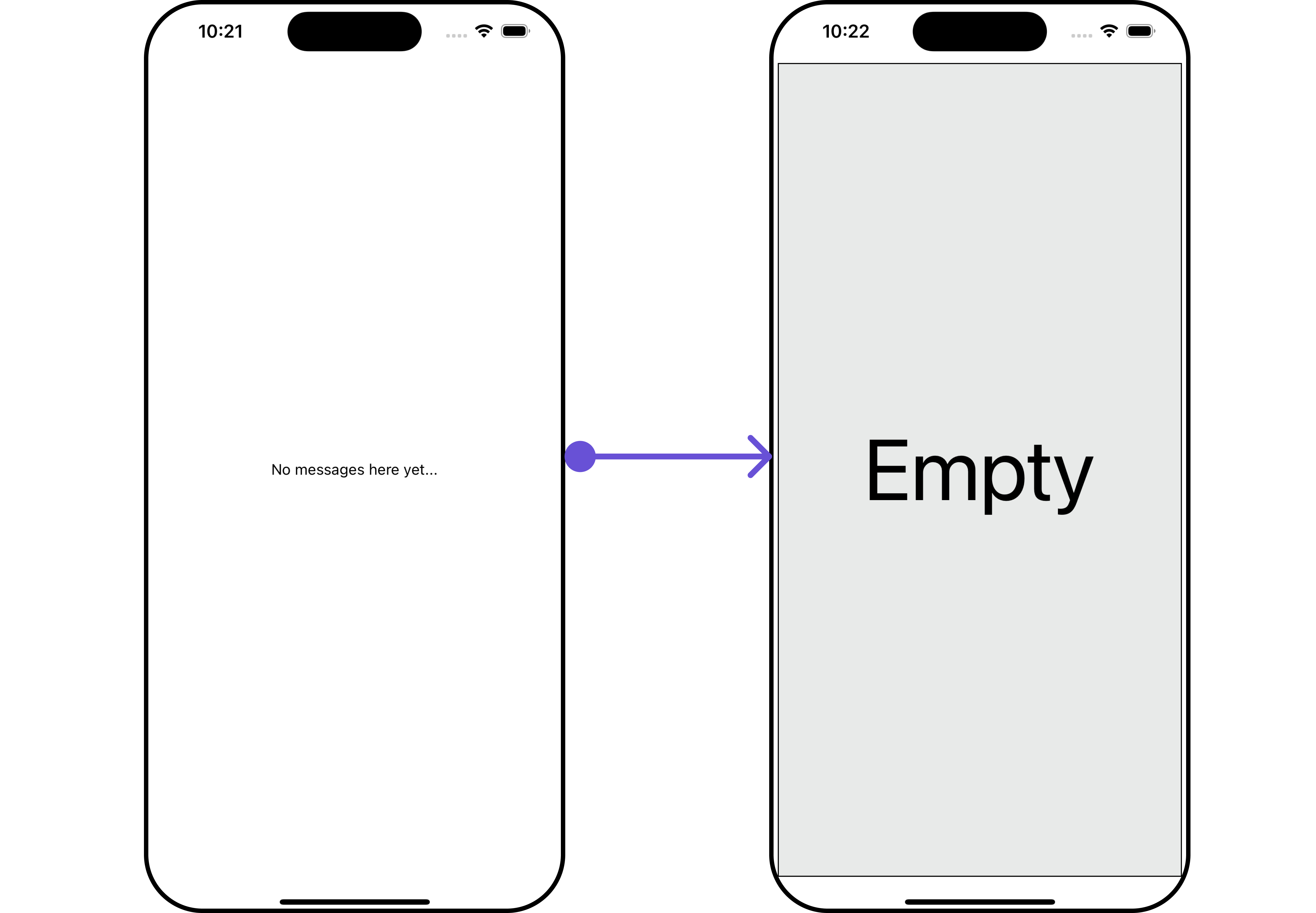
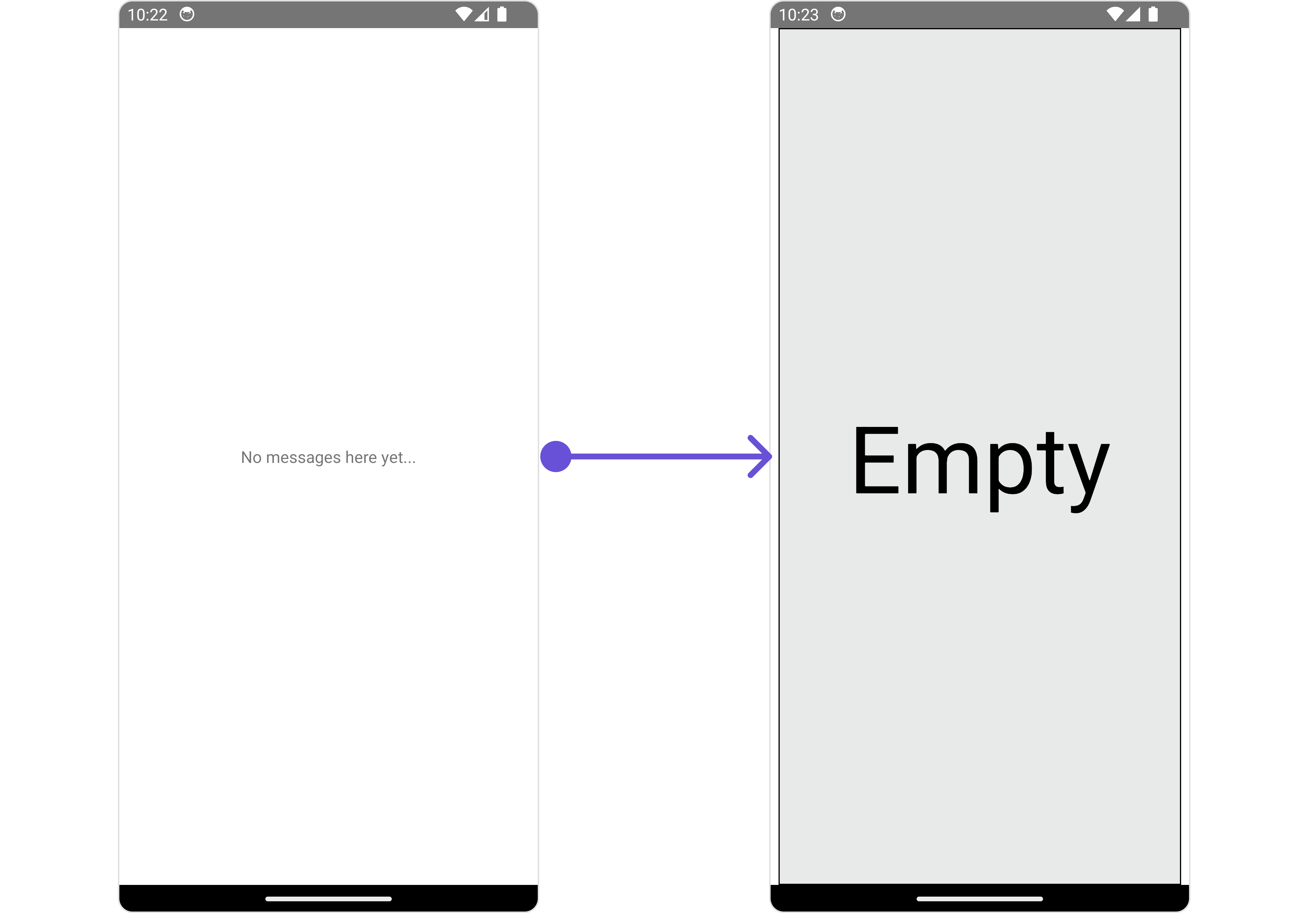
EmptyStateView
TheEmptyStateView method provides the ability to set a custom empty state view in your app. An empty state view is displayed when there are no messages for a particular user.
- App.tsx
- iOS
- Android
TextFormatters
Assigns the list of text formatters. If the provided list is not null, it sets the list. Otherwise, it assigns the default text formatters retrieved from the data source. To configure the existing Mentions look and feel check out CometChatMentionsFormatter- ShortCutFormatter.ts
- App.tsx
Configuration
Configurations offer the ability to customize the properties of each component within a Composite Component.MessageInformation
From the MessageList, you can navigate to the MesssageInformation component as shown in the image.- iOS
- Android
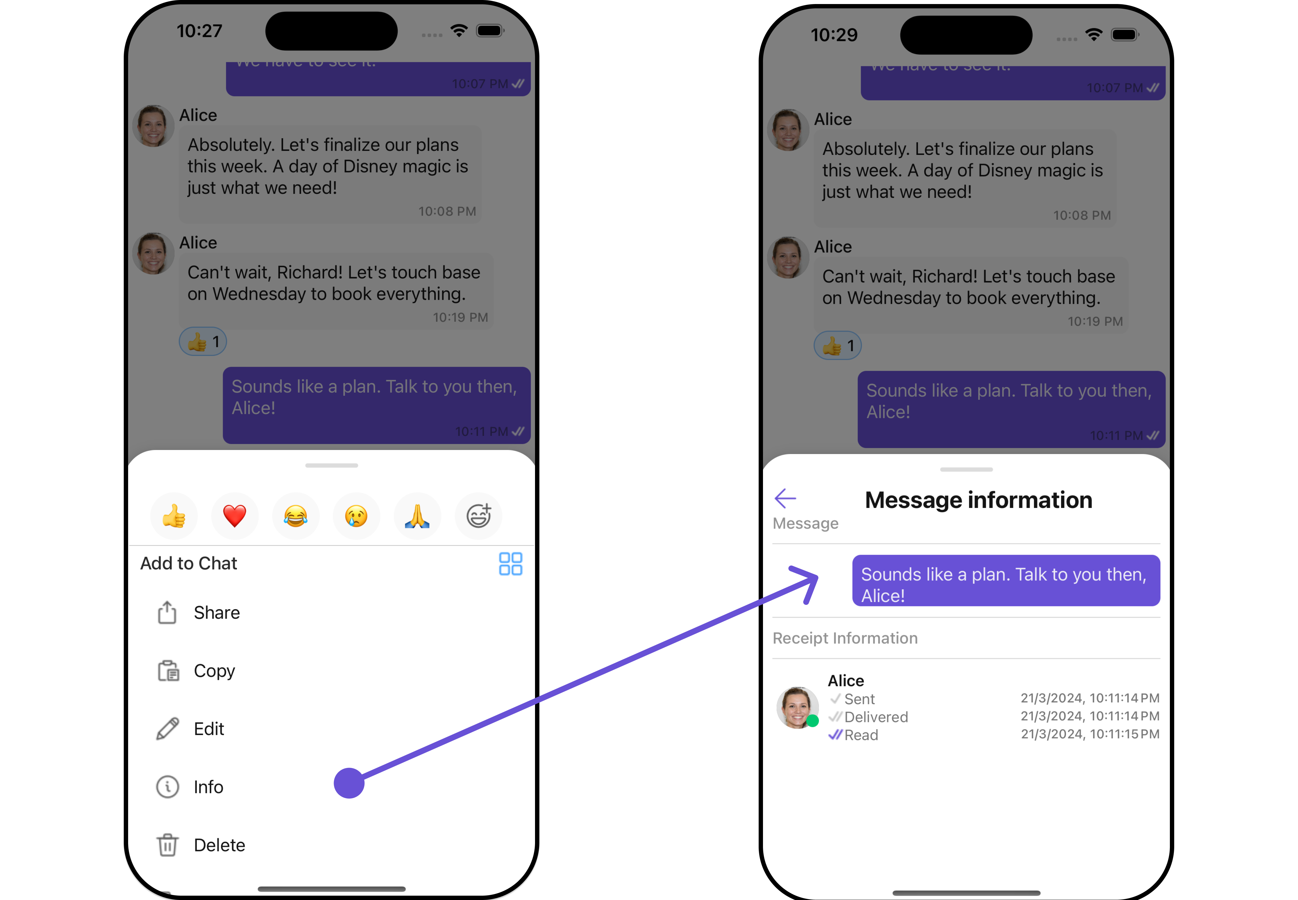
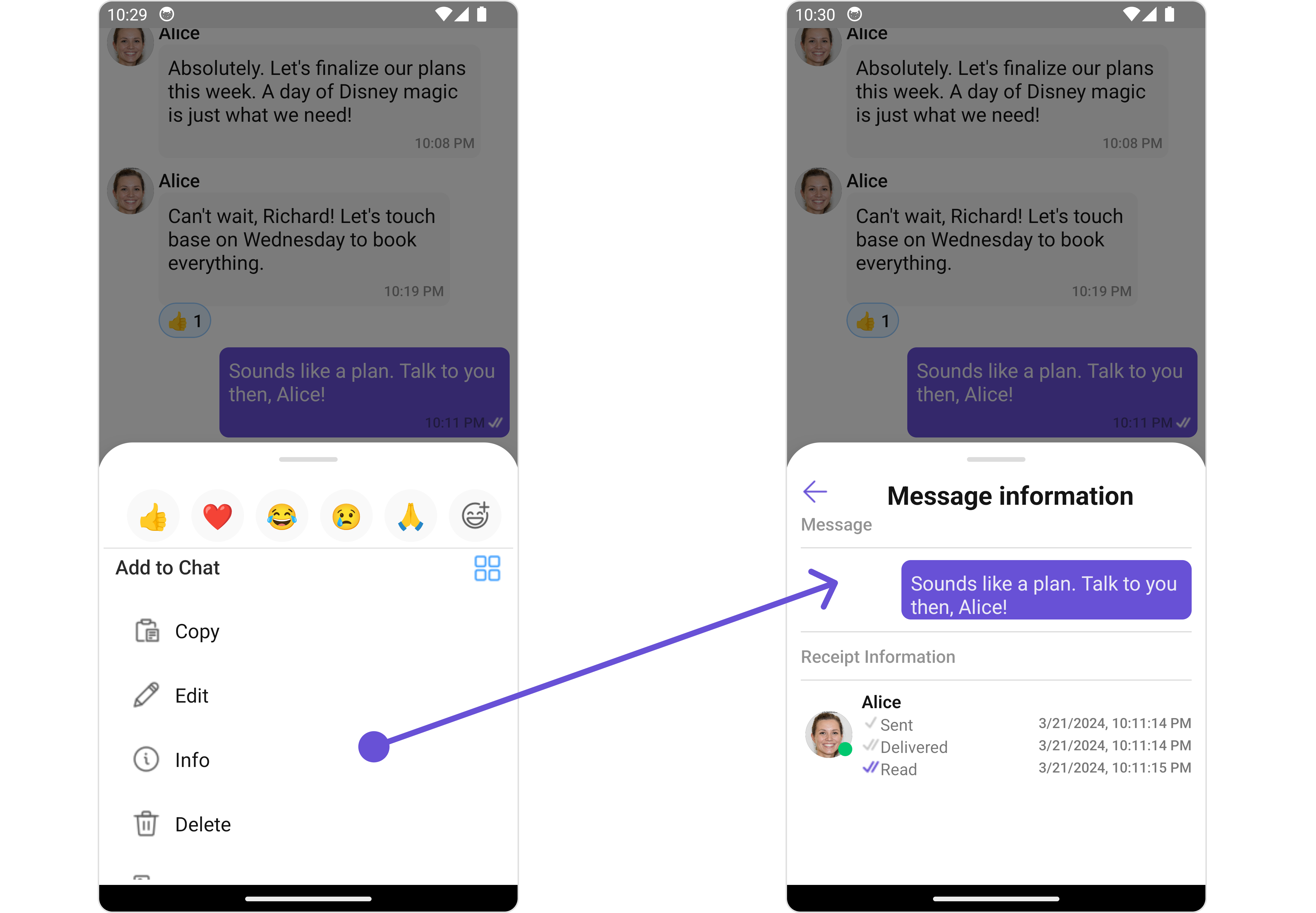
MessageInformationConfiguration object.
- App.tsx
MessageInformationConfiguration indeed provides access to all the Action, Filters, Styles, Functionality, and Advanced properties of the MesssageInformation component.
Please note that the 🛑 symbol are not accessible within the Configuration Object.
Example
- iOS
- Android
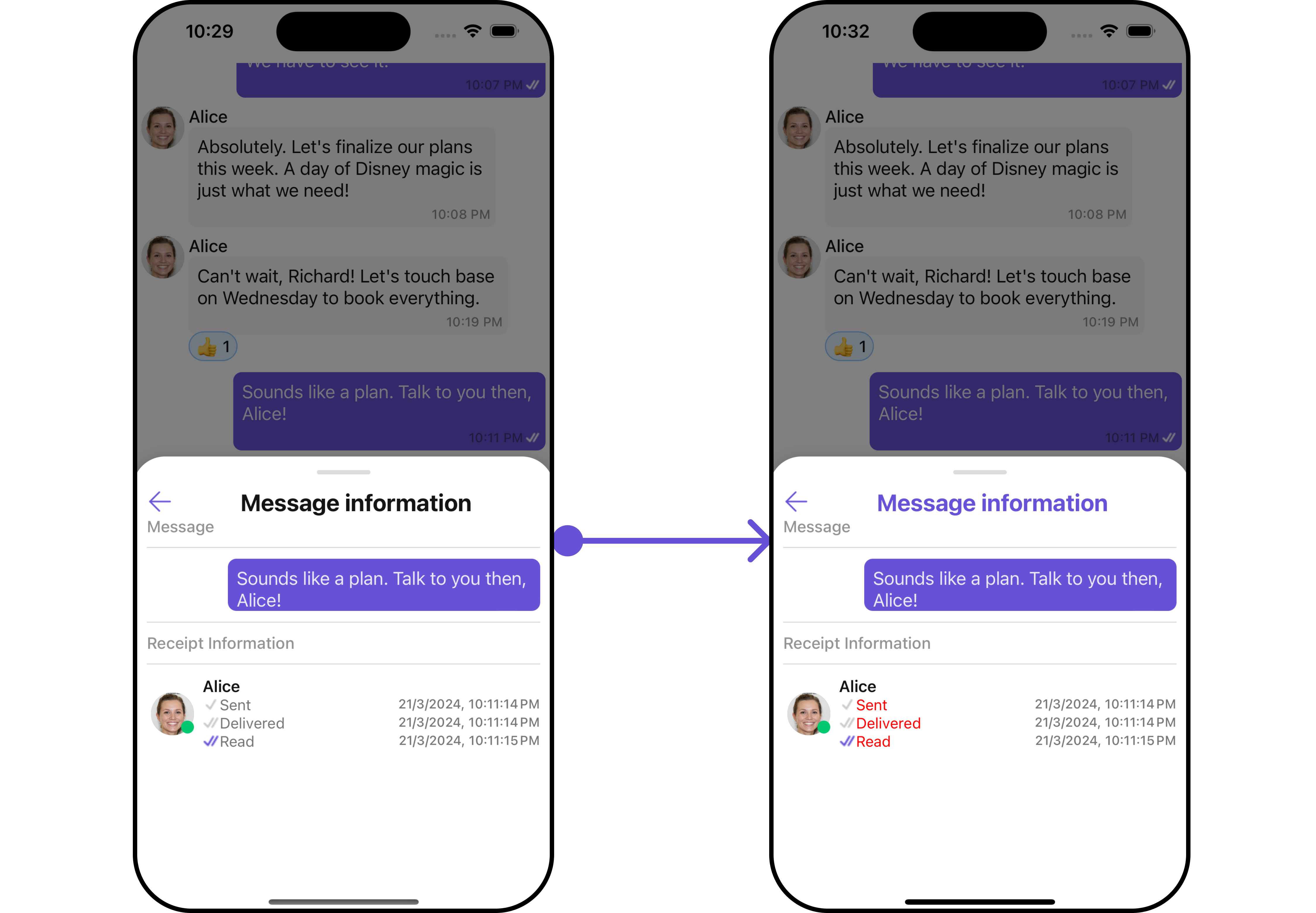
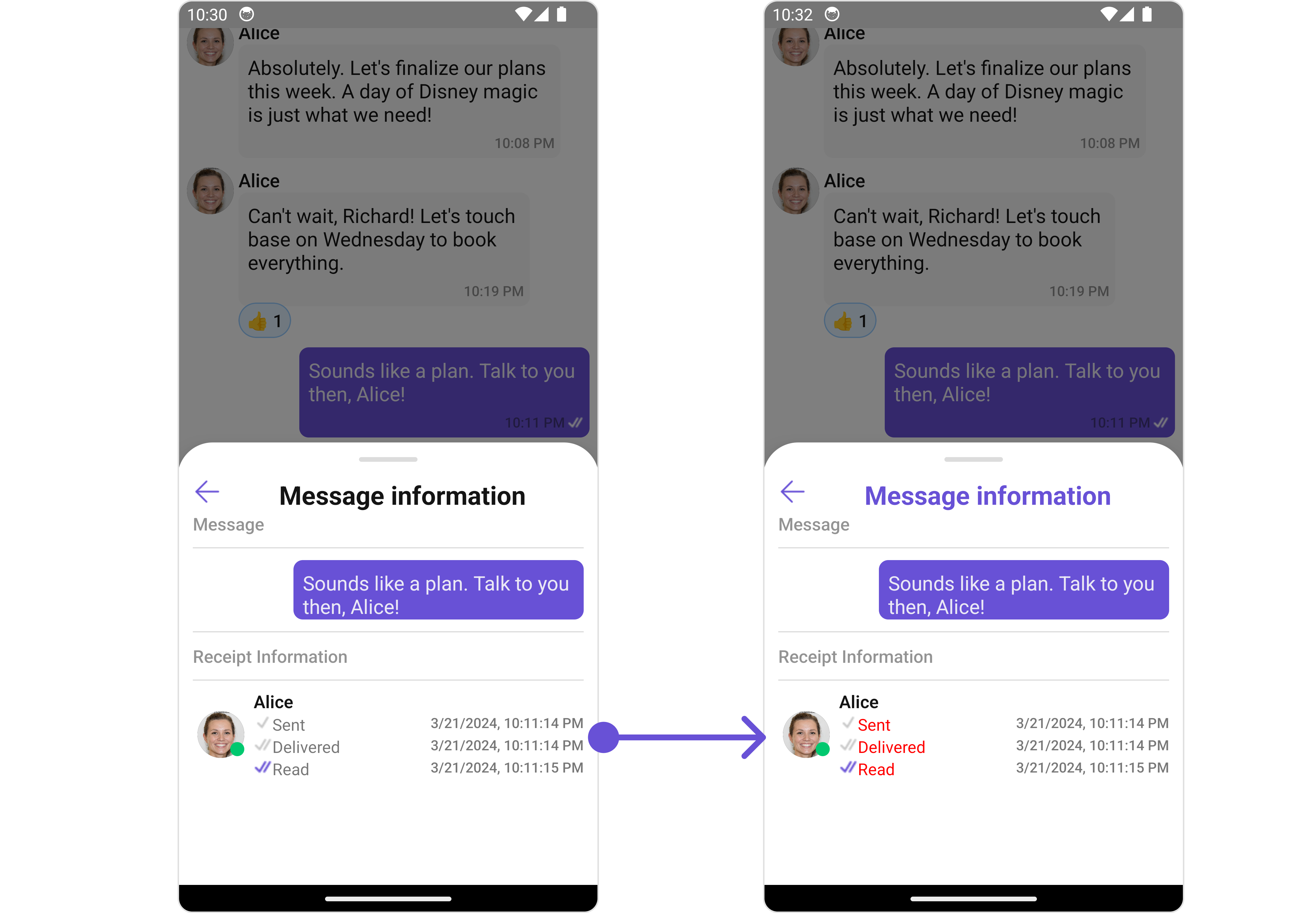
MessageInformationConfiguration.