

AI Agent Component Spec
AI Agent Component Spec
| Field | Value |
|---|---|
| Goal | Customize UI Kit appearance (colors, fonts, spacing) via Flutter ThemeExtensions |
| Where | ThemeData.extensions in MaterialApp |
| Color | CometChatColorPalette — primary, neutral, alert, text, icon, background colors |
| Typography | CometChatTypography — font sizes, weights, text styles |
| Spacing | CometChatSpacing — padding, margin, border radius |
| Dark mode | Use separate CometChatColorPalette for dark theme |
| Source | GitHub |
ThemeExtension system.
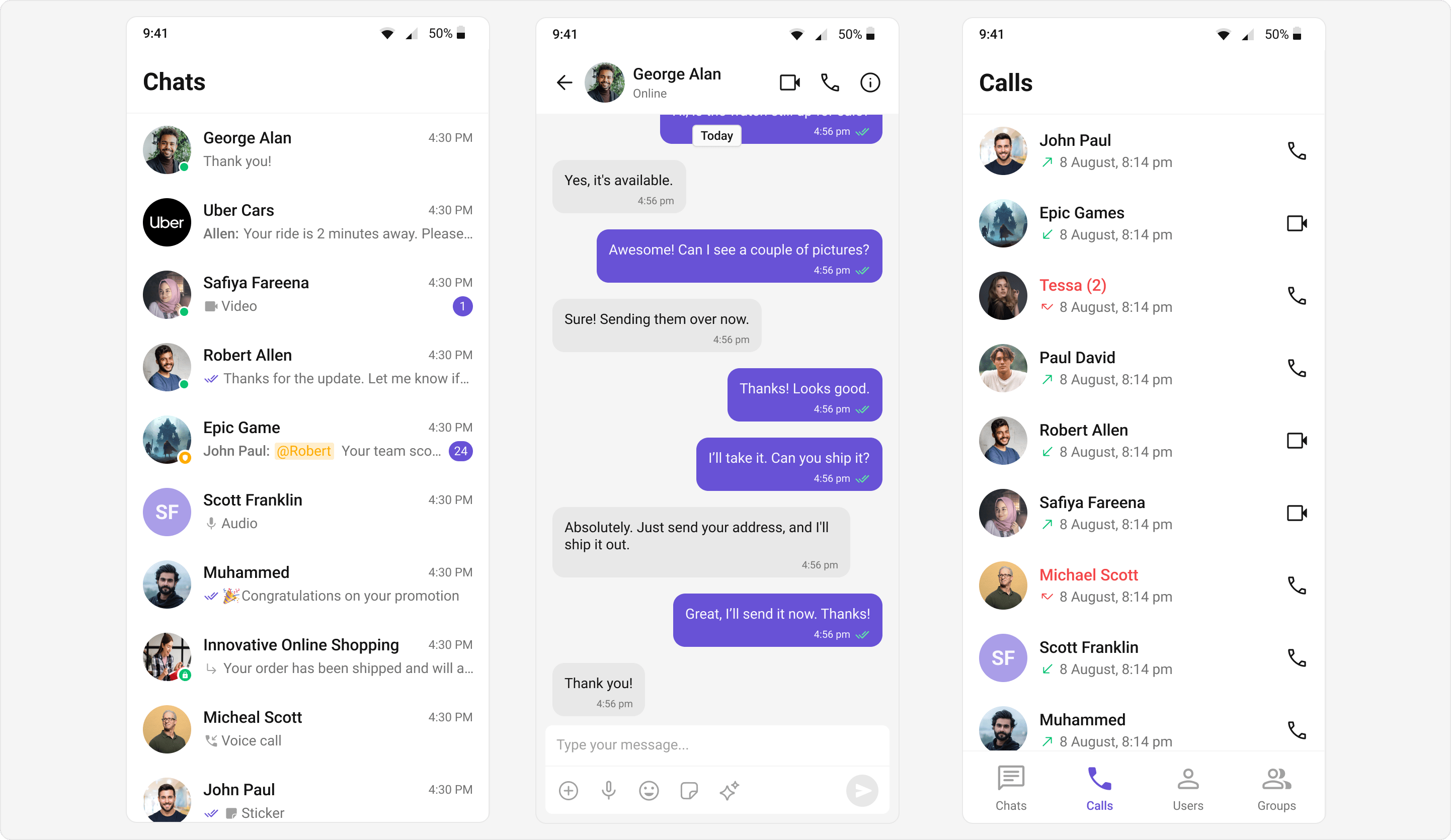
Core Components
| Component | Class | Purpose |
|---|---|---|
| Color | CometChatColorPalette | Primary, neutral, alert, text, icon, background colors |
| Typography | CometChatTypography | Font sizes, weights, text styles |
| Spacing | CometChatSpacing | Padding, margin, border radius |
Typography Tokens
| Token | Purpose |
|---|---|
heading1 - heading4 | Heading text styles |
body | Body text |
caption1, caption2 | Caption text |
button | Button text |
link | Link text |
title | Title text |
Spacing Tokens
| Token | Default Value |
|---|---|
spacing - spacing20 | 2px - 80px (increments of 4) |
padding - padding10 | Derived from spacing |
margin - margin20 | Derived from spacing |
radius - radius6, radiusMax | Border radius values |
Basic Usage
Override theme properties in yourMaterialApp:
- Dart
main.dart
Light and Dark Themes
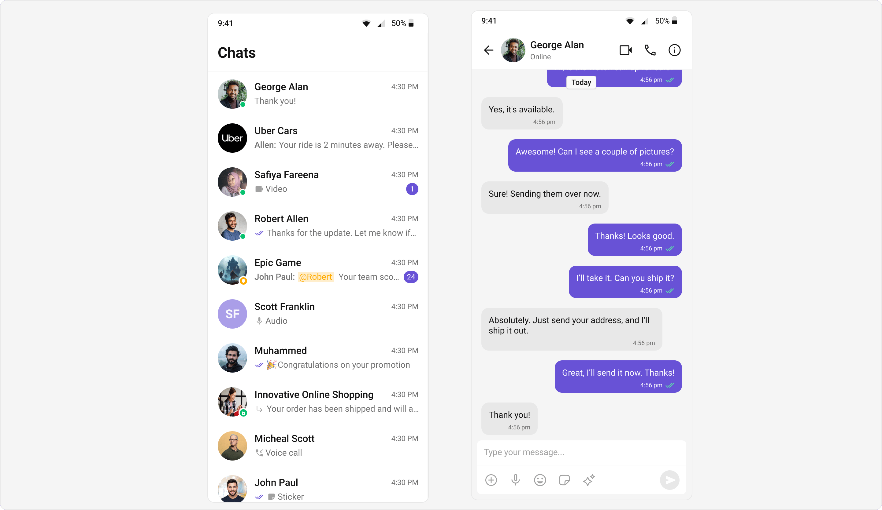
- Light Theme
- Dark Theme
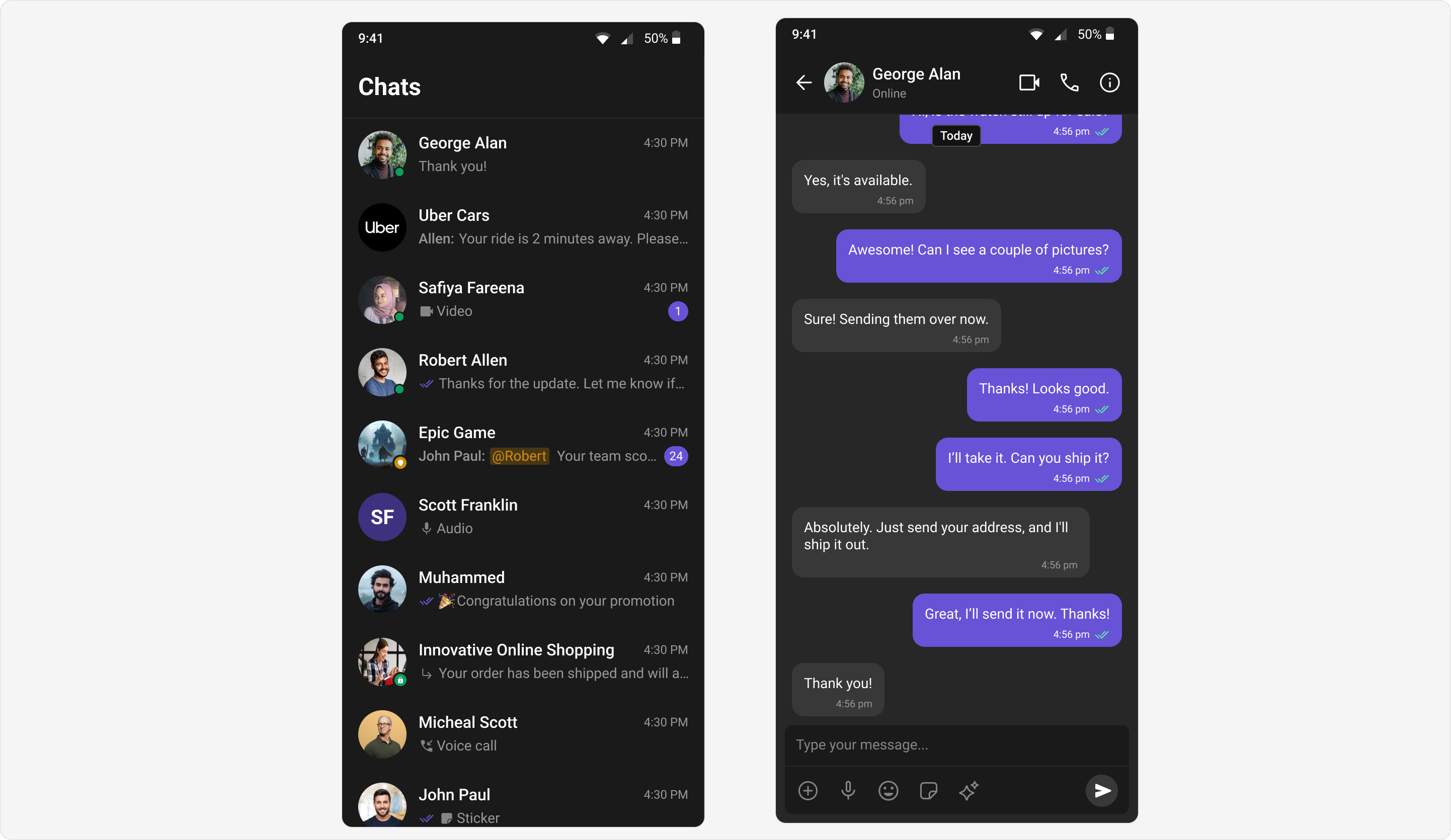
Custom Brand Colors
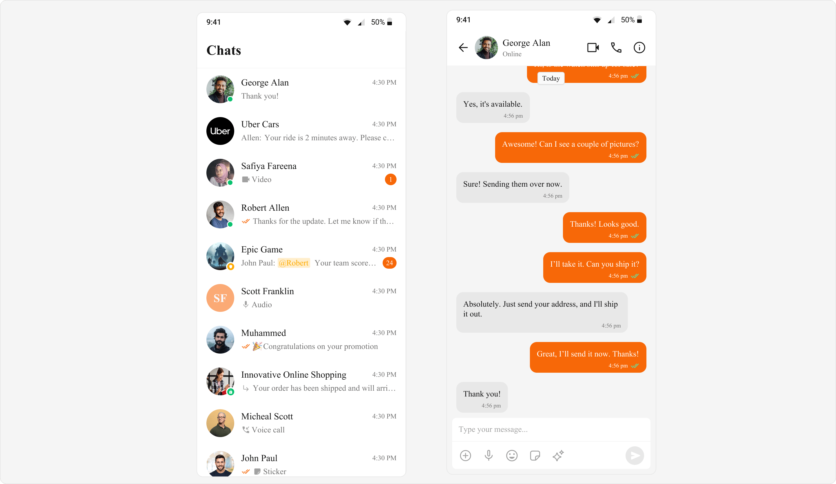
- Dart
Next Steps
Color Resources
Full list of color tokens
Component Styling
Style individual components
Message Bubbles
Customize message bubbles
Localization
Multi-language support