

AI Agent Component Spec
AI Agent Component Spec
Where It Fits
CometChatConversations is a sidebar list widget. It renders recent conversations and emits the selected Conversation via onItemTap. Wire it to CometChatMessageHeader, CometChatMessageList, and CometChatMessageComposer to build a standard two-panel chat layout.
- Dart
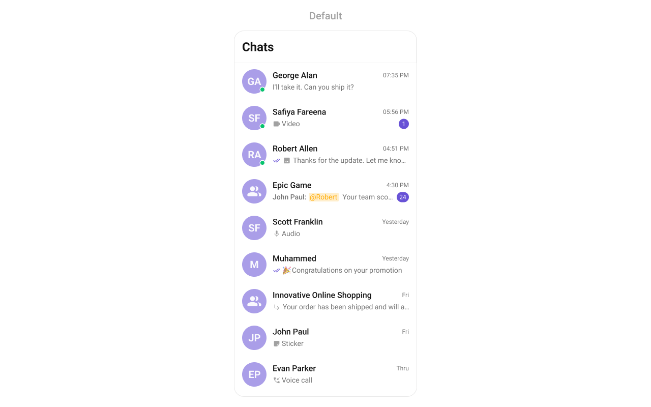
Minimal Render
- Dart
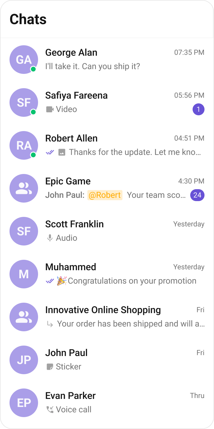
Navigator.push:
Filtering Conversations
Pass aConversationsRequestBuilder to conversationsRequestBuilder. Pass the builder instance — not the result of .build().
- Dart
Filter Recipes
Default page size is 30. The component uses infinite scroll — the next page loads as the user scrolls to the bottom.
ConversationsRequestBuilder Properties
Refer to ConversationsRequestBuilder for the full builder API.
Actions and Events
Callback Props
onItemTap
Fires when a conversation row is tapped. Primary navigation hook — set the active conversation and render the message view.- Dart
onItemLongPress
Fires when a conversation row is long-pressed. Useful for showing context menus or custom actions.- Dart
onSelection
Fires when conversations are selected in multi-select mode. RequiresselectionMode to be set.
- Dart
onError
Fires on internal errors (network failure, auth issue, SDK exception).- Dart
onBack
Fires when the back button is pressed.- Dart
onLoad
Fires when the conversation list is successfully loaded.- Dart
onEmpty
Fires when the conversation list is empty.- Dart
Global UI Events
CometChatConversationEvents emits events subscribable from anywhere in the application. Add a listener in initState and remove it in dispose.
When to use: sync external UI with conversation state changes. For example, update an unread count badge in a tab bar when a conversation is deleted.
- Dart
SDK Events (Real-Time, Automatic)
The component listens to these SDK events internally. No manual attachment needed unless additional side effects are required.
Automatic: new messages, typing indicators, receipts, user presence, group membership changes.
Custom View Slots
Each slot replaces a section of the default UI. Slots that accept a conversation parameter receive theConversation object for that row.
listItemView
Replace the entire list item row.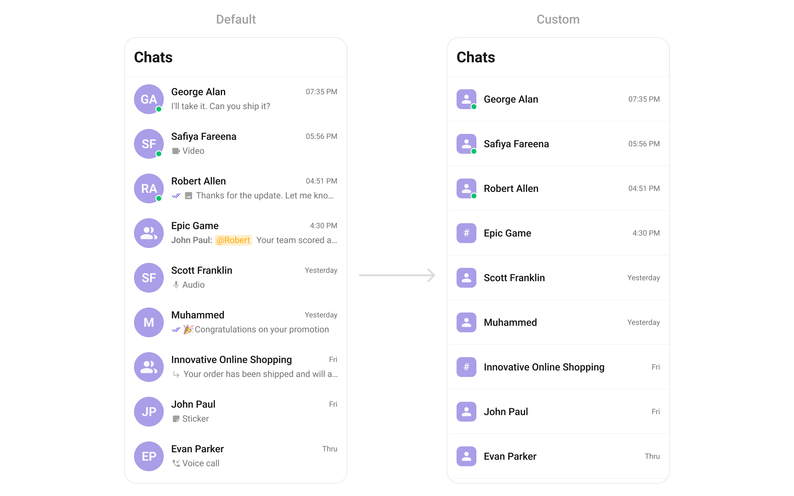
- Dart
- Dart
leadingView
Replace the avatar / left section. Typing-aware avatar example.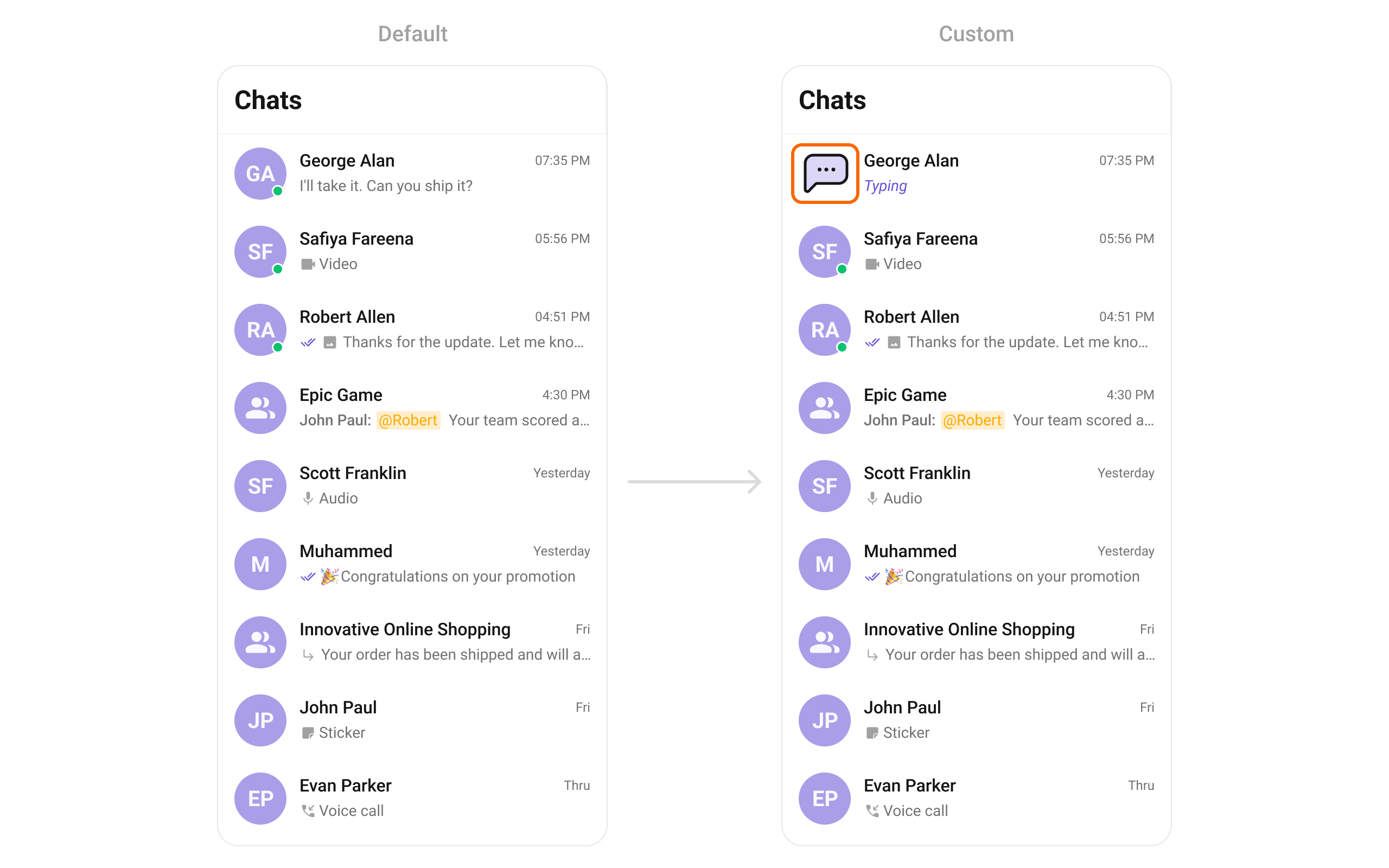
- Dart
titleView
Replace the name / title text. Inline user status example.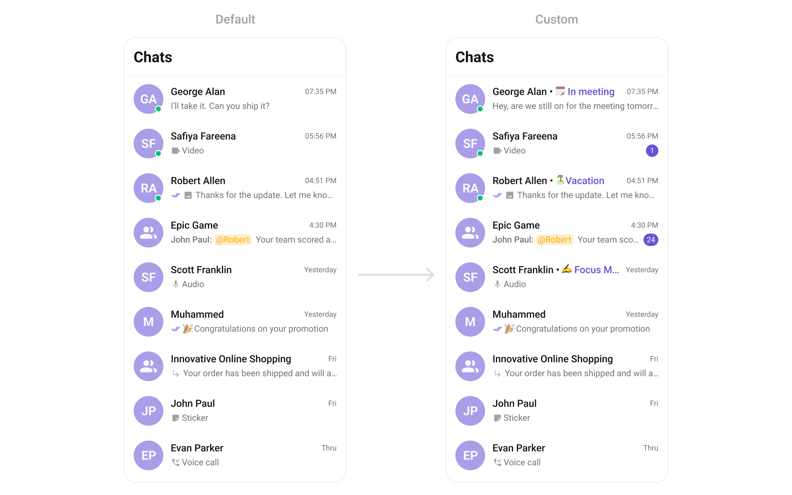
- Dart
subtitleView
Replace the last message preview text.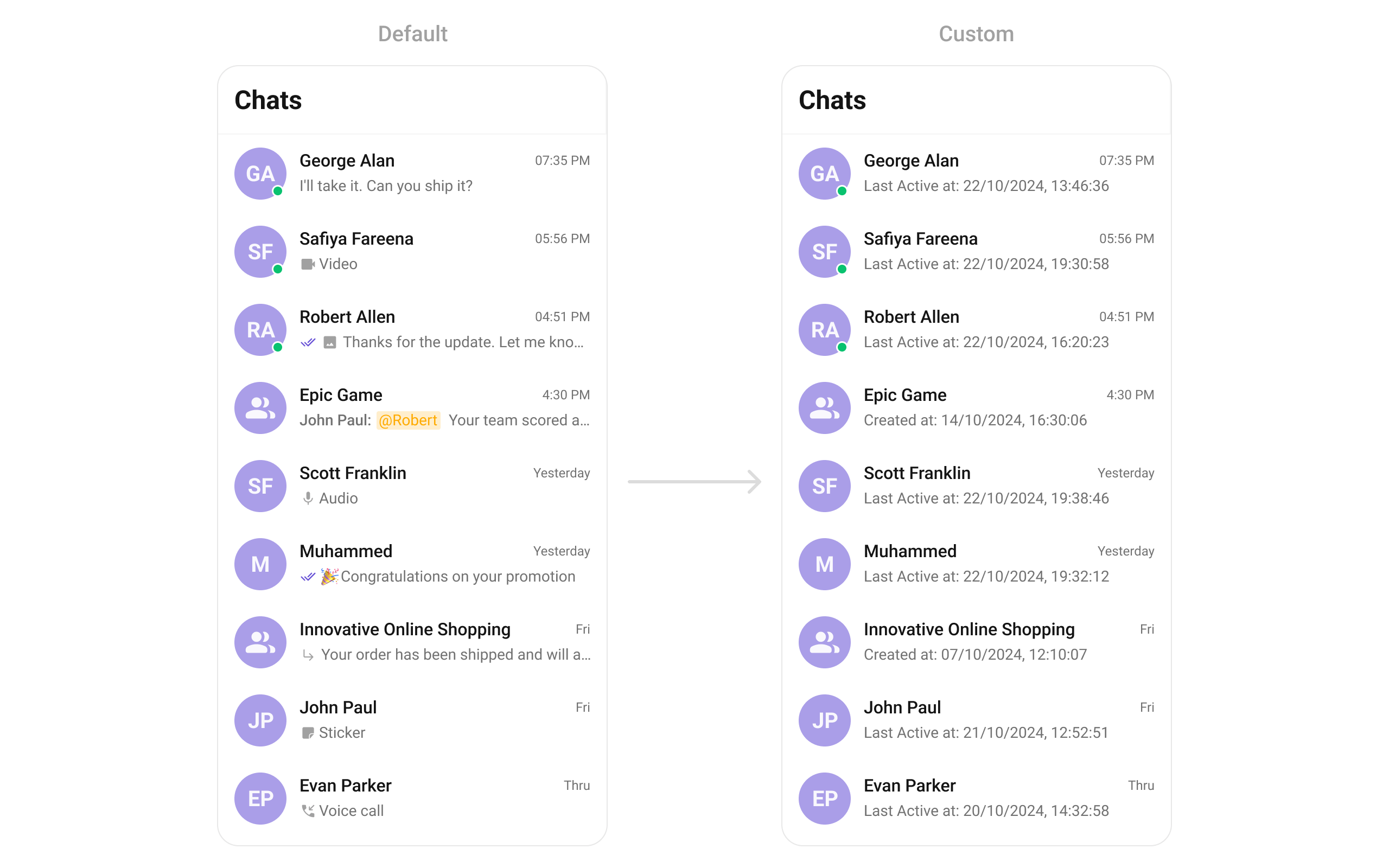
- Dart
trailingView
Replace the timestamp / badge / right section. Relative time badge example.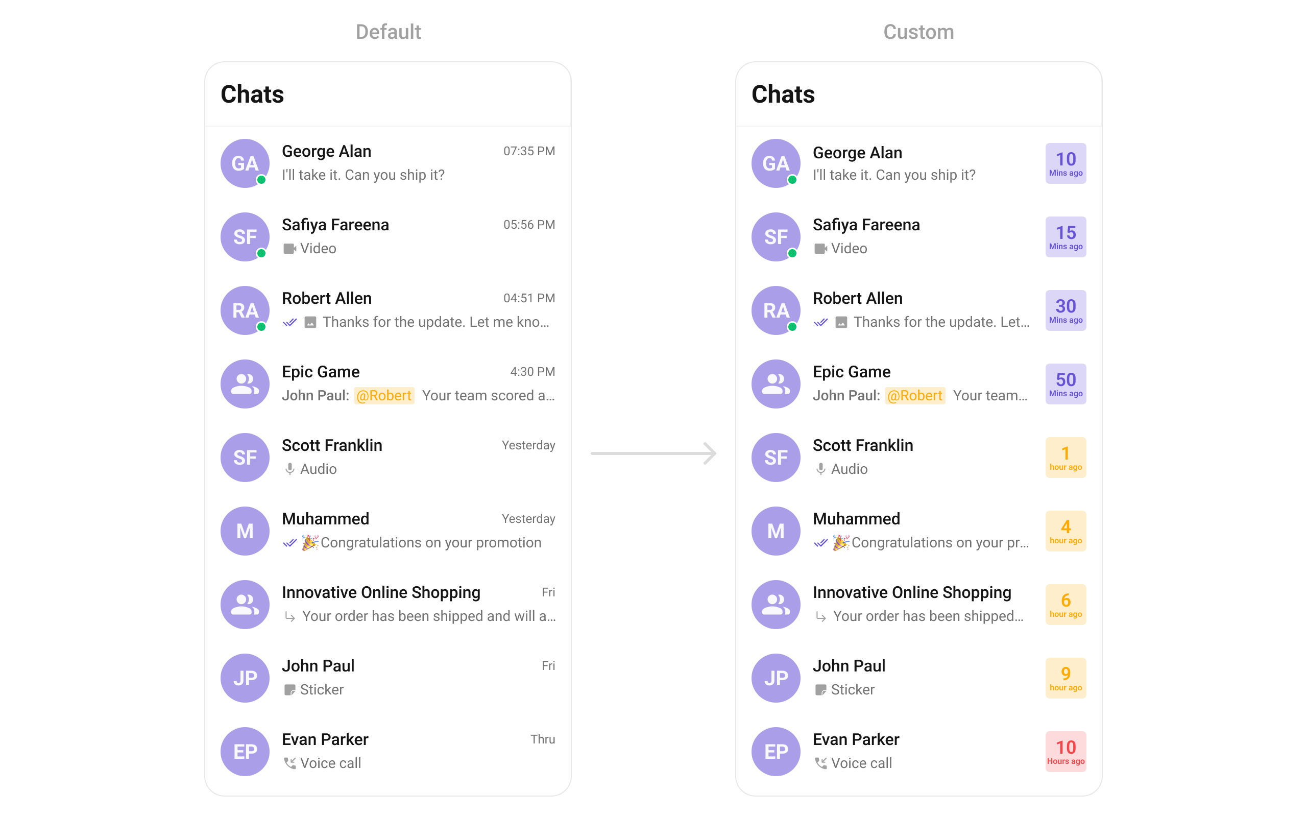
- Dart
setOptions
Replace the context menu / long-press actions on each conversation item.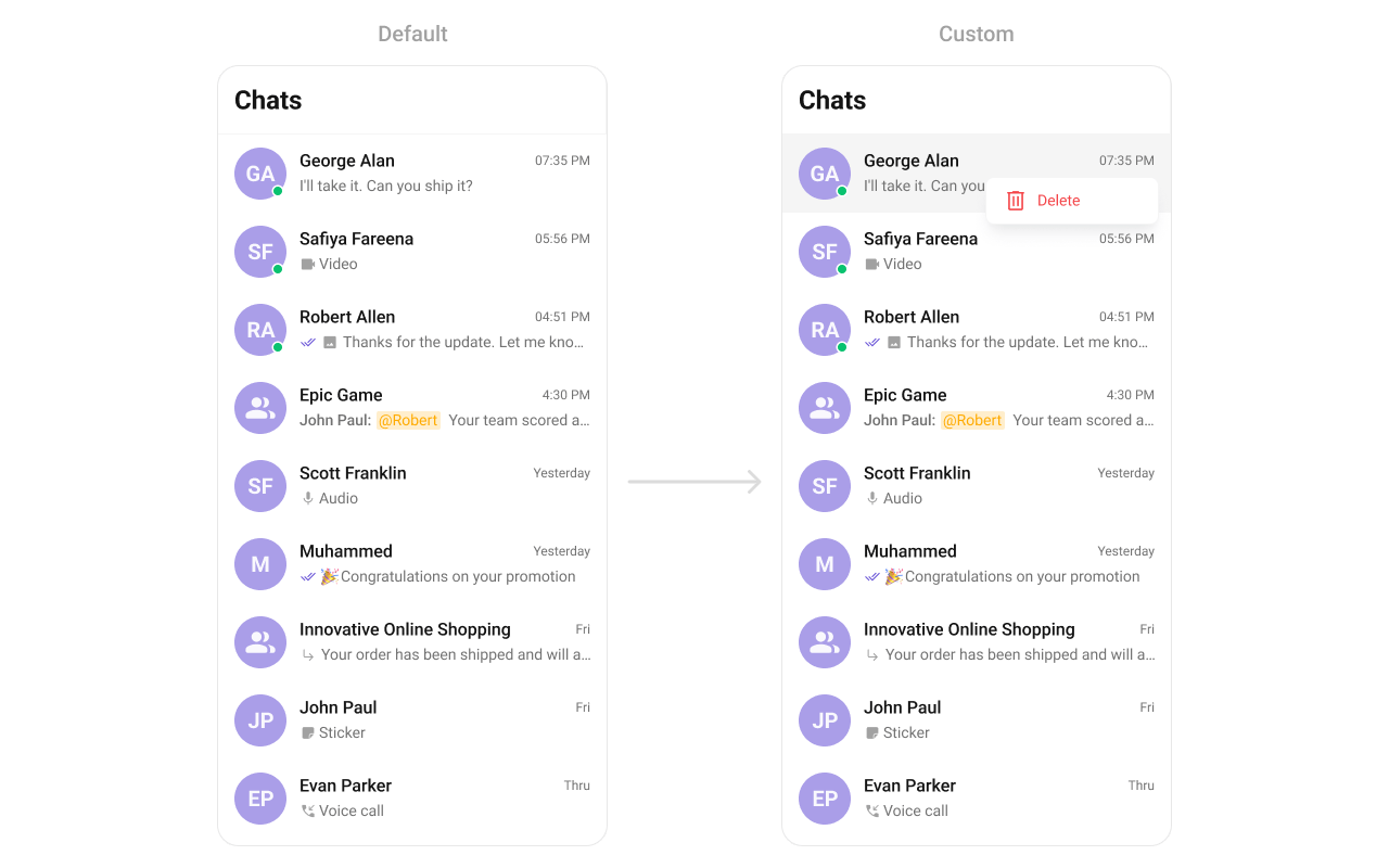
- Dart
addOptions
Add to the existing context menu actions without removing defaults.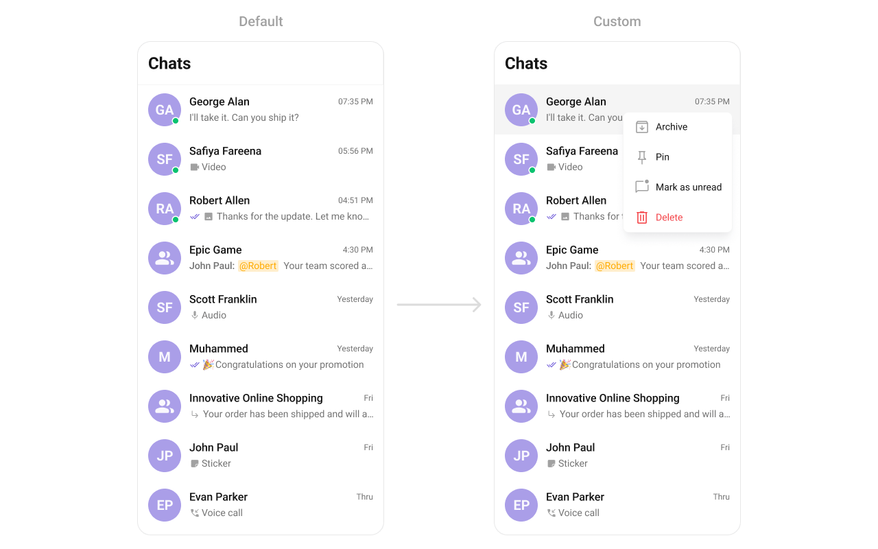
- Dart
appBarOptions
Add custom widgets to the app bar.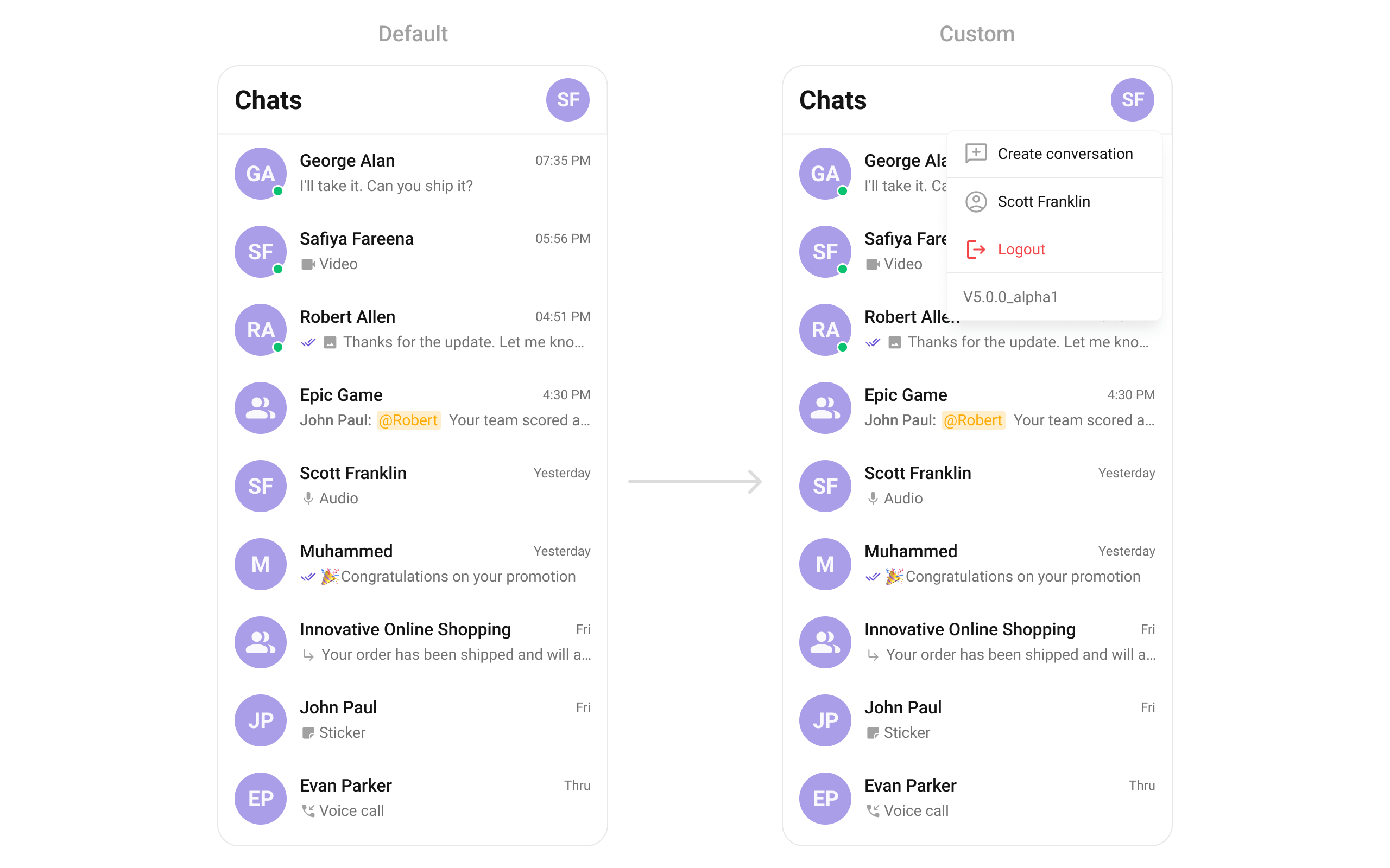
- Dart
- Dart
Styling
SetCometChatConversationsStyle to customize the appearance.
- Dart
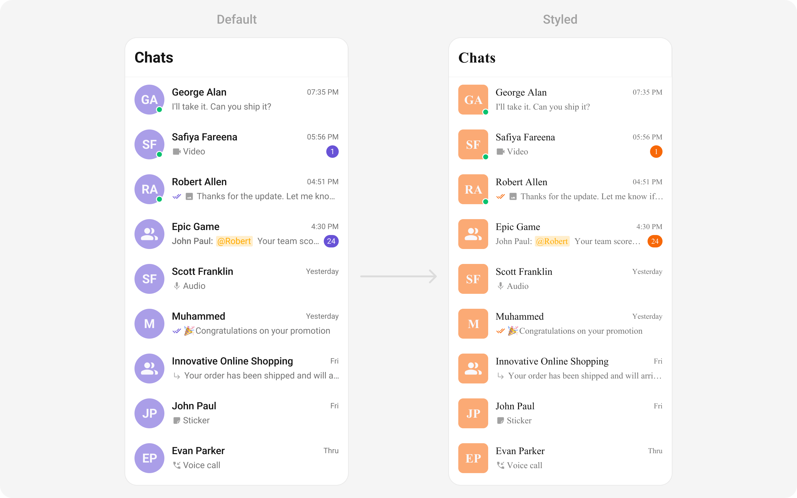
Style Properties
Common Patterns
Custom empty state with CTA
- Dart
Hide all chrome — minimal list
- Dart
Conversations with search
- Dart
Custom date pattern
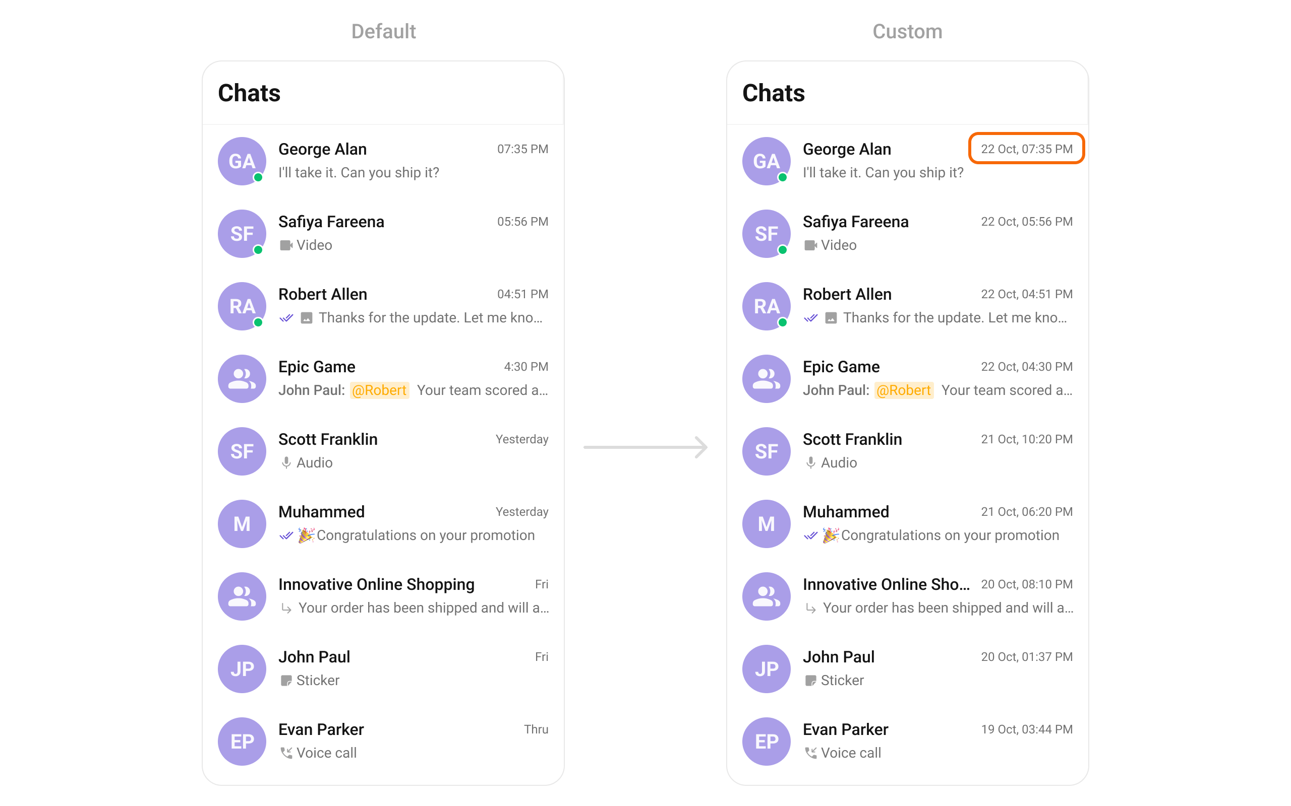
- Dart
Text formatters
Configure text formatters for the conversation subtitle. See CometChatMentionsFormatter for mention formatting.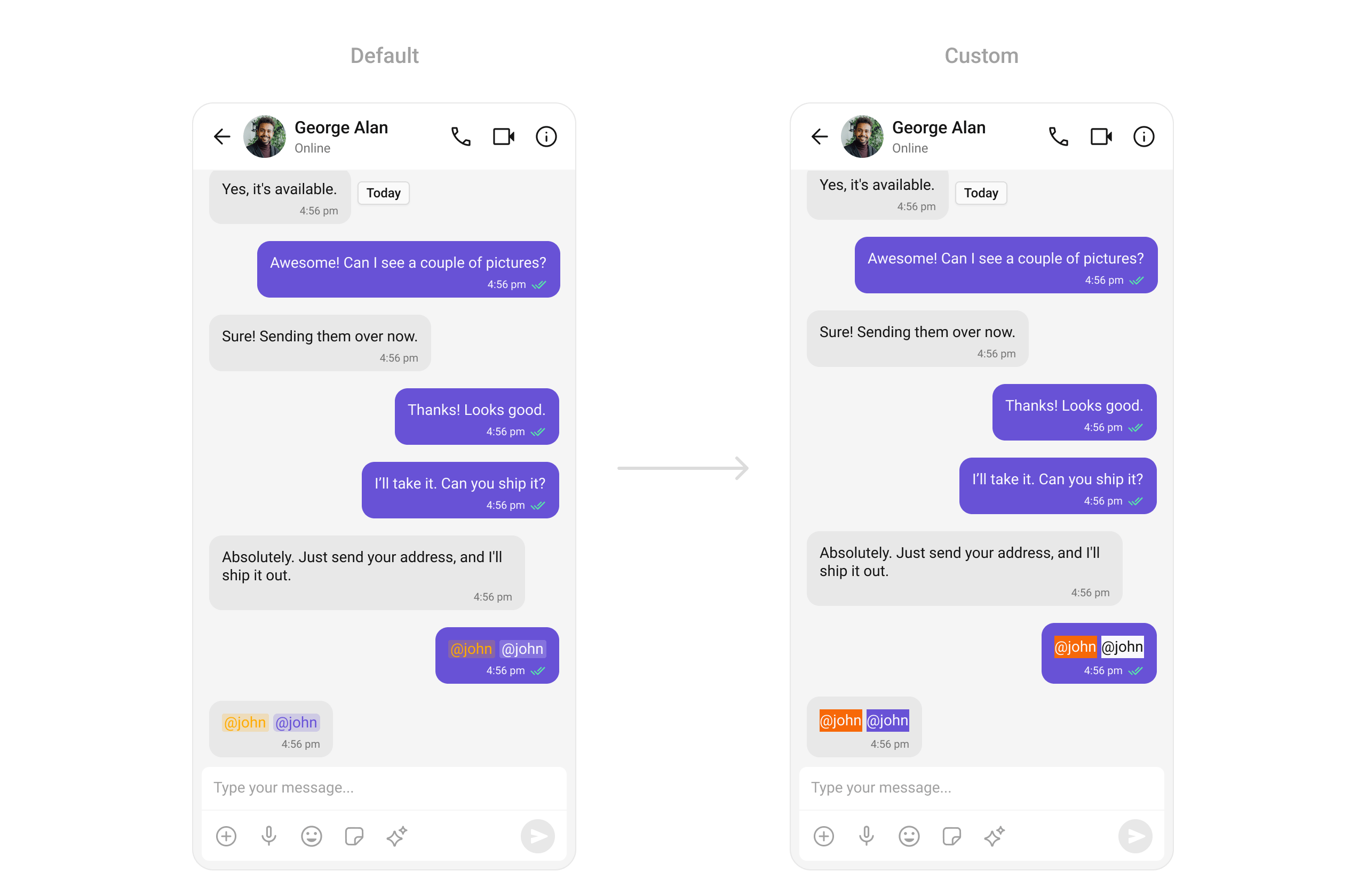
- Dart
Accessibility
The component renders a scrollable list of interactive items. Each conversation row is tappable and responds to both tap and long-press gestures. The context menu (options) is accessible via long-press. The unread badge count is exposed as text content. Avatar images include the conversation name for accessibility. For screen readers, the conversation list is rendered as a semantic list using Flutter’s built-in accessibility features. Status indicators (online/offline, group type icons) use visual icons — consider providing customSemantics widgets via leadingView if screen reader descriptions are needed for these visual indicators.
When using selection mode, checkboxes are rendered with proper accessibility labels. The component respects system accessibility settings including text scaling and high contrast modes.
Props
All props are optional. Sorted alphabetically.activateSelection
Controls when selection mode activates.
Values:
ActivateSelection.onClick, ActivateSelection.onLongClick
addOptions
Adds to the current list of actions available on long press.appBarOptions
List of widgets to display in the app bar.backButton
Custom back button widget.conversationsRequestBuilder
Controls which conversations load and in what order.
Pass the builder instance, not the result of
.build().
conversationsProtocol
Custom protocol for fetching conversations.
Use this for advanced customization of how conversations are fetched.
conversationsStyle
Style configuration for the component.customSoundForMessages
Path to a custom audio file for incoming message notifications.datePattern
Custom date format function for conversation timestamps.deleteConversationOptionVisibility
Controls visibility of delete option in context menu.deliveredIcon
Custom icon for delivered message receipts.disableSoundForMessages
Disables notification sound for incoming messages.emptyStateView
Custom widget displayed when there are no conversations.errorStateView
Custom widget displayed when an error occurs.
Hidden when
hideError: true.
groupTypeVisibility
Controls visibility of group type icon (public/private/password).hideAppbar
Hides the entire app bar.hideError
Hides the default and custom error views.hideSearch
Hides the search bar in the app bar.leadingView
Custom renderer for the avatar / left section.
Return
null to use the default avatar.
listItemView
Custom renderer for the entire list item row.loadingStateView
Custom widget displayed during loading state.mentionAllLabel
Custom label for group mentions (@channel, @everyone).mentionAllLabelId
Custom label ID for group mentions.onBack
Callback fired when the back button is pressed.onEmpty
Callback fired when the conversation list is empty.onError
Callback fired when the component encounters an error.onItemLongPress
Callback fired when a conversation row is long-pressed.onItemTap
Callback fired when a conversation row is tapped.onLoad
Callback fired when the conversation list is loaded.onSearchTap
Callback fired when the search box is tapped.
Requires
searchReadOnly: true to work properly.
onSelection
Callback fired when conversations are selected/deselected.
Requires
selectionMode to be set.
privateGroupIcon
Custom icon for private group indicator.protectedGroupIcon
Custom icon for password-protected group indicator.readIcon
Custom icon for read message receipts.receiptsVisibility
Controls visibility of message read/delivery receipts.scrollController
Custom scroll controller for the list.searchBoxIcon
Custom prefix icon for the search box.searchContentPadding
Padding for search box content.searchPadding
Padding for the search box.searchReadOnly
Makes the search box read-only (tap only).selectionMode
Enables single or multi-select mode.
Values:
SelectionMode.single, SelectionMode.multiple, SelectionMode.none
Must pair with onSelection to capture selections.
sentIcon
Custom icon for sent message receipts.setOptions
Replaces the list of actions available on long press.showBackButton
Shows the back button in the app bar.subtitleView
Custom renderer for the last message preview.textFormatters
Custom text formatters for the conversation subtitle.
See CometChatMentionsFormatter for mention formatting.
title
Custom title text for the app bar.titleView
Custom renderer for the name / title text.trailingView
Custom renderer for the timestamp / badge / right section.typingIndicatorText
Custom text shown when a user is typing.usersStatusVisibility
Controls visibility of online/offline status indicator.avatarHeight
Height for user/group avatars.avatarWidth
Width for user/group avatars.avatarPadding
Padding for user/group avatars.avatarMargin
Margin for user/group avatars.badgeWidth
Width for unread message badge.badgeHeight
Height for unread message badge.badgePadding
Padding for unread message badge.controllerTag
Tag for controller management. When passed, parent is responsible for closing.dateBackgroundIsTransparent
Controls whether the date background is transparent.dateHeight
Height for the conversation date display.datePadding
Padding for the conversation date display.dateTimeFormatterCallback
Callback for custom date and time formatting.dateWidth
Width for the conversation date display.listItemStyle
Style configuration for list items.searchContentPadding
Padding for search box content.searchPadding
Padding for the search box.statusIndicatorBorderRadius
Border radius for the status indicator.statusIndicatorHeight
Height for the status indicator.statusIndicatorWidth
Width for the status indicator.submitIcon
Custom submit icon for selection mode.Events
Subscribe using
CometChatConversationEvents.addConversationListListener() and unsubscribe with removeConversationListListener().
Customization Matrix
Users
Display and select from a list of users
Groups
Display and select from a list of groups
Message List
Display messages in a conversation
Theming
Customize the look and feel of components