

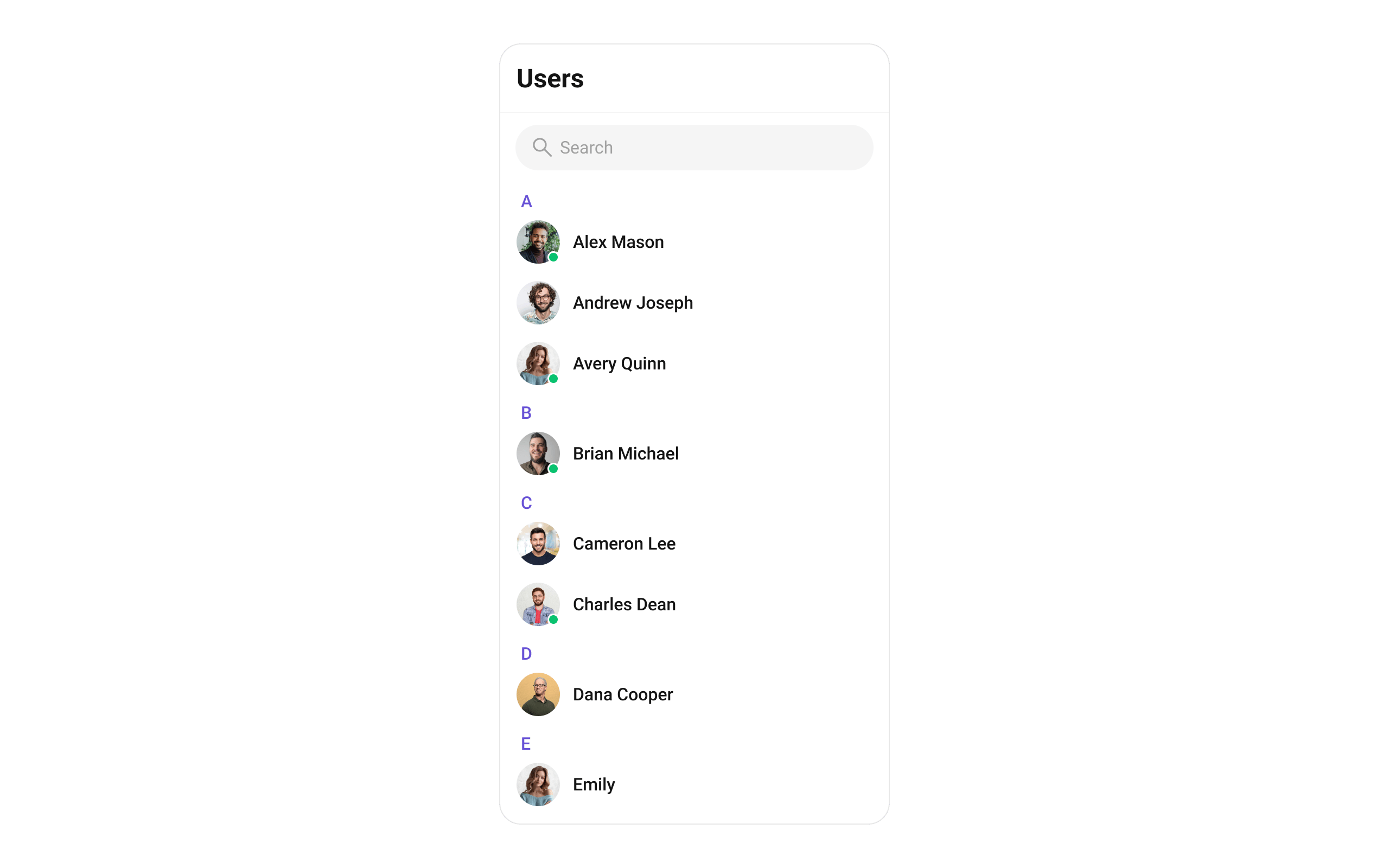
CometChatUsers renders a scrollable list of all available users with real-time presence updates, search, avatars, and online/offline status indicators.
Where It Fits
CometChatUsers is a list component. It renders all available users and emits the selected User via onItemClick. Wire it to CometChatMessageHeader, CometChatMessageList, and CometChatMessageComposer to build a direct messaging layout.
- Kotlin (XML Views)
- Jetpack Compose
activity_chat.xml
Quick Start
- Kotlin (XML Views)
- Jetpack Compose
Add to your layout XML:Or programmatically:
CometChatUIKit.init(), a user logged in, and the UI Kit dependency added.
Or in a Fragment:
- Kotlin (XML Views)
- Jetpack Compose
Filtering Users
- Kotlin (XML Views)
- Jetpack Compose
Pass a
UsersRequest.UsersRequestBuilder to control what loads:Filter Recipes
| Recipe | Builder method |
|---|---|
| Friends only | .friendsOnly(true) |
| Limit per page | .setLimit(10) |
| Search by keyword | .setSearchKeyword("john") |
| Hide blocked users | .hideBlockedUsers(true) |
| Filter by roles | .setRoles(listOf("admin", "moderator")) |
| Filter by tags | .setTags(listOf("vip")) |
| Online users only | .setUserStatus(CometChatConstants.USER_STATUS_ONLINE) |
| Filter by UIDs | .setUIDs(listOf("uid1", "uid2")) |
Actions and Events
Callback Methods
onItemClick
Fires when a user row is tapped. Primary navigation hook.
- Kotlin (XML Views)
- Jetpack Compose
Replaces the default item-click behavior. Your custom lambda executes instead of the built-in navigation.
onItemLongClick
Fires when a user row is long-pressed. Use for additional actions like block or mute.
- Kotlin (XML Views)
- Jetpack Compose
onBackPress
Fires when the user presses the back button in the toolbar.
- Kotlin (XML Views)
- Jetpack Compose
onSearchClick
Fires when the user taps the search icon in the toolbar.
- Kotlin (XML Views)
- Jetpack Compose
onSelection
Fires when users are selected/deselected in multi-select mode.
- Kotlin (XML Views)
- Jetpack Compose
onError
Fires on internal errors (network failure, auth issue, SDK exception).
- Kotlin (XML Views)
- Jetpack Compose
onLoad
Fires when the list is successfully fetched and loaded.
- Kotlin (XML Views)
- Jetpack Compose
onEmpty
Fires when the list is empty after loading.
- Kotlin (XML Views)
- Jetpack Compose
SDK Events (Real-Time, Automatic)
The component listens to these SDK events internally. No manual setup needed.| SDK Listener | Internal behavior |
|---|---|
onUserOnline | Updates online status indicator for the user |
onUserOffline | Updates offline status indicator for the user |
Functionality
| Method (Kotlin XML) | Compose Parameter | Description |
|---|---|---|
setBackIconVisibility(View.VISIBLE) | hideBackIcon = false | Toggle back button |
setToolbarVisibility(View.GONE) | hideToolbar = true | Toggle toolbar |
setSearchBoxVisibility(View.GONE) | hideSearchBox = true | Toggle search box |
setStickyHeaderVisibility(View.GONE) | hideStickyHeader = true | Toggle alphabetical sticky header |
setUserStatusVisibility(View.GONE) | hideUserStatus = true | Toggle online status indicator |
setSeparatorVisibility(View.GONE) | hideSeparator = true | Toggle list separators |
setSelectionMode(MULTIPLE) | selectionMode = MULTIPLE | Enable selection mode |
setTitle("Contacts") | title = "Contacts" | Custom toolbar title |
setSearchPlaceholderText("Find...") | searchPlaceholderText = "Find..." | Search placeholder |
Custom View Slots
Leading View
Replace the avatar / left section.- Kotlin (XML Views)
- Jetpack Compose
Title View
Replace the name / title text.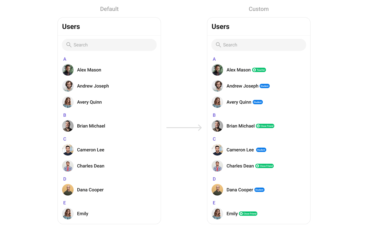
- Kotlin (XML Views)
- Jetpack Compose
Subtitle View
Replace the subtitle text below the user’s name.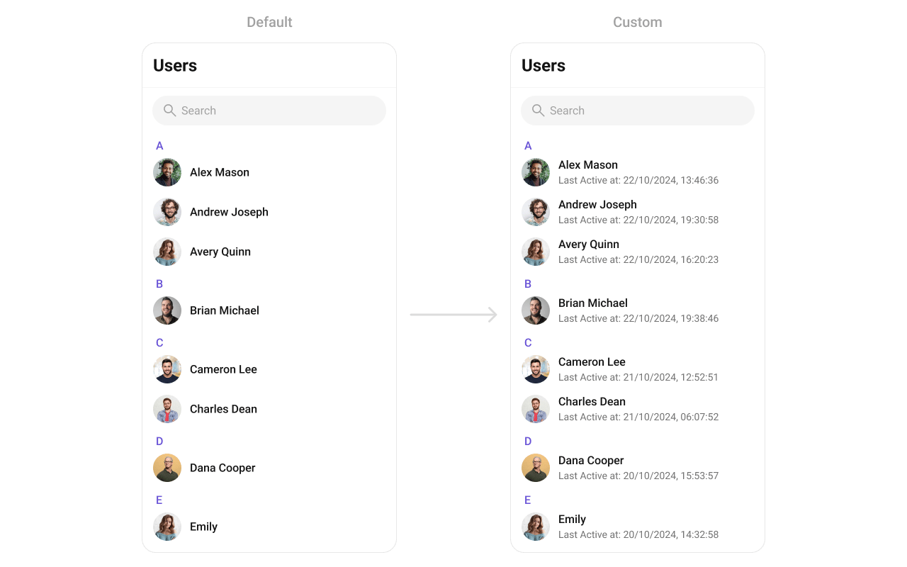
- Kotlin (XML Views)
- Jetpack Compose
Trailing View
Replace the right section of each user item.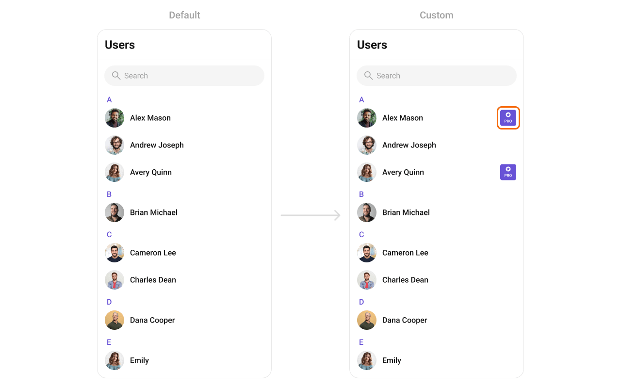
- Kotlin (XML Views)
- Jetpack Compose
Item View
Replace the entire list item row.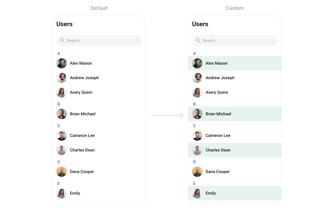
- Kotlin (XML Views)
- Jetpack Compose
State Views
- Kotlin (XML Views)
- Jetpack Compose
Overflow Menu
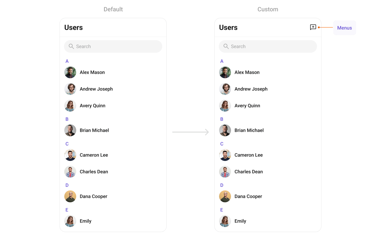
- Kotlin (XML Views)
- Jetpack Compose
Menu Options
- Kotlin (XML Views)
- Jetpack Compose
Common Patterns
Minimal list — hide all chrome
- Kotlin (XML Views)
- Jetpack Compose
Friends-only list
- Kotlin (XML Views)
- Jetpack Compose
Online users only
- Kotlin (XML Views)
- Jetpack Compose
Advanced Methods
Programmatic Selection
- Kotlin (XML Views)
- Jetpack Compose
ViewModel Access
- Kotlin (XML Views)
- Jetpack Compose
Style
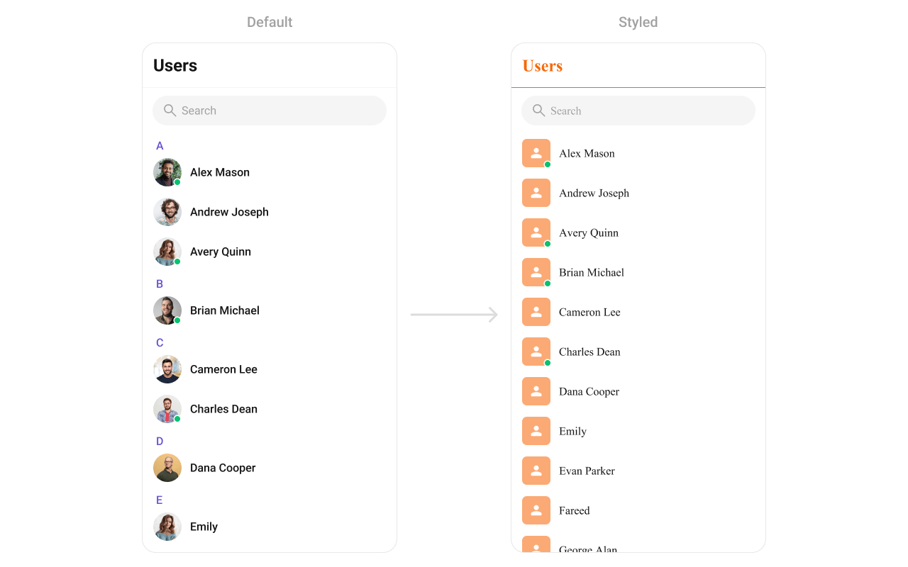
- Kotlin (XML Views)
- Jetpack Compose
Define a custom style in
themes.xml:themes.xml
Style Properties
| Property | Description |
|---|---|
backgroundColor | List background color |
titleTextColor | Toolbar title color |
searchBoxStyle | Search box appearance |
itemStyle.backgroundColor | Row background |
itemStyle.selectedBackgroundColor | Selected row background |
itemStyle.titleTextColor | User name color |
itemStyle.subtitleTextColor | Subtitle text color |
itemStyle.separatorColor | Row separator color |
itemStyle.avatarStyle | Avatar appearance |
itemStyle.statusIndicatorStyle | Online/offline indicator |
Next Steps
Conversations
Browse recent conversations
Groups
Browse and search available groups
Component Styling
Detailed styling reference with screenshots
ViewModel & Data
Custom ViewModels, repositories, and ListOperations