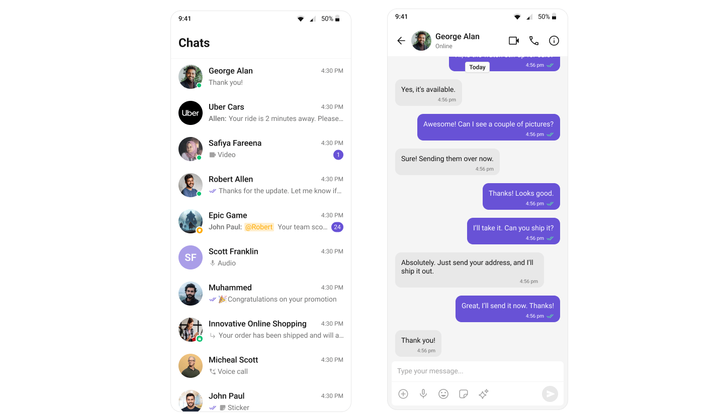
AI Integration Quick Reference
AI Integration Quick Reference
When to use this
- You want a single UI Kit theme that matches your app branding.
- You need light and dark mode support with consistent colors.
- You want to customize primary, background, or text colors across all UI Kit components.
Prerequisites
- CometChat UI Kit is installed and initialized.
- You’ve completed the Kotlin Integration or Jetpack Compose Integration.
Core Concepts
- Kotlin (XML Views)
- Jetpack Compose
The Kotlin XML UI Kit uses Android’s theme attribute system. All components read colors, typography, and fonts from XML theme attributes prefixed with
cometchat.CometChatTheme.DayNight— base theme built onTheme.MaterialComponents.DayNight.NoActionBar- Theme attributes like
cometchatPrimaryColor,cometchatBackgroundColor1, etc. are defined in yourthemes.xml - Programmatic access via
CometChatTheme.getPrimaryColor(context)andCometChatTheme.setPrimaryColor(color) - Dark mode via
values-night/themes.xmloverrides
- Programmatic overrides via
CometChatTheme.set*()(highest) - Activity-level theme
- Application-level theme
CometChatTheme.DayNightdefaults (lowest)
Quick Start
- Kotlin (XML Views)
- Jetpack Compose
1
Create your theme
In
app/src/main/res/values/themes.xml, extend CometChatTheme.DayNight:themes.xml
2
Apply the theme
In
AndroidManifest.xml, set the theme on your application:AndroidManifest.xml
3
Build and verify
Run the app and confirm UI Kit screens use your theme in both light and dark mode.
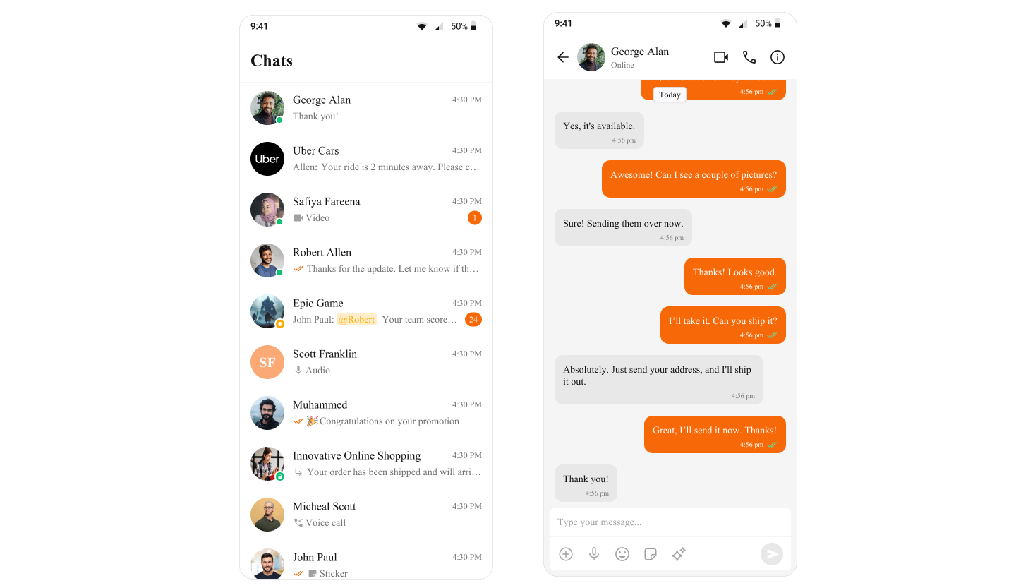
Change the Primary Color
- Kotlin (XML Views)
- Jetpack Compose
Override Or set it programmatically:
cometchatPrimaryColor in your theme:themes.xml
Customize Common Theme Attributes
- Kotlin (XML Views)
- Jetpack Compose
themes.xml
Add Dark Mode Support
- Kotlin (XML Views)
- Jetpack Compose
Create Android automatically applies
app/src/main/res/values-night/themes.xml and override attributes for dark mode:values-night/themes.xml
values-night overrides when the system uses dark mode.Apply a Theme to a Specific Activity
- Kotlin (XML Views)
- Jetpack Compose
Set Activity-level themes override the application-level theme.
android:theme on a specific <activity> in AndroidManifest.xml:AndroidManifest.xml
Color Token Reference