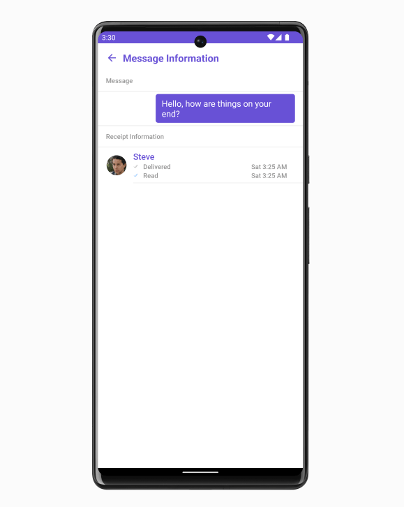
| setTemplate(CometChatMessageTemplate template) | CometChatMessageTemplate | Sets a custom message template for the message information view. |
| setMessage(BaseMessage message) | BaseMessage | Sets the message to be displayed in the message information view. |
| setErrorViewVisibility(int visibility) | int | Sets the visibility of the error view in the message information view. |
| setTitle(String title) | String | Sets the title that will be displayed at the top of the CometChatContacts view. This method allows you to customize the title to provide relevant information or context to the users. |
| setListItemView(Function3<Context, BaseMessage, MessageReceipt, View> listItemView) | Function3<Context, BaseMessage, MessageReceipt, View> | Sets a custom list item view for individual entries in the message information view. |
| public void setSubtitleView(Function3<Context, BaseMessage, MessageReceipt, View> subtitleView) | Function3<Context, BaseMessage, MessageReceipt, View> | Sets a custom subtitle view for individual entries in the message information view. |
| setReceiptDatePattern(Function1<MessageReceipt, String> datePattern) | Function1<MessageReceipt, String> | Sets a custom date pattern for formatting receipt dates in the message information view. |
| setStyle(MessageInformationStyle style) | MessageInformationStyle | Sets the overall style and appearance for the message information view. |
| setReadIcon(@DrawableRes int readIcon) | @DrawableRes int | Sets the custom icon resource for read receipts in the message information view. |
| setDeliveredIcon(@DrawableRes int deliverIcon) | @DrawableRes int | Sets the custom icon resource for delivered receipts in the message information view. |
| setListItemStyle(ListItemStyle listItemStyle) | ListItemStyle | Sets the style for list items in the message information view. |
| setAvatarStyle(AvatarStyle avatarStyle) | AvatarStyle | Sets the style for avatars in the message information view. |
| setError(OnError onError) | OnError | Sets the error callback to handle any errors that may occur within the message information view. |
| emptyStateText(String message) | String | Sets the text to be displayed in the empty state view of the message information view. |
| errorStateText(String errorText) | String | Sets the error message to be displayed in the error state view of the message information view. |
| setEmptyStateView(@LayoutRes int id) | @LayoutRes int | Sets the custom layout resource for the empty state view of the message information view. |
| setErrorStateView(@LayoutRes int id) | @LayoutRes int | Sets the custom layout resource for the error state view of the message information view. |
| setLoadingStateView(@LayoutRes int id) | @LayoutRes int | Sets the custom layout resource for the loading state view of the message information view. |
| setBubbleView(Function2<Context, BaseMessage, View> bubbleView) | Function2<Context, BaseMessage, View> | This method allows you to set a custom bubble view in the message information Component. |
| setMessageBubbleStyle(MessageBubbleStyle messageBubbleStyle) | MessageBubbleStyle | The setMessageBubbleStyle method is used to set the style and appearance of the message bubble in the CometChatMessageInformation component. |
| backIcon(@DrawableRes int res) | @DrawableRes int | The back button is typically displayed at the top-left corner of the message information view, and it allows users to navigate back to the previous screen or close the message information view. |
| addOnBackPressListener(OnBackPress onBackPress) | OnBackPress | This listener is triggered when the back button is pressed within the CometChatMessageInformation view. It provides a way to handle the back button press event and implement custom behavior. |